As promised (although a few days late), my reviews of the remaining SXSW Mondo posters...
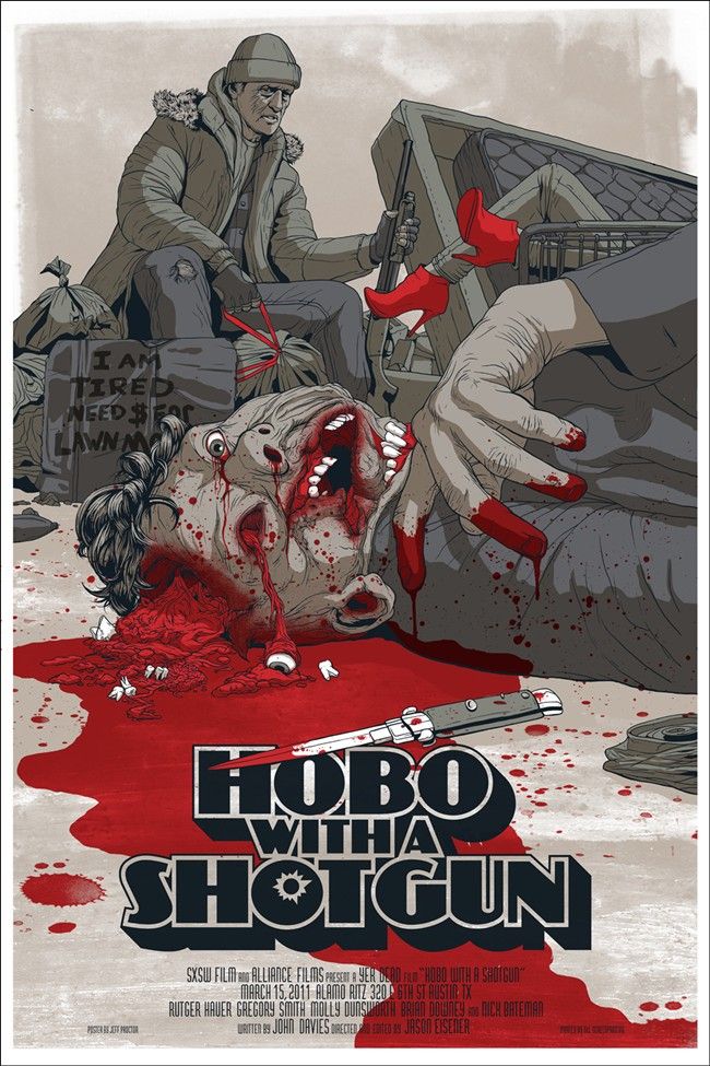 |
| Hobo with a Shotgun - Jeff Proctor |
I may have already mentioned this, but damn, Jeff Proctor has to be one of my favorite new artists. I love his photo realistic approach and the man just has a knack for gore. Need proof? Check out all of his
zombie-related art, it's beautiful stuff. Need more proof? Look at his freaking
Hobo with a Shotgun poster! I showed this picture to my girlfriend in a fit of nerd pride and she said she immediately felt like vomiting - a job well done in my book. I'm really hoping this makes it on to
Mondo's site next week (3/20 - 3/26), so I can purchase one with extreme prejudice. Make sure you're following
@MondoNews to keep up with the release details. To see more of Jeff's work head over to his website
MakeNonsense. If you missed the coming Mondo sale, I'm guessing a few of the posters will be available in two or three months down the road through his
store as well.
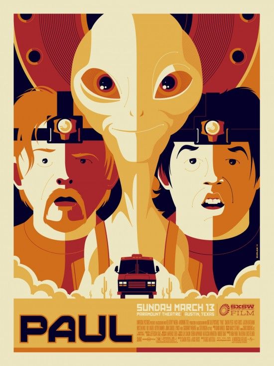 |
| Paul - Tom Whalen |
I really want to like
Paul the movie, I really do. I mean, you've got Simon Pegg, Nick Frost and Seth Rogen. Can't go wrong, right? I just have a sneaking suspicion that this movie is going to be a let down. Paranoia aside, Tom Whalen has created a lovely poster for the film. While this definitely isn't my favorite of the SXSW Mondo posters, I do really like his depiction of Paul the alien in the center of the frame high above the roving RV. So much so, in fact, that I almost feel the image would be stronger without Simon and Nick in it at all. I'd love to see Whalen tackle an
E.T. poster. How great would that be? The Tom Whalen
Paul poster will go on sale sometime next week through
Mondo. To see more of Whalen's incredible art head over to his blog at
StrongStuff.net.
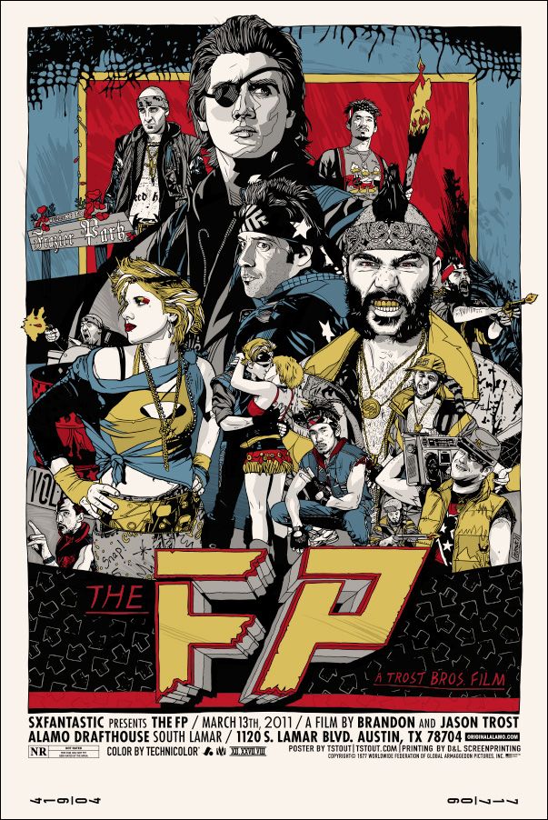 |
| The FP - Regular Edition - Tyler Stout |
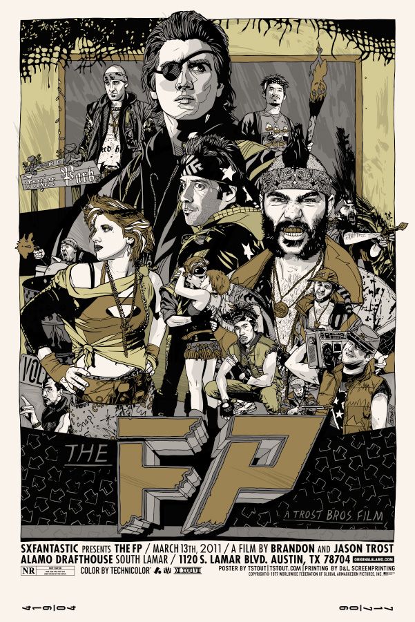 |
| The FP - Variant Edition - Tyler Stout |
Who could have created these posters? It's not like they've been completed in a particular artist's trademark style or anything…oh wait. Yes, these absolutely beautiful
FP posters highlight exactly why Tyler Stout is so sought after in the poster world. The level of detail and dedication to recreating these characters is astounding. When I first laid eyes upon this poster I had to ask myself, what the hell is
The FP? Thankfully my friends at
MUBI were more than happy to answer that question in the form of a synopsis (taken from the SXSW events schedule).
"Accompanied by his brother JTRO, Beat-Beat Revelation champion BTRO must compete for the pride of their hometown, Frazier Park (The FP). His opponent: ruthless fighter and trash talker, L Dubba E. L Dub not only defeats BTRO, he sends him to an early grave. L Dub's instant climb to power has forced The FP to fall into disarray. Crazed with anger, JTRO vows revenge. After a crash course in the ancient techniques of Beat-Beat from master BLT, JTRO challenges L Dubba E. Their battle to the finish, born of lust, power and revenge, will leave only one man standing."
I am SO completely in. Hearing the plot of this film somehow makes this poster even more incredible. My favorite touch might have to be the
Dance Dance Revolution style arrows surrounding the title. I want this poster, I want this movie, I want both of these things immediately. And as usual, I tend to gravitate toward the regular versions of Tyler's posters because they're so colorful and fun. I'm not going to lie, I go crazy when someone like Tyler Stout does posters for a huge franchise like
Star Wars, but I get even more excited when he does something for a small independent film like
The FP or
Best Worst Movie. This and Proctor's
Hobo with a Shotgun poster might just be my favorite two of the festival. If you'd like to learn more about Tyler Stout checkout his
website, and be sure to follow
Mondo's Twitter to stay in the know about the Stout
FP movie poster drop, which by the way is happening sometime next week.
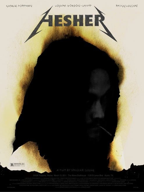 |
| Hesher - Alan Hynes |
This is probably my least favorite of the bunch, but it's still better than 99.9% of the posters put out by movie studios (ironically, the film's
official poster is pretty amazing). From what little I know about the film, anarchist-cum-pyromaniac Hesher (played by Joseph Gordon-Levitt) inserts himself into a family's life for better or for worse. Sounds pretty awesome in my opinion. Alan Hynes, whom I've previously
written about, has created something foreboding here, and is definitely playing with Hesher's fiery personality and approach to life. With that said, I definitely feel like I'm not getting the whole picture with just this jpeg to go on. To learn more about Alan Hynes, be sure to head over to his
GigPosters.com profile (the man has 114 posters to his credit over there, talk about being prolific). Like the rest of the SXSW posters that
Mondo commissioned, the
Hesher movie poster by Alan Hynes will be released sometime next week at a random time through
Mondo's website. Be sure to follow
@MondoNews to get an exact drop time. Check it out!
Now if you don't mind, I need to get back to
Dragon Age 2. It's kind of incredible...

 (flaws and all), and am looking forward to seeing what he does with his latest. Add Alex Pardee to the mix, the insanely talented artist who did some of the concept work and marketing materials for the film, and it doesn't even matter if it makes sense, at least we know it's going to be pretty.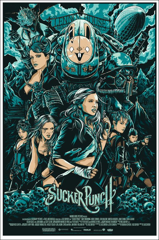
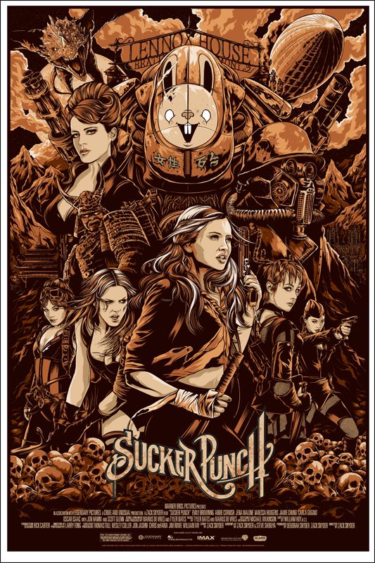
 artwork, which I thought was great and quickly purchased (and previously wrote about). As usual, my favorite elements of Ken Taylor's work, at least with his recent output, has been his depiction of the otherworldly and unusual. Needless to say, this poster doesn't disappoint with the Pardee bunny-emblazoned mech, the gargoylish dragon, and the rather creepy gas mask wearing stranger - it's a wonderfully strange design.
, 300
, LEGEND OF THE GUARDIANS
and WATCHMEN

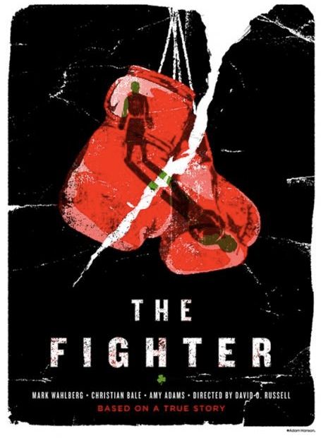
 movie poster by Adam Hanson
 ." And the room responding, "Hi Darren." Yeah, I'm that guy. The guy who never played one of the most innovative and beautifully crafted games ever made (or so I hear). I swear one day I'll play the game (I promise), but for now I've got the impressive artwork of James Bacon to fill that void in my heart. Out of the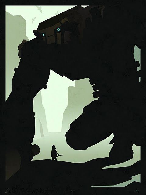
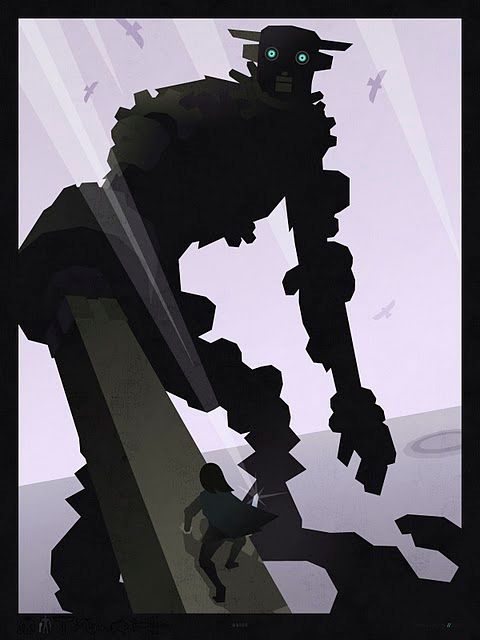
 is, I'm in for a treat. You can find all of James's art, including his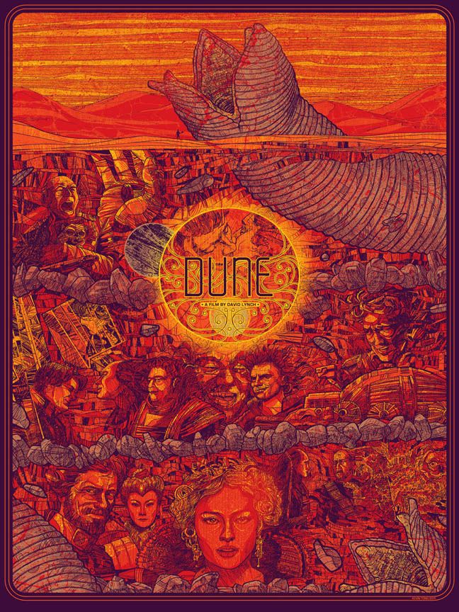
 ,
,  and then
  . To this day I still don't really understand all of it (I've never read the book), but it's clear that the cast and crew made something very special, and a little bit weird. Much like the film, Tong's poster has so much going on that it can be a bit intimidating from a distance, but from what I've seen of the close up shots (which can be found at Kevin's
  isn't my favorite Scorsese film (I’m more partial to
  and
and  ), but it’s still a fantastic film and is obviously the work of a master filmmaker. I’ve written about the talented Mr. Sherrat before, but I’m more than happy to write about him again, as he’s clearly a superbly talented chap.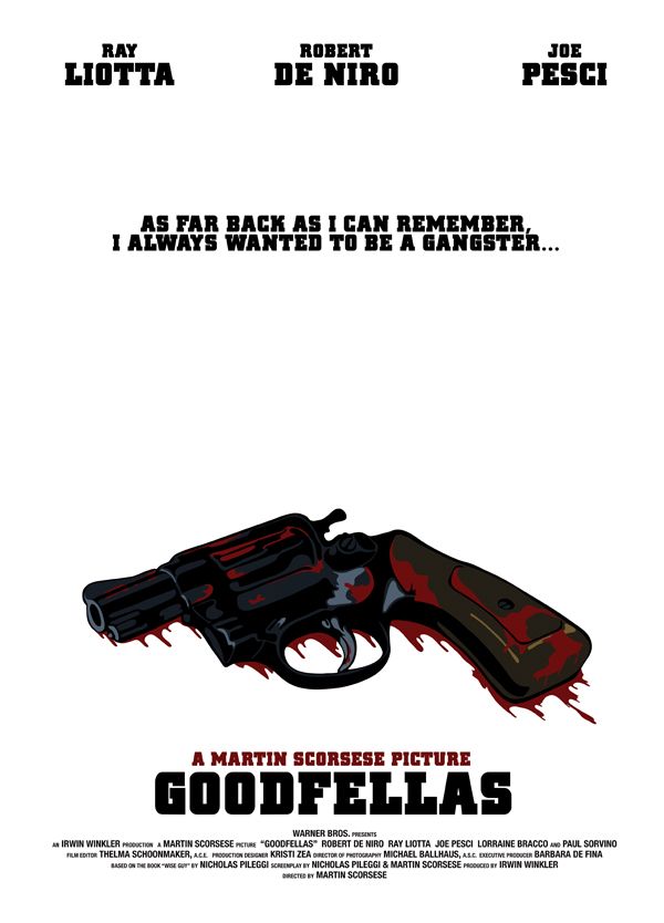
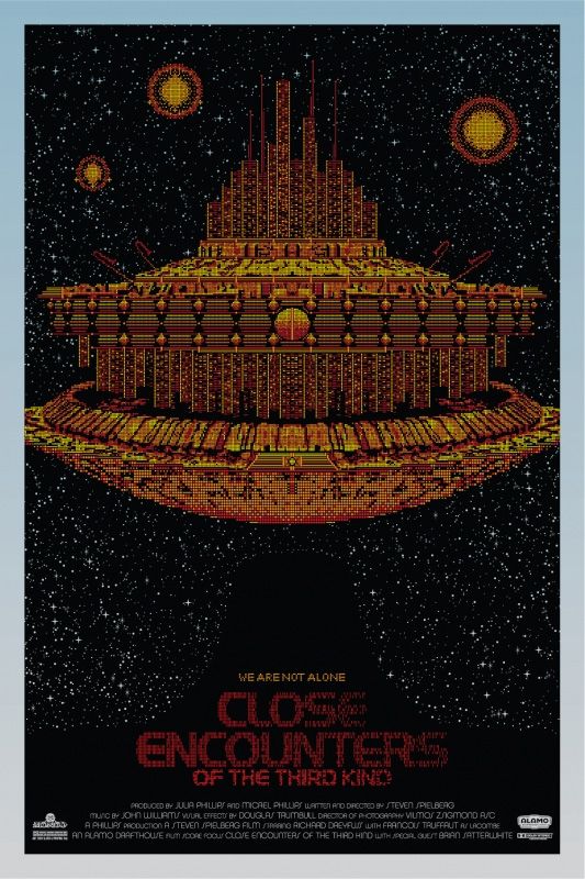
 poster by Todd Slater. Tomorrow, I'll be babbling about all of the amazing SXSW Mondo posters that were not part of the Duncan Jones Director's Series (I already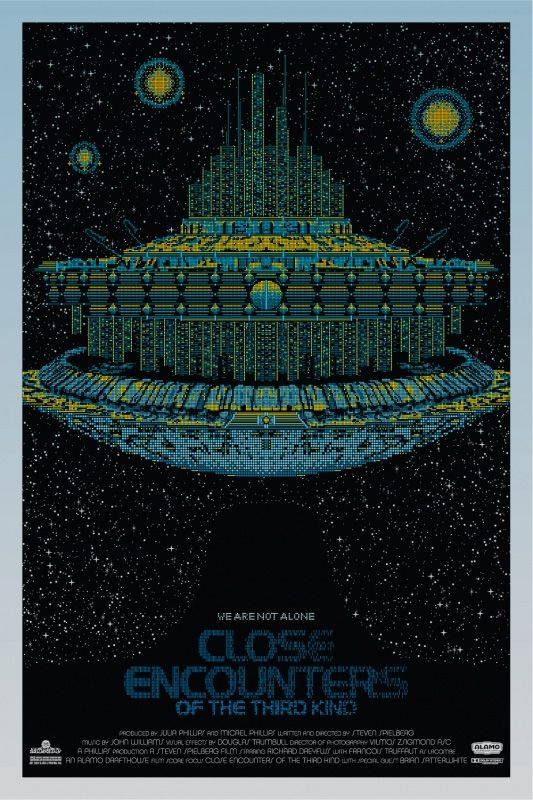
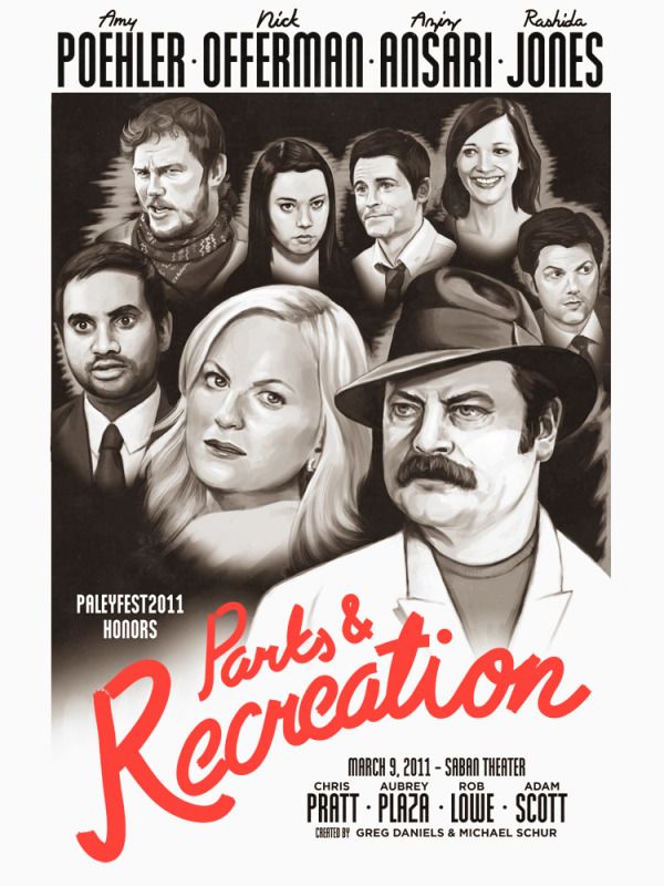
 , and has surpassed even my highest expectations. I love, love, love that he decided to place Nick Offerman's Ron Swanson (easily the best character on the show) in the forefront. It's a tie between Danger's
  and Mitchell's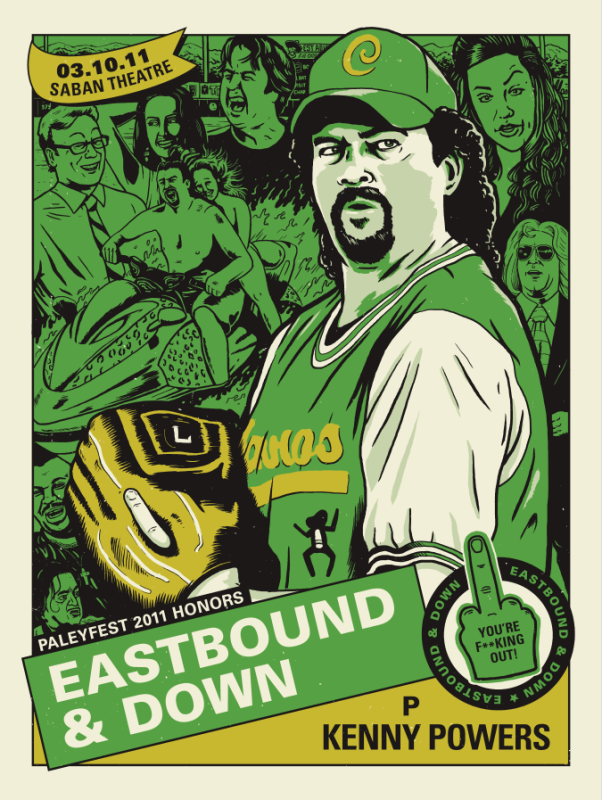
 and play it whenever I want to laugh or am feeling particularly mean spirited (this show is mean - that's one of the reasons I love it). This poster pretty much says it all, it's loud (green and yellow), it's made to look like a baseball card and it's literally flipping the bird at the viewer - perfection, thy name is this poster. Again, make sure to check out Derek's
 /
/  poster. I really like how the artist tinted this image with green and yellow, it reminds me of an old photograph that's lost some color with age or sun damage, but is far from forgotten. Be sure to check out the
  poster is unveiled, depending on if anything else big is hitting that day, I may or may not do a part 3. Have a great night!