Showing posts with label Poster Review. Show all posts

Monday, March 7, 2011

PaleyFest Posters Curated by Gallery 1988 Part 1

I could try and tell you in my own words what PaleyFest is, but I think Jensen Karp, co-owner of Gallery 1988, does a much better job and also touches upon the reason I'm writing this post in the first place (taken from the G1988 blog):
"Proud to announce that we were involved in this year's PaleyFest Honors, a yearly festival that celebrates television's rich and diverse programming and the creative process behind the medium for the last twenty-seven years. Each year they pick a group of shows to honor, and then the cast and crew participate in a panel and Q&A. It's pretty amazing.

We were asked this year to curate limited edition silkscreen posters to commemorate the nights' events. We will selling posters for the PaleyFest Honors for the Walking Dead (3/4), True Blood (3/5), Parks & Recreation (3/9), Eastbound & Down (3/10), Freaks & Geeks/Undeclared (3/11) and Glee (3/16)."
If the title of this entry didn't already give it away, and Jensen's quote wasn't clear enough, I'll lay it all out for you - I wanted to cover some of the amazing artwork being offered by Gallery 1988 in cooperation with the Paley Center for Media's PaleyFest. I'll just be reviewing the Walking Dead and True Blood posters today, but tomorrow I'll return to cover Parks & Recreation, Eastbound & Down, Freaks & Geeks and Undeclared. Now on with the show.
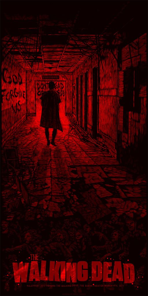
The Walking Dead - Daniel Danger

I missed out on this one over the weekend, and admittedly, was quite bummed. That is, until I found out some rather fantastic news (read on, read on)! Daniel Danger's The Walking Dead print captures everything that's great about Danger's style from his bleak aesthetic to his love for shadow and manipulation of light; the man likes mood. Daniel is inexplicably able to create incredibly complex environments armed with what seem like thousands of tiny hash marks. If Olly Moss is the master of minimalism, then Daniel Danger is the director of decay and disrepair, often creating something both beautiful and frightening with apocalyptic tones. My favorite detail has to be near the bottom, behind the title, where you can barely make out the roving undead. It reminds me of the elaborate stone and stained glass work that ornate houses of worship would often feature. The Walking Dead is a great television show and an even better comic book series, so for everyone who missed out on this one, I feel your pain. And as I stated earlier, while this may be sold out via the Gallery 1988 store, there's a light at the end of the tunnel - Daniel Danger has officially confirmed that he will have 100 additional posters available for purchase through his Tiny Media Empire site sometime soon. Pretty awesome, right? Danger's The Walking Dead measures 12" x 24" and is limited to an edition of 250. There's hasn't been a release date announced yet, so be sure to regularly check his website, subscribe to his mailing list and follow @TinyMediaEmpire.
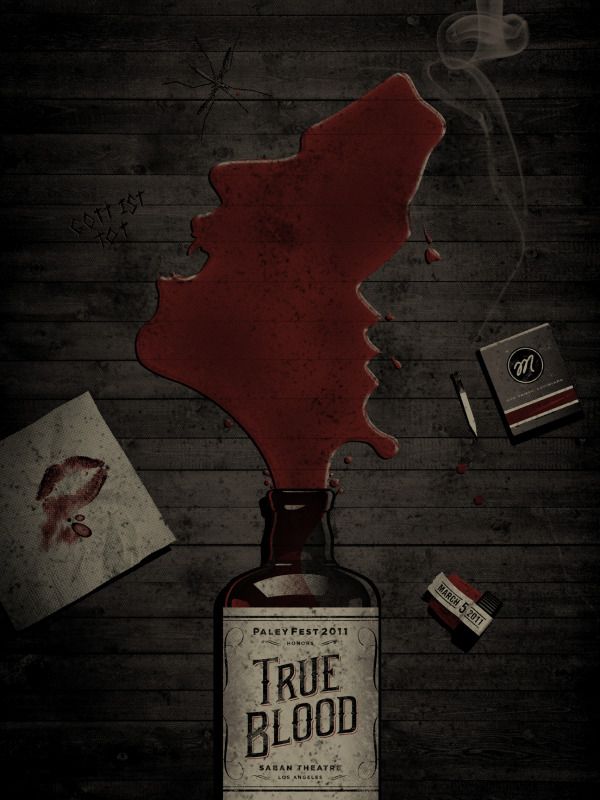
True Blood - DKNG Studio

DKNG Studio's True Blood poster is pretty nuts. I haven't seen the poster in person, but it's kind of shocking to know that this is a screen print and not a high quality giclée. The detail is just astounding. If you've seen True Blood, hell, even if you haven't, you probably immediately understand the meaning of the poster. The True Blood bottle, and really the entire image, has a very dated and retro look to it - it's absolutely perfect given the setting of show. I'm not going to babble on too much longer, because unlike the Daniel Danger Walking Dead posters, these prints are actually still available through Gallery 1988, so I want to get this post up as soon as possible. DKNG Studio's True Blood poster measures 18" x 24" and costs $35. If you have any interest in these prints, I highly recommend heading over there now. Be sure to also take a look at the DKNG Studio site for more great art. Good luck!

I'll be back tomorrow with more PaleyFest poster coverage!

Friday, March 4, 2011

"Moon" & "Source Code" Movie Posters by Olly Moss

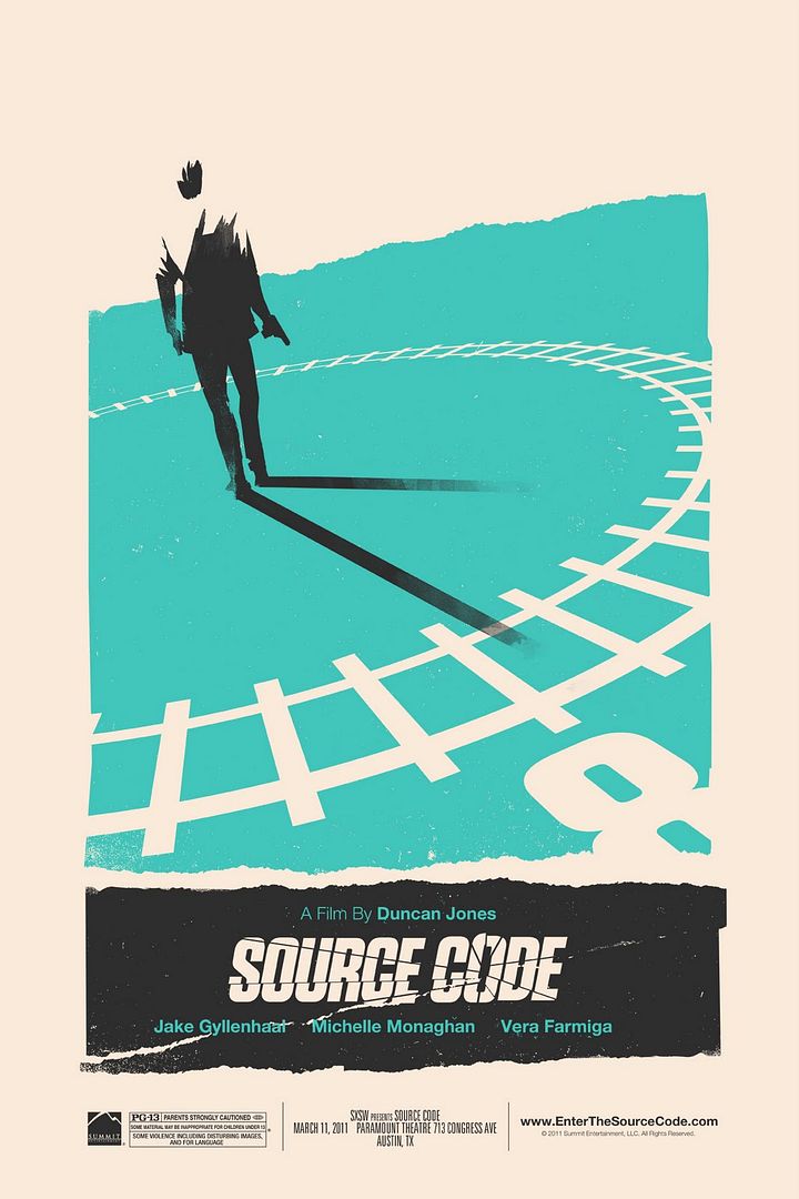
The following two prints are already all over the Internet, but I had to write about them because they're a poster lover's dream come true. The incredibly talented Duncan Jones (son of androgynous rock star David Bowie), director of the incredible Moon and the upcoming Source Code, and Olly Moss (not the son of androgynous rock star David Bowie), poster boy of the poster world, have come together to create something beautiful...something very, very beautiful. Continuing their excellent Director's Series, Mondo will be releasing not one, but two, Olly Moss posters inspired by the films of Duncan Jones. Commence communal frothing at the mouth.
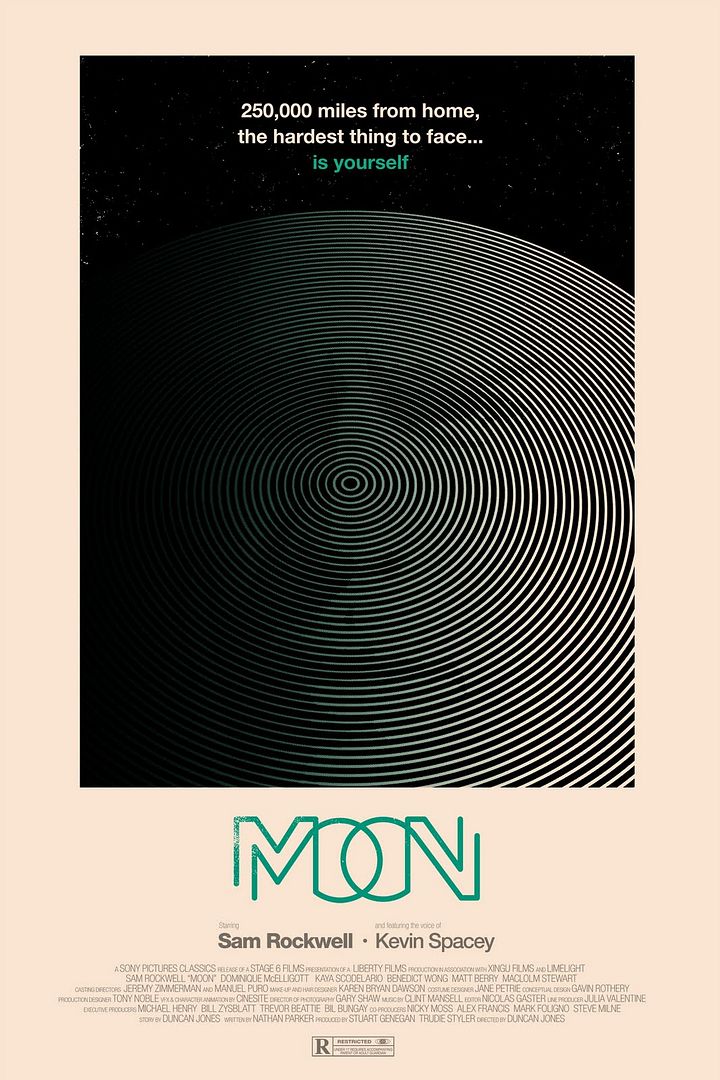
Moon

Moon was easily one of the best films of 2009. I had to go to my local independent theater to see it originally, but wow, was it worth it! It totally works as both a brilliant, mind-bending sci-fi story, and as a beautiful one man performance piece. As usual, the keen eye of Olly Moss was able to take what was so great about the original movie poster by All City Media, featuring an already minimalist design, and reduce it to it's barest essentials, while also keeping the tone and the message of the film firmly in tact. The 16" x 24" Moon poster by Olly Moss will be released at SXSW in Austin next week, and whatever is left over (if anything is left over) will be available at Mondo's website. The poster will cost $35 and is limited to an edition of 250. Be sure to follow @MondoNews to keep up with their release schedule.

Source Code

Out of these two posters, I think my favorite has to be Olly's Source Code print. It reminds me of what a one sheet would like for a classic spy film, maybe one of the numerous James Bond flicks. It's not like I need another reason to go see this film, but this poster certainly doesn't hurt. Thankfully Olly has once again met the high expectations we have set for him and has delivered a wonderfully clever design. The railroad tracks that act as both a literal railway, and as the outline of a clock, illustrate perfectly why Moss is the master of minimalism. I want to see this movie and this poster (in person) so badly. Like Olly's Moon poster, the Source Code print is being released at SXSW next week and any remaining prints will be available through Mondo's store. Interested in more Olly goodness? Check out his BigCartel store, blog and Twitter. The poster measures 16" x 24", is limited to an edition of 200 and will cost $35. If you'd like to know more about Duncan Jones, head over to his blog at manmademovies.co.uk or follow him @ManMadeMoon.

Thursday, March 3, 2011

Rhys Cooper's "A Clockwork Orange" Movie Posters

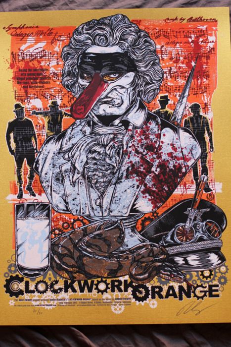
Alright, alright, so I guess I lied when I said no more Kubrick posters this week, but this is kind of a big deal and I just found out about it today. Tommy Good, the fine folks who handle all of the poster releases for Melbourne's Astor Theatre, have just announced their next release - A Clockwork Orange print by Rhys Cooper. Is your heart racing yet? I've already briefly (very briefly) explained my love for Kubrick's dystopian tour de force, so I won't delve to deeply into that this time around, but I did want to comment on the astonishing level of detail and complexity present in these prints. This design is just dripping with Cooper's trademark bloodletting splatter style artwork and can be a bit frightening to take in, but then again so can A Clockwork Orange.
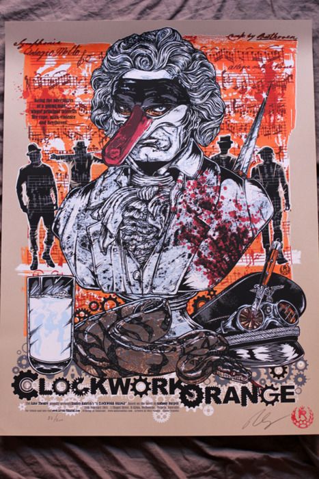
A Clockwork Orange - Regular Edition

A Clockwork Orange - Variant Edition (Printed on Gold Foil Stock)

Is that Beethoven with a rather phallic looking mask? Yep. In case you couldn't tell just by looking at these posters, A Clockwork Orange is kind of a strange / brilliant / amazing movie. And as is often the case with his art, Rhys has packed a ton of stuff into this striking image, including a snake, a glass of milk laced with narcotics (no doubt from the Karova Milk Bar), a silhouette of the gang, and of course the aforementioned Beethoven bust, all set against a colorful page of sheet music. These posters seem to really capture the manic "ultra-violence" that is Alex's primary drug of choice. I'm really not sure which version I like better, the regular or the variant printed on gold foil stock. On the one hand, I tend to go with the less showy (and always cheaper) edition, but on the other hand, the garishness of the gold variant perfectly reflects Alex's bombastic personality. I'm also loving the title work Rhys did here. I especially appreciate the cog-within-a-cog transition he used to connect the "K" and the "O."

I highly recommend visiting Tommy Good, where you can find an excellent interview with the artist, but I wanted to excerpt the bit of the conversation that focused on his inspiration.
"[I've] always been a fan of Clockwork and one of the parts that fascinated me was Alex's relationship with his parents and how they had no idea what he was really like. How could you not be suss of a kid who has a combination lock on his bedroom door? He has a record player, images of Beethoven and his python under his bed, it is the real Alex who lives in there and kinda like his trophy room so that is the approach I took with the poster. Like a bedroom shelf."
Both 18" x 24" Clockwork Orange posters will be available for purchase at some point next week through the Tommy Good website / storefront. The gold foil variant is limited to an edition of 50, while the regular edition will be limited to 200, and both posters are signed and numbered. Be sure to sign up for their newsletter as well as follow @ThisIsTommyGood to get the exact date and time of the drop. Since these posters were printed by Tim Doyle's Nakatomi Inc. there's a good chance that they'll be available at some point down the road through Nakatomi, but you probably don't want to risk losing out. For additional Rhys Cooper artwork head over to his Studio Seppuku store. Finally, the only way I could properly end this post is with a quote from the film.
"There was me, that is Alex, and my three droogs, that is Pete, Georgie, and Dim, and we sat in the Korova Milk Bar trying to make up our rassoodocks what to do with the evening. The Korova Milk Bar sold milk-plus, milk plus vellocet or synthemesc or drencrom, which is what we were drinking. This would sharpen you up and make you ready for a bit of the old ultra-violence." - Alex

Tuesday, March 1, 2011

Stanley Kubrick-Inspired Movie Posters by Adam Maida

I promise this is my last Stanley Kubrick-related post of the week. I found these gorgeous images today and was completely floored. I'll start with the most recent one and work my way back from there. If you're a lover of Kubrick, then you'll no doubt be in paradise for the next several minutes.

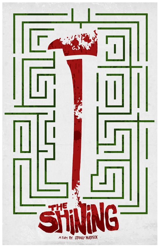
The Shining

I found this one by way of the Minimalist Movie Posters blog (which actually led me to the artist's Tumblr page, where I saw the rest of his Kubrick work) and found myself quite liking it. Is it weird that something can make you think of Christmas (the green and the red), while also conjuring images of blood, murder and insanity? The type and color Adam used for The Shining title is pitch perfect, and the dark red on lighter red color scheme really conveys the chaos and menace that this movie exudes. Unfortunately, this poster is not currently available for purchase (the next two are though), but I'm sure we'll be seeing this in his Etsy store at some point in the near future.
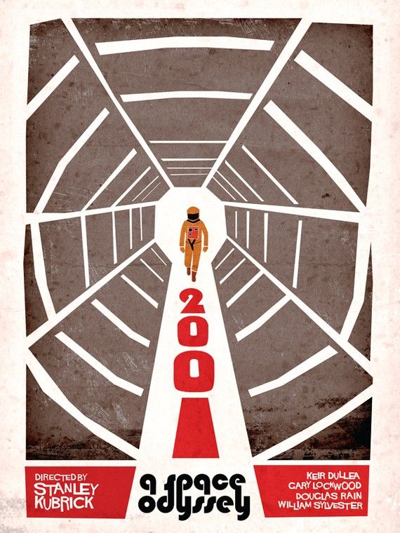
2001: A Space Odyssey

Here's a retro take on Kubrick's science fiction spectacle 2001: A Space Odyssey. Maida's 2001 poster has a very cool 60's look, similar to the now very recognizable Saul Bass aesthetic. He totally nailed the astronaut and the antiseptic paranoia that HAL 9000 and the vacuous void of space create. Unlike the previously mentioned Shining poster, Adam Maida's 2001 poster can be purchased and only costs $25 through his Etsy store. The poster measures 18" x 24" and appears to be an open edition. And on a completely separate note, the 2001 Blu-ray is one of the most beautiful transfers I've ever seen - it looks like it could have been filmed yesterday.

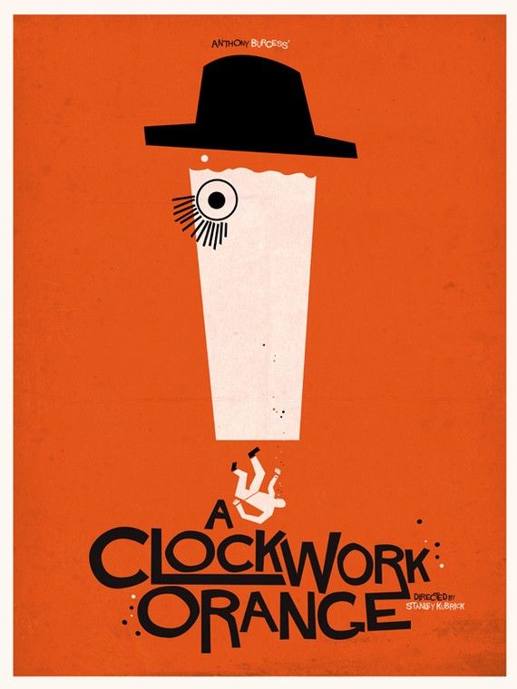
A Clockwork Orange

This is my second favorite Kubrick film after Dr. Strangelove. A Clockwork Orange somehow still manages to shock me every time and watching a hungry, intense Malcom McDowell is always a treat. Here Adam has taken advantage of, and reinterpreted, the iconic shot of the young, criminally reprehensible Alex, fake lashes and all. This poster isn't bursting with detail or brimming with double-meanings, but it's a very fitting representation of Kubrick's sometimes disturbing, always darkly comedic vision. This poster is also available as an 18" x 24" print for $25 through Adam's Etsy store. Be sure to visit his blog to see even more of his stylish artwork and if you're a fan of The Royal Tenenbaums, Adam has a created some really great movie posters in honor of one of my favorite dysfunctional families.

Monday, February 28, 2011

Livia Lucie's "Full Metal Jacket" Movie Poster

I'd been meaning to write about this print for a while now, but kept forgetting until today. I guess there's just too many amazing posters out there (this is a good thing). The films of Stanley Kubrick are pretty mindblowing and I'm not sure I could ever be friends with someone who doesn't love at least a fraction of his filmography. One of my favorites is Full Metal Jacket (although my number one Kubrick film will forever be Dr. Strangelove). I really loved his take on the Vietnam war, and although I think the whole movie is a masterpiece, it's the first half, the part that takes place on Parris Island during recruit training, that truly blows me away (no pun intended).
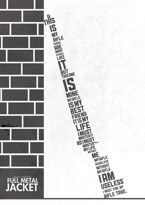

Full Metal Jacket

Artist Livia Lucie created this mind boggling typographic masterpiece in honor of one of the greatest war / anti-war films ever made. For anyone who's seen Full Metal Jacket, or served as a Marine for that matter, you'll immediately recognize the Rifleman's Creed that has been shaped to create the body of said rifle; it's inventive, creepy and beautiful all at the same time. I'd love to see an entire series from Livia dedicated to the films of Kubrick, each with its own clever composition. Over the span of my obsession with poster art I've seen some great type-centric posters, especially as minimalist posters have really started picking up steam over the last year, but I have to say, this may be one of my favorites (definitely top three).

The A3-sized (equivalent to 11.69" X 16.54") Full Metal Jacket print is available right now through the Picmix Store for £12 (or around $19). The storefront says it's a limited edition print, but I'm not seeing the edition size anywhere. If you're having any hesitation about picking one of these up, put it away, because not only will you be buying an awesome poster, 10% of all sales will go toward Wateraid, an organization attempting to improve access to safe water, hygiene and sanitation in the world's poorest communities. It's a win-win. To learn more about Livia Lucie head over to her website and check out her blog. If you've got some extra money lying around, would you mind commissioning her to do another Kubrick-inspired print? I'd really appreciate that. Thanks!

Friday, February 25, 2011

Dan Sherratt's "Donnie Darko" Movie Poster

Dan Sherratt is a UK-based artist I stumbled onto recently, originally through his Shop Reworking Titles blog, but more recently through the website Eat Sleep Live Film, where he contributes a feature called, you guessed it, "Reworking Titles." I decided I'd highlight one of my favorite posters from his blog and I'm sure as time goes on I'll continue to write about the amazing work Dan seems to be consistently cranking out.

Donnie Darko was a film I really identified with when I first saw it in high school. It wasn't necessarily that I saw myself as a loner or anything like that, but rather, Darko was a film that spoke to all of the things I loved about cinema at the time. It was confusing, inexplicable and unbelievable all wrapped up in a vague science fiction / horror shell - I thought it was cool.
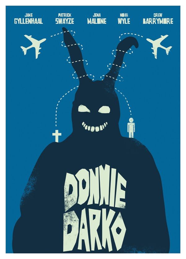
Donnie Darko
I remember showing the DVD to everyone I knew while attempting to describe how indescribably deep and awesome it was. I've rewatched the film several times since (go with the theatrical cut, not the overly indulgent director's cut), and I still love it. Sure, a little bit of the luster has warn off, and I wouldn't put it anywhere near my top ten films of all time list, but it's still a damn fun movie to take in and explore. Dan's Donnie Darko poster has that increasingly popular Saul Bass (everything IS cyclical I guess) feel to it and it works in just about every way. The poster's design is concise, without being too simplistic, and quickly conveys a fairly convoluted plot. You've got Frank, the prophetic rabbit, proclaiming the end of the world, or at least Donnie's world, with two possible realities existing to the right and the left of one of cinema's most memorable bunnies (next to Harvey that is). This is a great poster and an excellent example of design done right.

The Donnie Darko movie poster by Dan Sherratt is available through the Shop Reworking Titles blog for £20 (roughly $32). The poster measure 594 mm x 420 mm (or 23.4" x 16.5" for US readers), and from what I can tell appears to be an open edition, but I'm not certain of that. I also don't think this is a screenprint, but again, the site doesn't feature a ton of information. I would have loved to see some process shots or find out more about his approach to the poster, but no such luck. Be sure to check out the Shop Reworking Titles blog for more prints and his Eat Sleep Live Film feature, where he talks about a few of his designs. It looks like he also hosts a portfolio of his work at heartstrand.co.uk.