The "Criterion Connection" is my little corner of the world where I can obtusely and clumsily wax on about my commitment to Criterion's commitment to important classic and contemporary films.
This month's
Criterion announcement brought us some very welcome info about their release plans for June, which include Louise Malle's
Black Moon
and
Zazie dans le métro
, Nicolas Roeg's
Insignificance
, Robert Aldrich's
Kiss Me Deadly
, Kon Ichikawa's
The Makioka Sisters
, Robert Siodmak and Edgar G. Ulmer's
People on Sunday
, and Raffaelo Matarazzo's
Runaway Melodramas Eclipse Series
. I don't know too much about the majority of these films (one of the many reasons why I love Criterion), but I'm most excited for
Kiss Me Deadly,
Black Moon,
Zazie dans le métro and
Insignificance. I think this may be the first time in a long while where every announced title is completely new to the collection - well done Criterion. Enough about that though, let's get to the focus of this month's "Connection."
I thought I'd use this entry to highlight my favorite works of art available through the official
Criterion Collection store. I think you'll find that the work is top notch and you may even recognize a name or two from Criterion's very impressive stable of artists. I'd go as far as to say, that even if you're not a fan of the Criterion Collection or art house films in general, you'll still come to appreciate the incredible artistry on hand. Without further ado, I give you the must-have artwork from
Criterion's vault.
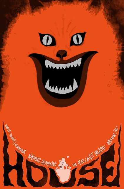 |
| House - Sam Smith |
Sam Smith's
House movie poster is insane in all the right ways. Recognize the artist's name? That's right, Sam Smith, the man who not only created the super classy
Black Swan screen print not too long ago (read my
post about it), but was also part of last month's "
Criterion Connection," appears to be a favorite throughout the hallowed halls of Criterion. If you haven't seen Nobuhiko Ôbayashi's bat-shit crazy fever dream known as
House ,
, you're really missing out. I mean how often do you get to see a carnivorous piano feasting on human flesh, a man turn into a pile of bananas, or a demonic cat winking menacingly? Sam Smith has captured all of that hallucinatory splendor with this intense poster that manages to make you laugh while your skin crawls. Sam Smith's
House one-sheet is available from the
Criterion Collection website for $25 and measures "27 x 39". This is a limited edition glossy finish
poster, although Criterion doesn't explicitly say what the edition size is, and is the perfect
gift for the man or woman in your life that loves strange cinema of the fiendish feline variety. I also highly recommend checking out Sam's blog,
Sam's Myth, where you can find a great
post detailing the
House poster process and how he originally got connected with Criterion. It's fascinating stuff. Still not sure you should invest time in a film like
House? Then I highly recommend checking out the
trailer at
criterion.com to seal the deal and get a feeling for just how bonkers the film is. The film is also available for streaming through
Hulu Plus, but I'd recommend a blind
Blu-ray or
DVD
purchase if you've got some spare change.
 |
| Corridors of Blood |
|
 |
| First Man into Space |
|
 |
| The Haunted Strangler |
|
 |
| The Atomic Submarine |
|
If you're a fan of comics you may recognize the above four prints as a product of the insanely talented Darwyn Cooke. Apart from being an Eisner Award-winning comic book renaissance man (he writes, draws and animates), Darwyn Cooke also created an amazing set of prints for Criterion's release of their
Monsters and Madmen boxset. The set contains four films (some horror, some sci-fi) from producers Richard and Alex Gordon that occasionally feature a rather sinister Boris Karloff (is there any other kind of Boris Karloff?). I haven't seen any of these films yet, but I just had to include Cooke's amazing artwork in this entry. Darwyn's nostalgic style fits so perfectly with these four films from 1958 & 1959, that it's a wonder he hasn't done more movie cover art. Seriously Criterion, get this guy back on your payroll! I think my favorite of the set would have to be his "
First Man into Space" print, but they're all seriously amazing and make me want to seek out these movies. I really like how Cooke was able to use a different color palette for each print, allowing them to thrive separately, and as a collection. The
"Monsters and Madmen" giclée set can be purchased from
Criterion for $125, with each
print measuring 8" x 10". The
product page states that the first edition consists of 100 sets, so I'm not entirely sure if they plan to make a second edition, but it sounds like a possibility. If you're interested in checking out the films,
Corridors of Blood and
First Man into Space are currently streaming through Hulu Plus, should you want to avoid the somewhat steep cost of the
DVDs
. And for those of you interested in learning more about Darwyn Cooke, I recommend picking up his
DC: The New Frontier
,
The Spirit
and
Richard Stark's Parker: The Hunter
comic books. They're all great reads!
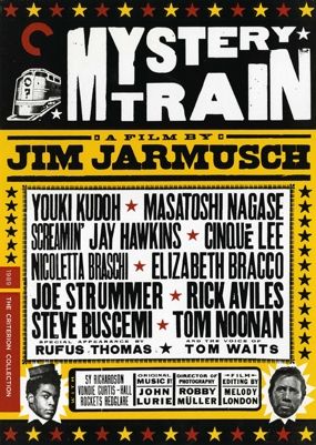 |
| Mystery Train - Yee-Haw Industries |
I absolutely adore this film! So it should come as no surprise that Jim Jarmusch's
Mystery Train
is my favorite movie in the white-haired auteur's filmography. The compositions and color in this film are just jaw dropping. It's amazing to think that prior to
Mystery Train, Jarmusch had only made black and white films (beautiful black and white films, but you know what I'm saying). The
Mystery Train movie poster by Yee-Haw Industries is the same artwork used for the DVD / Blu-ray cover (similar to Sam Smith's
House poster), but still makes quite a fetching poster. I can't quite explain it, but the color and design somehow just seem so fitting for the film's southwestern environs. Maybe that's because Yee-Haw Industries is located in Knoxville, Tennessee, a mere 400 miles from the film's Memphis setting. Alright, so maybe 400 miles isn't a walk in the park, but at least it's in the same state. Another cool thing about this poster is that it was created with a letterpress (
picture), which based on the artist's description of the process, sounds like a pretty interesting process (taken from the
Mystery Train product page):
"Our process is pretty true to how they would have actually done it seventy to one hundred years ago. We use Vandercook proofing presses, mainly from the thirties and forties. When we initially proofed the headline type, it was all laid out using ascending sizes of wood type. The credits were all typeset using antique wood and lead type.
Everything in letterpress is set in reverse. So we have fonts of individual letters that are all reversed, and when the paper offsets onto the type it becomes right-reading. Producing a run of posters is a rather slow process. All the prints are hand-printed, one color at a time (Mystery Train is three colors on whiteboard), allowing for time to dry in between. Most of the wood type we use is probably eighty to one hundred years old—strong stuff!”
The limited edition
Mystery Train letterpress is available through
Criterion for $30 and measures 16.4" x 23.1". Unfortunately, I couldn't find this streaming anywhere, but this is one that's definitely worth owning on Blu-ray - the picture quality and rocking soundtrack are superb! If you've got some free time I also recommend checking out the
Yee-Haw Industries website,
blog and
Flickr account.
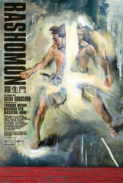 |
| Rashomon - Kent Williams |
In full disclosure, my
Rashomon
poster review was taken from a post I wrote for another blog. For those who haven’t seen the film, here’s the gist of it (taken from the
Rashomon product page):
Through an ingenious use of camera and flashbacks, Kurosawa reveals the complexities of human nature as four people recount different versions of the story of a man’s murder and the rape of his wife.
Sounds kind of nuts, right? This was the film that changed the role of the narrator in cinema, evidently they can’t always be trusted. This poster perfectly reflects the differing views of a single moment. I love Kent's style. His artwork seems completely chaotic and yet totally controlled. This was the poster that Criterion / Janus used when re-releasing the film in theaters in 2009. Thankfully for you and I, Criterion decided to sell it as a
limited edition one-sheet through their website. Have I mentioned how perfect this design is? Toshiro Mifune is looking particularly badass as he’s being torn apart in four different directions. Ouch and symbolic. The Kent Williams's
Rashomon movie poster measures 27" x 40" and is currently
available at the
Criterion store. If you love classic movies, nay, iconic movies that forever changed the landscape of cinema (dramatic I know) then you’ll love this poster. Also be sure to visit Kent Williams’s
site. For those who haven't seen the film, and aren't ready to pull the trigger on the DVD,
Rashomon is currently streaming through
Hulu Plus.
 |
| Robinson Crusoe on Mars - Bill Sienkiewicz |
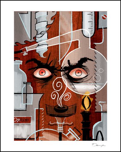
Bill Sienkiewicz’s
“Robinson Crusoe on Mars” print deserves to be hung in a gallery – this thing is insanely beautiful. One of the things I’ve really come to appreciate about Criterion, and that is on full display with this print, is how they can take a film that may be exploitive or may not be considered a masterpiece by any film scholar and somehow create something that transcends its humble beginnings and lovingly places it in the context of film history. I’m sure I sound like a broken record at this point, but wow, Bill has really created something that completely transports me to another world (Mars to be specific) with his beautiful broad strokes that make up the mountainous landscape of the red planet, to his precision point depictions of the stars in the sky above. You might begin noticing that Criterion likes to use comic book artists (Darwyn Cooke, Kent Williams and Bill Sienkiewicz) who are more than capable of conveying a film’s plot, feeling, and character using only a static canvas. Bill’s limited edition
“Robinson Crusoe on Mars” giclée is available through
Criterion for $125 and measures 22” x 16”. The
Robinson Crusoe on Mars
was recently re-released on DVD and Blu-ray and is certainly worth a rent, if not a blind purchase. To learn more about the art of Mr. Sienkiewicz head over to
billsienkiewiczart.com or pick up his
Stray Toasters
,
Elektra Omnibus
, or
30 Days of Night: Beyond Barrow
comics.
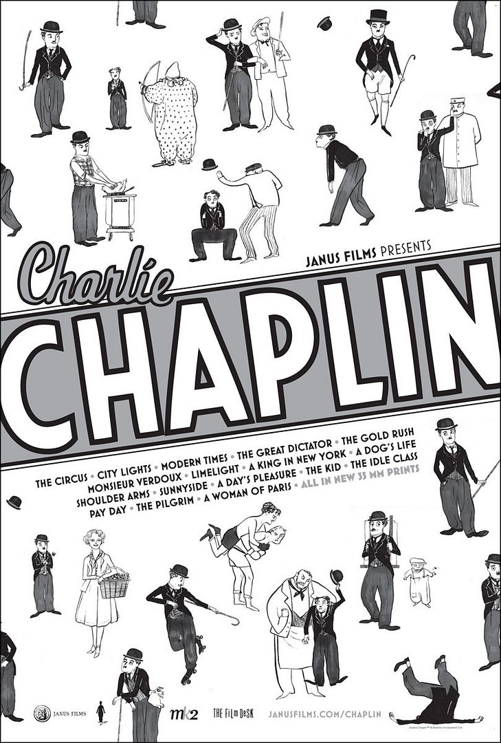 |
| Charlie Chaplin Festival - Kate Beaton |
The Charlie Chaplin Festival poster by Kate Beaton is probably the most playful of the posters I chose to write about in this post (the
House poster is pretty fun too, but that’s a different kind of playful, a creepy / crazy kind of playful), but it also seems to perfectly match the mischievous mood of the troublesome tramp played by the inimitable Charlie Chaplin. Kate (another comic artist!) did exactly what she should have done here - kept it simple, and I can’t thank her enough for that. From the black and white color palette to the straightforward sketches that illustrate all of the tramp’s iconic gags, pratfalls and poses, the Charlie Chaplin Festival poster is the perfect representation of a comedy legend. Kate Beaton’s
Charlie Chaplin Festival one-sheet costs $25, measures 26” x 40” and is available for
purchase through
Criterion’s store. As I mentioned earlier, Kate, like many other artists included here, has worked in comics, but she tends to skew a little more indie with her web comic
Hark! A Vagrant. Check it out, it's very funny!
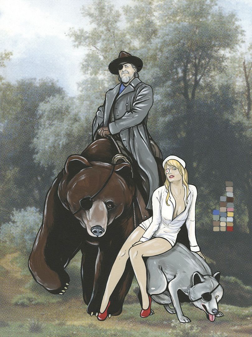
My fingers are officially exhausted from all of the typing, so I think I’ll end it here. For more information on the
Criterion Collection be sure to head to
criterion.com. I’ll leave you with a teaser image from this month’s Criterion newsletter that’s meant to hint at what a future, currently unannounced
Criterion release could be.
Everyone who knows what they’re talking about has already concluded that this a nod to Stanley Kubrick’s
The Killing from 1956, which is one of the few Kubrick films I haven’t seen. Needless to say, I’m very excited. How about you?
As a reminder for those of you that haven't yet entered the Posterocalypse
Fighter giveaway, I'll be giving away
The Fighter movie poster by Adam Hanson and a mystery print on March 31st to one lucky person who leaves a comment with their name and email address (US only) in last Tuesday's blog post (it was titled "
Giveaway - The Fighter by Adam Hanson"). Good luck!