I'd like to introduce a new feature called ARTicles tonight. I'm hoping to do an entry like this maybe once a month where I can highlight interesting articles and blog posts that I've happened upon about, you guessed it, art. They may not all be about cool movie posters, but you can rest assured that the vast majority of this column will be either dedicated to art, film, or film art. Please let me know if you like this feature, and of course, if you know of some great ARTicles (yeah, it's cheesy) feel free to email them to me at
posterocalypse@gmail.com. Enjoy!
"Tons of Hand Painted Movie Posters from Ghana" (Nerdcore)
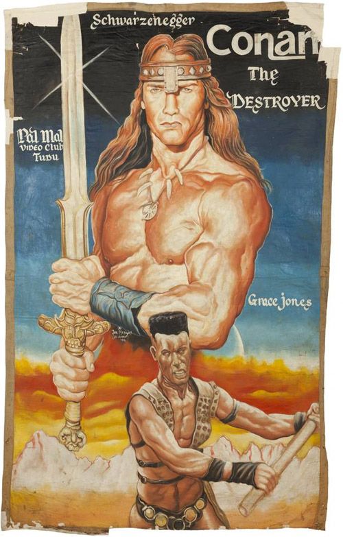 |
| Conan the Destroyer |
I think the best way to prepare yourself for the images you're about to see is to read the summary of what the posters represent (stolen from the
Nerdcore): "During the late 1980s, a cottage industry developed in Ghana, West Africa, called the 'mobile cinema.' It was composed of young entrepreneurs who possessed three pieces of property — a TV, a videocassette recorder (known then as a VCR), and a portable, gas powered generator. Armed with these tools plus desire and ambition, they traveled from village to village showing movies on the VCR and selling tickets to the event...Most cinema operators found the only way to thrive was to increase sales, the only way to increase sales was to advertise, and the only effective way to advertise was to put up posters." What we have here are hand crafted African (Ghana to be exact) movie posters executed with varying levels of success. Any way you look at it, it's a blast to see these one of a kind works of movie art. If you want to check out even more poster goodness head over to
Primative Explorer's African Movie Posters Gallery. Note: Much of Nerdcore is in German, so unless you sprechen die Deutsch you might have some difficulty wandering the site.
"Process: SOLARIS" (Sam's Myth)
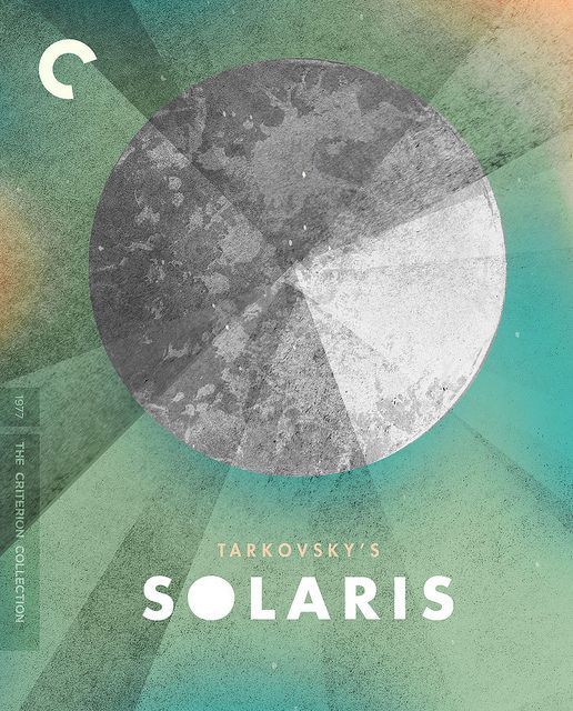 |
| Solaris |
Yeah, I go a little nuts over the Criterion stuff (I know, I know), but I'm always excited to read (and then immediately talk about) a Sam Smith process post. It's amazing how thorough he is in discussing and illustrating the creative process. There are some artists who are fantastic at putting together a process post (Kevin Tong's
process videos immediately come to mind), but I think Sam may have the most impressively in-depth and analytical write ups on the web. In this post, Sam walks us through the creation of his
Solaris
Criterion cover artwork. I haven't seen the film yet, but reading through his creative journey while making the cover has definitely piqued my interest. Be sure to check out Sam's blog,
Sam's Myth, for additional required reading. And if you're at all interested in
Solaris after reading his post, you can pick it up for a pretty decent price on
Amazon.
"Movie Poster of the Week: Rainer Werner Fassbinder's World on a Wire" (MUBI)
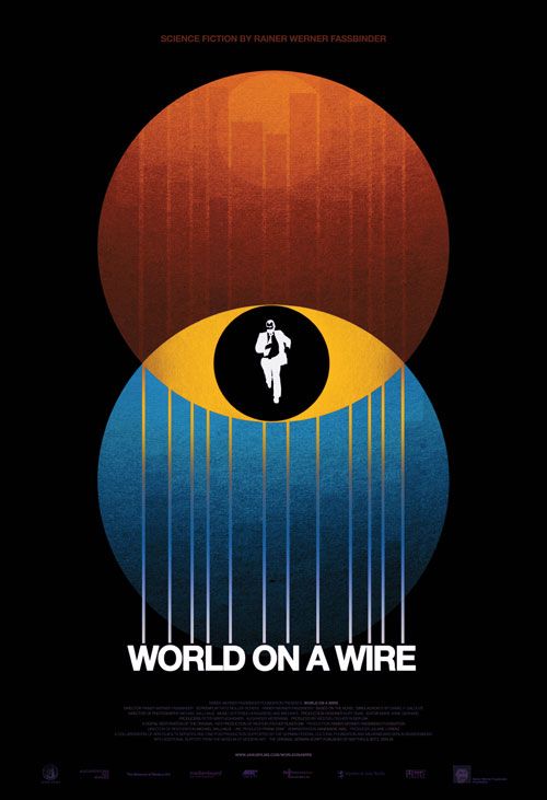 |
| World on a Wire |
This is another Sam Smith-related link, but I think anyone who's a fan of good design will appreciate what he's done here.
MUBI, an online community for fans of moving pictures, has a weekly feature called "
Movie Poster of the Week." Unsurprisingly, the feature is meant to highlight some of the cool film artwork that has recently been released or announced. It turns out that Sam Smith just so happened to create a very slick poster for a re-release of the 70s German sci-fi masterpiece from R.W. Fassbinder,
World on a Wire. I'll let you click the
link if you're interested in more information, but that's not going to stop me from teasing the film with a quick synopsis: "Made in 1973 for German television and rarely seen until it resurfaced at MoMA last year,
World on a Wire is a three-and-a-half-hour, two-part, sci-fi head-trip of a movie about government conspiracies and parallel realities set in a world of gleaming ’70s corporate minimalism." Interested? I thought so. And as of yesterday,
World on a Wire is now available for viewing on
Hulu Plus through their deal with Criterion and Janus.
"64 Years of Cannes Film Festival Posters" (L'Express)
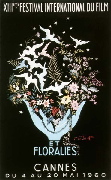 |
| Cannes 1960 |
I found this link by way of
Sound on Sight's wonderful "
The Art of the Cannes Poster" article and was entranced by the range of artistic styles on display. This collection of Cannes posters goes from 1946 to 2011 and fluctuates from bleak minimalism to indulgent absurdity to just plain weird. I think my favorite may be the 1960 poster (pictured to the left). Yeah, it's kind of busy, but I love the silhouettes against the black background. I can't help but think that by peeking at these posters I'm seeing a snapshot of what
cool looked like in years past. For those of us who will probably never make it to the Cannes Film Festival this is as close as we'll get to experiencing the chic avant-garde nonchalance that I imagine everyone walks around with. What's your favorite poster? Note: This website is in French, although you shouldn't have any trouble navigating it.
"Critique Commentary: Rick Poynor Selects DVD Covers from the Criterion Collection’s Film List" (Eye Magazine Blog)
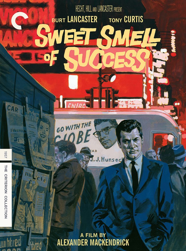 |
| Sweet Smell of Success |
I promise this is my last Criterion related link (at least for today). The
Eye Magazine blog wrote up a great post about some of their favorite Criterion covers. The post is especially fun to read, because not only do you get to find out who the art directors and designers were, but in some cases a little bit about the inspiration for each design. My favorite cover is probably Sean Phillips and Eric Skillman's
Sweet Smell of Success
cover (pictured to the left), but I also love Skillman's
Blow Out
and Kellerhouse's
Gomorrah
covers. And as an FYI to everyone who was wowed by the
Sweet Smell of Success cover, I highly suggest you immediately pick up all of Sean Phillips' and Ed Brubaker's amazing
Criminal
comic book series. I know I mentioned Sam Smith's blog earlier in this entry of ARTicles, but if you're in the mood for some more amazing process posts from another artist I'd recommend visiting
Cozy Lummox, the digital home of artist Eric Skillman.
"Mind Blowing Examples of Experimental Typography" (Webdesigner Depot)
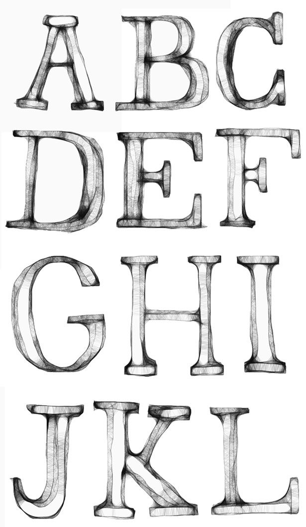 |
| Typographic Example |
This post really has nothing to do with film, I just thought this was a great collection of typographic experiments. Looking at something like this just makes you want to create, or at least, makes me want to create. I wish these were all available as fonts that I could freely and indiscriminately abuse. It's fascinating when a letter in the alphabet goes from being a small, but important, piece of something larger to a beautiful work of art all on its own. As my own typographic experiment, I googled "typographic experiment" and it turns out there's a book titled
Typographic Experiment
- that is all. Note: Give yourself about thirty minutes to go through all of these abecedarian masterpieces. I studied three or four of the images for at least a good five minutes, completely lost in the detail, until I realized the faucet had been running for the better part of ten minutes with nary a dish, pot or utensil cleaned.
"Saul Bass' Movie Posters: Then and Now" (Christian Annyas)
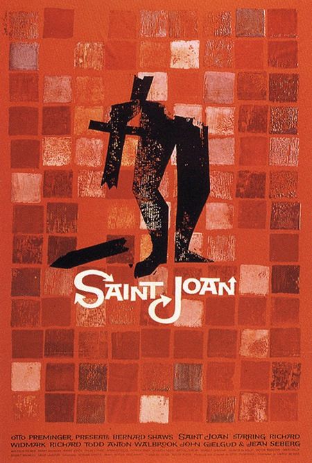 |
| Saint Joan |
This post from
Christian Annyas' blog was at once incredibly interesting and also kind of sad. In it Christian compared many films' original Saul Bass posters against the films' more recent (and by "more recent" I mean in the last ten years) DVD covers. To be fair, a few of the DVD covers aren't necessarily bad, not at all, but when you've already got such great artwork waiting in the wing, why oh why, would they opt for the floating disembodied head? One of the things I found most interesting when reading Annyas' post, was that whenever Saul Bass worked on a film "he created a complete and consistent identity for films (main and credit titles, a symbol or trademark, trailers, posters, ads, album cover)." That cohesiveness is sorely lacking in today's films. In fact, the only filmmaker that immediately comes to mind that still seems to exercise that level of control over the entire package (the film and the marketing) is David Fincher. Tangent aside, be sure to check out this
post.
Well I guess that's it. Hope you enjoyed everything and again, please send me an
email if you've got an ARTicle that you'd like to see here, or if you find a dead link.