Sunday, February 26, 2012

Jay Shaw's "Bullhead" Movie Poster

When I think back to 2010, the emergence of artist Olly Moss comes to mind. His ability to make a clever minimalist design out of pretty much anything was, and still is, incredibly impressive and stood in stark contrast to the bursting-with-detail artwork of Tyler Stout and Martin Ansin. Well, I may be a bit presumptuous in saying this, but I feel like 2012 will definitely be the year that Jay Shaw (AKA Iron Jaiden) hits in a big, big way. Don't believe me? Take a look at his amazing poster for Drafthouse Films' Bullhead below.

Bullhead Movie Poster
Jay Shaw (AKA Iron Jaiden)
18" x 24" - Numbered
$30 - Limited to 80

Not only is Jay a clearly talented artist, his work thus far has shown a remarkably deep knowledge of art and film history. He created a loving tribute to the Blaxploitation gem The Spook Who Sat by the Door for Cinema Overdrive. He crafted a retro and surreal print for Drafthouse Films' Comin' At Ya! 3D and now he's channeled the strange and dreamlike style that has long been the trademark of Polish poster art for the film Bullhead. There's already been a great article written on this print at HitFix, but I did want to briefly talk about my take on Shaw's work and the movie itself. I remember seeing Bullhead at last year's Fantastic Fest and being completely blown away. Bullhead isn't a thrill-a-minute action film, it's a thoroughly contemplative story about Matthias Schoenaerts' hormone-injecting (in more ways than one) Jacky Vanmarsenille and his attempt to negotiate his personal and professional demons. He's a flawed-man who's had to deal with some very intense and personal traumas of both the physical and psychological variety. I probably couldn't be any vaguer, could I? Due to these issues, there are many scenes where he's on the precipice of full-on rage, much like a bull ready to gore its agitator. See where I'm going with this? Jay has captured the animalistic nature of both the man and his chosen line of work with pitch-perfect execution. The desolate background behind the hoofed man, whose body has been partially transformed into that of a beast, only further echoes the harsh world Jacky, the film's lead, tries to survive in. My final take: great poster, killer typography, and a beautiful fusion of new and old.

Jay's Bullhead movie poster will be available through Mondo at a random time during today's Oscar broadcast. The poster measures 18" x 24", is limited to an edition 80, and will only cost $30. To receive up-to-the-second notifications on the print's drop, be sure to follow @MondoNews on Twitter. You can also follow the artist Jay Shaw (AKA Iron Jaiden) on Twitter @tweetofnonsense. And if you're interested in seeing more of Mr. Shaw's artwork, be sure visit to visit his Kingdom of Nonsense website. Oh yeah, and the following four prints will ALSO be released during today's Oscar broadcast through Mondo!

Hugo Movie Poster (Regular)
Kevin Tong
24" x 36" - Numbered
$45 - Limited to 295
Hugo Movie Poster (Variant)
Kevin Tong
24" x 36" - Numbered
$65 - Limited to 100

Rango Movie Poster
Tom Whalen
18" x 24" - Numbered
$40 - Limited to 270
Bridesmaids Movie Poster
Dave Perillo
18" x 24" - Numbered
$40 - Limited to 220

It's going to be quite an evening! Good luck with the poster drops everyone!

Thursday, February 23, 2012

Cult Cinema Sunday's "Clerks" and "Blade Runner" Movie Posters

Sheesh! It's been a while, hasn't it? I meant to write about these prints more than a week ago, but life (read: work) has a funny way of forcing you to reprioritize. On the plus side, I do really enjoy getting paid every two weeks and immediately spending that money on more posters. So, there's that. Now, where was I? Oh yeah, so Cult Cinema Sunday is a monthly film night in Hull (as in Kingston upon Hull) that recently started a poster project with some local artists and designers. Noinch, noinch.

Clerks Movie Posters
Snapper 52
16.5" x 11.7" - Signed and Numbered
£6 - Limited to 100


Clerks Movie Poster
Domanic Li
16.5" x 11.7" - Signed and Numbered
£6 - Limited to 100

Clerks Movie Poster
Coren Macniven
16.5" x 11.7" - Signed and Numbered
£6 - Limited to 100

I have a love / hate relationship with Kevin Smith. I think he's a really fascinating guy to listen to, but the majority of his films don't work for me. Thankfully, Clerks does. All of the artists here have captured a piece of what makes the movie such a success - Snapper 52's design reminds me of Smith's humble beginnings with its DIY aesthetic, while Coren and Domanic's prints commemorate the Jersey locale that became so iconic. And I found it interesting how all the prints touched on the film's black and white photography. Everything mentioned in this post is currently available through the Cult Cinema Sunday storefront for £6 each. The posters are signed and numbered, limited to an edition of 100, and measures 16.5" x 11.7".

Blade Runner Movie Poster
James Fenwick
16.5" x 11.7" - Signed and Numbered
£6 - Limited to 50

Blade Runner Movie Poster
Domanic Li
16.5" x 11.7" - Signed and Numbered
£6 - Limited to 50

Blade Runner is one of my all-time favorite movies. I'm guessing it's also one of yours. It's just really, really, really good. When I first watched Ridley Scott's science fiction neo-noir masterpiece, I wanted to explore that world so badly. It's probably a good thing I couldn't, because something tells me a ten year old without any sort of guardian or parent around would not fare well in its suffocatingly smokey neon streets, but I was totally entranced by what Ridley had created. Out of the two prints, James Fenwick's has got to be my favorite - I just love the poster's otherworldly palette and James' mix of detailed line work and purposefully turbid shading. Bottom line: both of these designs are fitting tributes to easily the coolest film of the 1980s (there, I said it). Domanic Li and James Fenwick's Blade Runner prints are currently available through Cult Cinema Sunday. Both posters measure 16.5" x 11.7", are limited to an edition of 50, and cost £6.

Friday, February 17, 2012

Tim Doyle's "Blade Runner" Art Prints

It's hard to say 'no' to free stuff, isn' it? Especially when said free stuff is inspired by the science fiction masterpiece Blade Runner and drawn by Tim Doyle. Tim, who had previously created two prints depicting the replicants Leon Kowalski and Pris as part of his last Nakatomi Mystery Tube sale is at it again, this time with perhaps the coolest and most emotionally tortured character from the Ridley Scott classic. No, not the replicant owl! Don't be ridiculous. I meant Roy Batty!

"Batty" Art Print
Tim Doyle
9" x 24" - Signed and Numbered
Free with Order - Limited to 200
Inspired By: Blade Runner
"Rachel" Art Print
Tim Doyle
9" x 24" - Signed and Numbered
Free with Order - Limited to 200
Inspired By: Blade Runner

I really enjoyed Tim's last batch of Blade Runner prints, but I much prefer these. My preference doesn't have anything to do with the previous posters' execution, they are, after all, done in a very similar style. No, my adoration comes from a place of love for the Roy Batty character. I don't know about you, but when I think about Rutger Hauer, Blade Runner is the film that immediately comes to mind. Rutger's performance was brilliant and he completely owned the complexity that made Roy such a memorable villain (and hero). Likewise, Tim has captured and owned, artistically speaking, that iconic moment where a dove-clutching Batty is pondering his mortality and humanity. It's a really touching scene and clearly makes for a wonderful poster. Also, I've got to point out the impressively restrained detail in Roy's face and Mr. Doyle's use of color (or rather, lack of color) to represent his practically fluorescent platinum-blond hair.

And let's not forget about Rachel, Deckard's main squeeze. Similar to his "Batty" print, Tim's "Rachel" artwork uses a prop of sorts to tell us more about the character. For Roy it was the dove, for Rachel it's the hazy cloud of smoke that she's practically wearing like a shirt and her lit cigarette. It's a nice stylistic touch and will surely be impressive to see in person. Ultimately, if Doyle's posters are offering us yet another chance to enjoy and celebrate the characters we grew to love and / or hate from one of the most important science fiction films ever made, which I think they are, I'll take it. With that said, I've got my fingers crossed for a "Batty" print.

Here's the really cool part: Tim Doyle's "Batty" and "Rachel" prints are both completely FREE and will come with any poster orders placed through the Nakatomi storefront until they run out (one print per order). So, if you've been eyeing that new The Massive print by Kristian Donaldson, or haven't been able to get Tim's adorable "Vietnam on Wheels-2" poster out of your mind, then now is the perfect time to pull that metaphorical trigger attached to your wallet. Both Blade Runner inspired prints measure 9" x 24", are signed and numbered, and are limited to an edition of 200. If you'd like to learn more about the talented fellow behind the artwork above be sure to visit mrdoyle.com, nakatomiinc.com and follow him on Twitter @NakatomiTim.

Wednesday, February 15, 2012

Malleus' "Profondo Rosso" Movie Posters

Deep Red is one of my favorite Argento films, not my all-time favorite mind you, but definitely in the top three. Not only does it feature one of the coolest, albeit short, intros ever put to celluloid (I love the theater with its massive red curtains and the smooth tracking footage escorting us through its hallways), the film also boasts one hell of a freaky children's song (I picture a choir exclusively populated by the kids from Village of the Damned). There's a lot to like about Deep Red or as it's known in its native land, Profondo Rosso, and thankfully Malleus Rock Art Lab has again joined Dark City Gallery to continue their excellent Argento poster series, crafting an exquisitely grotesque print in celebration of Dario's fifth film.

Profondo Rosso Movie Poster (Regular)
Malleus
19.5" x 27.5" - Signed & Numbered
£40 - Limited to 145

I'm going to start this review by mentioning the first thing that entered my mind when I saw these prints: is that a freaking eyeball?! Yes, extreme close-ups of eyes don't exactly reside in my comfort zone. I think it has something to do with the fact that our eyes are so vulnerable to the elements, both natural (sand) and not so natural (a rusty blade, a screwdriver, probing fingers, sharp needles, dull needles, basically any type of needle), but the skill and style with which Malleus has made the eye and its lashes a framing device is super impressive. More than that though, the eye plays an important part in the movie's plot and is a fitting inclusion in the print's design. It should be noted that Deep Red was a film that featured not only some visually striking kills, but also played around with some rather heady ideas about gender roles and sexuality. For example, Argento specifically uses a close-up of an eye with mascara being applied to possibly suggest the killer may be of the female variety, but wait a minute, throughout the film's running time we meet other characters, not all women, that could also potentially fit this mold. Deep Red is a film that continually asks you rethink your assumptions and this is a poster that ably draws on that ambiguous imagery to do the same.

There's a lot of other great touches too, including the addition of the zipper from the killer's leather gloves, the depiction of Helga's death with the eye's surface acting as her shattered window (complete with broken glass below), and the revoltingly beautiful typography that's sinuously growing from the thinly drawn eyelashes. These are beautiful posters and deserve to be in the home of anyone who appreciates both good design and a genuine giallo masterpiece.

Profondo Rosso Movie Poster (Variant)
Malleus
19.5" x 27.5" - Signed & Numbered
£60 - Limited to 95

Both the regular and variant versions of Malleus' Profondo Rosso (AKA Deep Red) movie posters are currently available through Dark City Gallery's online storefront. The regular print costs £40 (around $63) and is limited to an edition of 145, while the variant is limited 95 and costs £60 (approximately $94). If you'd like to know more about Dark City Gallery and see what else they have for sale, be sure to visit darkcitygallery.com and follow @darkcitygallery. And to learn about the artist collective known as Malleus Rock Art Lab head over to malleusdelic.com and follow them on Twitter @malleusdelic. And if Blue Underground's impressive Deep Red blu-ray is just a bit too much money for you, the film is currently streaming on Netflix! Go watch it! After you buy a poster, that is.

Sunday, February 12, 2012

Danny Miller's "Zombie of The Walking Dead" Print Sets

I was one of the many who first discovered The Walking Dead when it only came in the form of ink on paper. Like many of my fellow comic nerds, I loved The Walking Dead because there wasn't really any black and white storytelling, everything was told in shades of grey; it felt organic and real (or as real as a story about a zombie apocalypse can feel, that is). Once the story made the transition to television, the first thing that struck me (and many others like me) was just how impressive the oozing, putrid, stumbling zombies looked in 1080p. They were both gross and beautiful in a way that any horror aficionado can appreciate. And much of that can be attributed to the work of Greg Nicotero and his KNB EFX Group. For those unfamiliar with the man, Greg has worked on films like Evil Dead 2, Misery, Army of Darkness, Pulp Fiction, Wes Craven's New Nightmare, In the Mouth of Madness, Mulholland Dr. and many, many, many more. Long story short, Greg reached out to artist Danny Miller and had him create some prints in honor of the many wonderful undead featured in The Walking Dead television series.

"The Zombies of The Walking Dead" Print Set (Regular)
Danny Miller
Zombies from Left to Right: Well Walker / RV Walker / Bearded Walker
Set Contains 3 Prints (14" x 30") - Signed and Numbered
$40 Each or $110 Per Set - Limited to 400

"The Zombies of The Walking Dead" Print Set (Variant)
Danny Miller
Zombies from Left to Right: Well Walker / RV Walker / Bearded Walker
Set Contains 3 Prints (14" x 30") - Signed and Numbered
$70 Each or $190 Per Set - Limited to 75

Just by looking at the images above you can tell that Danny was the perfect guy for this job. His ability to recreate the fully realized and absolutely terrifying visages of dilapidated flesh is, well, terrifying. But I think the highest compliment that can be paid to artwork like this, besides saying it's wonderfully executed, which it is, is to mention how much my skin is crawling. And yes, these prints make my skin crawl, especially the bloated husk of a zombie on the left (yum). Out of the two sets, I appreciate the regular version a bit more, due to it being more colorful, but I'm guessing the variant is going to be a stunning metallic silver, so it's bound to look pretty sharp in person. I know there are already a ton of Night of the Living Dead and Dawn of the Dead prints and posters floating around on the Internet, but I'm thinking it's completely okay for Miller to work on whatever zombie-related franchise he wants to try his hand at based on his Walking Dead work, don't you think?

Photo of "Zombies of The Walking Dead" Print

Greg Nicotero (KNB EFX Group) with his BFF Signing Posters

Danny Miller's "The Zombies of The Walking Dead" prints will be available through the Twenty Eyes Collective store later today at 10:30 PM EST (7:30 PM PST). The regular set consists of three zombie prints, is limited to a run of 400, and can be purchased for $40 per print or $110 for the whole set. The variant set, also made up of three separate prints, is limited to an edition of 75 and can be purchased for $70 per print or $190 for the entire set. One of the coolest things about these sets is that they're signed by both the artist, Danny Miller, AND special effects makeup man Greg Nicotero. In other words: this is pretty much a must-have for any fans of horror from the 80s, 90s, or today. To learn more about artist Danny Miller, be sure to visit his website and the newly founded Twenty Eyes Collective page. And to learn more about the work of Greg Nicotero, check out KNB EFX's site.

Friday, February 10, 2012

Dan Sherratt's "Drive" Art Print

While Drive may not have received a lot of Oscar love, the film has clearly made an impact on us poster geeks the world over. There's not one, not two, not three, but more like 40 or 50 amazing Drive prints available online, and I'm more than happy to write about all of them, but there are a select few that really impress. Case in point: Dan Sherratt's excellent Drive inspired art print.

"Drive" Art Print
Dan Sherratt
12" x 24" - Signed and Numbered
£25 (approximately $40) - Limited to 30
Inspired By: Drive

So much has been said about the film (by me and by others), that I don't really feel the need to deliver a lengthy sermon on why this movie rocks so much. It just does. But I'm more than happy to talk about Dan's insanely cool print. To start, I love his restrained use of color, which makes the red pop all the more and beautifully connects the film's intense bursts of violence with the Driver's intimate connection to his car. Gosling, who towers above the supporting cast, looking stoic as ever, is deified by the red halo / sun / giant brake light as the patron saint of driving fast and kicking ass. I also love the little touches, including the "DR1 V3" license plate and the faintly visible skyline silhouette. Ultimately, it's the simplicity of Sherratt's poster that really impresses me and, in many ways, mirrors the psyche of the Driver - it's stripped-down and incredibly focused. Here's what Dan had to say about his print:
"I went with the most iconic thing about the film - Gosling. There can't be many people that don't have a man crush on him after 2011. I saw the process pictures for the official poster and one of the original ideas was a grand theft auto / 1980's style character poster and I thought it looked fantastic. No idea why they didn't go with it in the end but that's what they get paid for. Decided to give it a go myself, really happy with the results."
Yeah...Dan nailed it. I'm definitely one of those guys with a man crush on Gosling after Drive.

"Drive" Art Print Photo

"Drive" Art Print Photo

Dan Sherratt's Drive inspired art print is currently available for £25 through his Drawn Chorus storefront. The poster measures 12" x 24" and is limited to a run of 30. If you have any interest in this print, I'd highly recommend locking it down quickly due to its incredibly limited edition size. To learn more about the very talented Dan Sherratt, be sure to visit his storefront, his website, Tumblr blog and follow him on Twitter @reworkingtitles.

Thursday, February 9, 2012

Giveaway - "12 Angry Men" Movie Poster by Kevin Ang

UPDATE (3/17): Thanks so much for entering everyone, this was one of Posterocalypse's most successful giveaways yet, hopefully the good times will keep rolling! Random.org has picked a winner and it's Mike (lucky contestant number 5)! Congrats Mike! He'll be receiving the 12 Angry Men movie poster later this week. I've got a lot more posters to hand out, so be on the lookout for another giveaway next week. Most importantly, thanks for reading!

It's February already? Well, I guess that means it's time for another contest and this one might be my favorite yet, or at least tied with last month's in terms of awesomeness. You may or may not remember I wrote about the amazing Kingdom of Nonsense curated "The Machines Are Winning: A Tribute to Sidney Lumet" show last September, where I specifically called out some of my favorite pieces. If you happened to read my post, or better yet, purchased some artwork from the show, you probably saw Kevin Ang's gorgeous 12 Angry Men print. Surprise! Mr. Ang's breathtaking work of art will be this month's giveaway. Yes, you read that right. You could own this lovely poster just by leaving a comment. Simple, right? Take a look at the rules and instructions below and good luck!

12 Angry Men Movie Poster
Kevin Ang
18" x 24" - Numbered
Limited to 35

1) 12 Angry Men poster by Kevin Ang

Unfortunately, since I'm the one paying for shipping this contest is only open to readers in the US (sorry everyone else, international shipping can be expensive and complicated). I've decided to change the rules up a bit this time: in order to win you'll need to leave a comment on this post with your email address, your name, and your favorite Sidney Lumet film and on March 17th I'll randomly pick and email the winner to get his or her shipping address. Entries are limited to one person per household.

Tuesday, February 7, 2012

Chris King's "Army of Darkness" Movie Poster

This is the first time I've ever written about artist Chris King, but if his Army of Darkness poster is anything to go off of, the guy's got some talent. I must also sadly admit, this is the first time I've written about Raimi's third film in the Evil Dead trilogy - my second favorite movie in the series! I can't believe it's taken me this long to mention it!

Army of Darkness Movie Poster
Chris King
Multiple Sizes
Multiple Prices - Open Edition

Yes, the print features the undead, a graveyard, Bruce Campbell, and what I believe to be a rather infamous Deadite Captain. And yes, all of these things, in combination or by themselves, make for a wonderfully kickass poster. But it's the style in which King chose to interpret the film which really has me floored. I know Chris used a lot of 80s fantasy / adventure one sheets for inspiration, but when I first saw this poster I was immediately reminded of movies like Gone with the Wind and Casablanca. The prominence of Ash and Sheila in the print's composition, and the largely flesh-colored palette, bring a warmth to the film I don't always associate it with. Ultimately, it's the romanticization of what's widely regarded as a schlocky horror-comedy masterpiece that I find really novel and greatly appreciate.

Reference Stills (taken from wingsart.net)

Concept Draft (taken from wingsart.net)

Here's what Mr. King had to say about the print's creation (taken from wingsart.net):
"...I worked on a new draft taking strong influence from 1980′s fantasy posters from amazing artists such as Drew Struzan and ended up with something that I really liked. My usual process of inking as separate parts was used, but this time I’ve gone for a much more rendered look (mixing inks and pencils which I don’t usually do) as this felt appropriate and something i’ve wanted to try. Tonal values are put down in grayscale first and then worked over in colour (Photoshop) to finish. Hey presto! One Army of Darkness poster and a new self-promotional piece I’m pretty pleased with. Hail to the King baby!"
Chris King's Army of Darkness print is currently available through Society6 and is an open edition. The poster comes in five different sizes, each at a different price point. You can learn more about the artist by visiting wingsart.net or by following him on Twitter @wingsart. And if you'd would like to purchase more of Chris' work, be sure to check out society6.com/wingsart!

Saturday, February 4, 2012

DoomCMYK's "Game Time 3" Art Print

I don't know about you, but I love Adventure Time. There's just something about its self-reflexive absurdity and the clandestine adult themes hiding right under the show's candy (kingdom) surface. I've seen a few of DoomCMYK's Adventure Time inspired prints in the past, but this is the first time I'm (barely) ahead of the curve enough to actually tell my readers about it. Take a look!

"Game Time 3" Art Print (Variant)
DoomCMYK (AKA Robert Mangaoang)
11" x 17" - Signed and Numbered
$19.99 - Limited to 200
Inspired: Adventure Time

This print isn't really doing anything monumental or important, it's not pushing the boundaries of the medium, but damn if doesn't put a huge smile on my face. DoomCMYK's poster captures that carefree and zany (did I really just use the word "zany"?) attitude that Finn and Jake so unashamedly exude, regardless of the insanity they face each and every episode. But beyond the artist's ability to maintain the show's tone, I feel the need to congratulate him for perfectly reproducing the Adventure Time characters while seamlessly combining them with a ton of popular video game franchises. That's not to say there isn't something deliriously entertaining and yet oddly unnerving about seeing Finn tote around a handgun, even if it's in the guise of Solid Snake. I'll be honest, it kind of weirds me out (but in a good way). Bottom line: I've really enjoyed what DoomCMYK has done so far, and am looking forward to many more mathematical Adventure Time inspired artworks from this artist going forward.

DoomCMYK's "Game Time 3" print will be available Sunday (2/5) through his Etsy store at 10 AM EST (7 AM for those of us on the West Coast). The giclée measures 11" x 17", is limited to an edition of 200, and only costs $19.99! To learn more about artist Robert Mangaoang, be sure to visit his website, Tumblr blog, or follow him on Twitter @doomsdaily and @Doom_CMYK. And it probably wouldn't hurt to sign up for his newsletter either. Just sayin'.

Friday, February 3, 2012

Daniel Danger's "The Woman in Black" Movie Poster

I haven't seen The Woman in Black yet, so I can't really comment on the film's quality, but I'll be watching it this weekend. In the meantime, I thought I should still let everyone know about this excellent movie print by Daniel Danger.

The Woman in Black Movie Poster
Daniel Danger
24" x 36" - Signed and Numbered
$60 - Limited to 200

This movie, at least from what I can gather from the trailer, seems like the perfect film for Daniel Danger to immortalize via a limited edition screen print. It features all of the things he loves to draw: dilapidated houses, creepy / overgrown flora, and mysterious figures standing in doorways, windows and possibly even on rooftops. Danger brings his incredibly detailed eye (and hand) in depicting the house (you can practically see every shingle), but also knows when less means more (all of the shadowy silhouettes). In short, this movie works to all of the artist's strengths and the poster is the better for it.

Daniel Danger's The Woman in Black poster will be available today through Danger's Tiny Media Empire store at 2 PM EST (11 AM for us West Coasters). The poster measures 24" x 36", is limited to an edition of 200, and will cost $60. To learn more about Daniel, visit tinymediaempire.com and / or follow him on Twitter @tinymediaempire.

Wednesday, February 1, 2012

Ken Taylor's "Drive" Movie Poster

Within minutes of seeing the Drive print on Entertainment Weekly's site last night, I received the long awaited notification from Amazon that my copy of the Nicolas Winding Refn-directed neo-noir masterpiece was on its way to my front door. I'm sure you'd like me to believe it was all just a coincidence. You'd really like that, wouldn't you? But I know better. Oh yes, I know! I recognize it for the sign that it is: the powers that be want me to rest my F5-pushin' index finger in preparation for tomorrow's Drive release, so that I might claim my own copy of Ken Taylor's awe-inspiring poster. Amen.

Drive Movie Poster
Ken Taylor
24" x 36" - Numbered
$45 - Limited to 445

Ken Taylor is someone I've always appreciated, but it's his recent work (Gremlins, Beneath the Planet of the Apes, and of course Drive) that really has me reappraising his output. He's gone from an artist I'm merely interested in, to an artist I'm quickly becoming obsessed with. The color palette, the composition, the typography - everything screams Drive, but is clearly Taylor-made (not to be confused with the golf club company). The poster totally works for me, but it's one element in particular that immediately caught my attention upon initial exposure: the serpentine roads depicted in the background. I've seen lots of fan-made Drive posters, and some of them are great (case in point: Luis Fernando Cruz's interpretation), but I don't think I've seen any that have so cleverly utilized the convoluted Southern Californian maze of highway roads, which serve as both a fitting symbol for the film's locale and an eye-pleasing artistic choice. It's also very refreshing to see that the now iconic embroidered scorpion is nowhere to be found - while undeniably cool, at this point I've just seen it in too many times. I'm not sure how many prints of this Mondo will actually have in-hand, but there's no denying this poster is going to go quick! Good luck drivers!

Ken Taylor's Drive print will be available tomorrow (2/2) at a random time through Mondo. The poster will cost $45, is limited to an edition of 445, and measures 24" x 36". To learn exactly when the print will drop, be sure to follow Mondo on Twitter @MondoNews. And if you'd like to learn more about artist Ken Taylor (and let's be honest, who wouldn't?), you can visit kentaylor.com.au or google "Ken Taylor," but chances are you'll have better luck with the former. I'll leave you with this little diddy:
There once was a man named Driver,
Whose favorite music came from synthesizers.
He'd cave in your head,
If you messed with his tread.
And that concludes my rhyming Drive primer.
Yep! My love for the film is so great, that I felt the need to write a childish rhyme about the movie. Oh yeah, and if you don't already own Drive, please fix that!

Tuesday, January 31, 2012

Tim Doyle's "Unreal Estate" Art Show (EXCLUSIVE)

UPDATE (2/21): For the next few hours (until midnight tonight PST) the following two Simpsons inspired prints will be available for purchase. They can be purchased separately or together! In fact, you can buy them through the Spoke Art store right now!

"742 Evergreen Terrace" Art Print
16" x 20" - Signed and Numbered
$40 (Separate) / $100 (Matching Set) - Edition Size TBD
Inspired By: The Simpsons

"742 Evergreen Terrace" Art Print (Glow in the Dark Variant)
16" x 20" - Signed and Numbered
$70 (Separate) / $100 (Matching Set) - Edition Size TBD
Inspired By: The Simpsons

UPDATE (1/31): You can find the other exclusives at /Film and Inside the Rock Poster Frame. Check 'em out!

Remember that episode of The Simpsons when Homer became a fully realized computer-generated 3D character? It was part of a their annual "Treehouse of Horror" special, if my memory serves me. Or when the city of South Park was transformed into an anime battleground, complete with throwing stars and brightly colored nunchuks? Or more recently, when the series Community channeled the claymated winter wonderland of Rankin-Bass, albeit in a much more disturbing and hilarious manner? I do, and I don't think I'm alone in admitting there's something innately enthralling (and jarring) about a show's reality, whether it's live-action or animated, being turned on its head and transformed into something else. Something foreign, yet undeniably familiar. Cue Tim Doyle's new solo show "Unreal Estates," which poses the question: what if the warped and assuredly twisted mind of Mr. Doyle was to reinterpret some of our favorite televised locales? The answer: they would look a lot like what you see below. Duh. In much more concise and poetic terms, here's how Tim described his newest solo endeavor:
"'Unreal Estate' is a collection of locations that many of us know and have been to on a weekly basis at times, but can never actually visit. These places are in our memories transmitted and entrenched there through a cathode-ray tube. Some of us have been going to these places for decades, some of these places were taken from us, way too soon."
Did anyone else get a Videodrome-esque vibe from that summary? I'll be using tonight's post to preview some of the show's unbelievably cool artwork for Tim Doyle's "Unreal Estate" which opens on Thursday (2/2) at the Spoke Art Gallery in San Francisco. I have five images to discuss here, but I wanted to start things off right by premiering (yes, you read that correctly, PREMIERING) Doyle's 
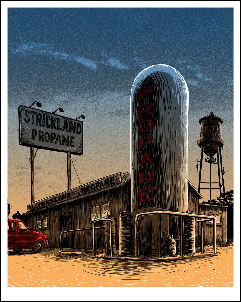
King of the Hill inspired artwork "Rusty Shackelford." You saw it here first! Unless, of course, someone already appropriated the image from my site and put it on their blog or Tumblr page, in which case, you saw it here second...or third...or fourth (you get the idea). Here we go!

"Rusty Shackelford" Art Print (POSTEROCALYPSE EXCLUSIVE)
Tim Doyle
16" x 20" - Signed and Numbered
Limited to 100
Inspired By: King of the Hill

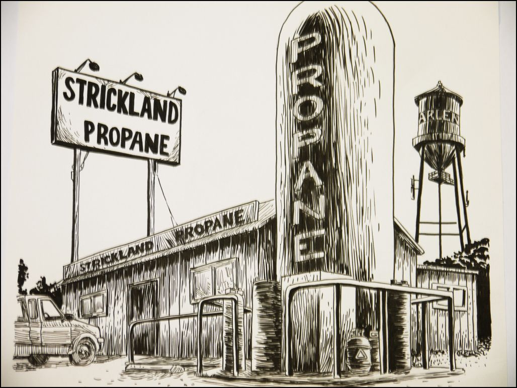
"Rusty Shackelford" Original Drawing (POSTEROCALYPSE EXCLUSIVE)
Tim Doyle

I'm always kind of amazed that King of the Hill had such a long run on television. The show was so region-specific and never really went for the humorous non sequitur (I'm looking at you Family Guy) or the pop culture-friendly one-liner (I'm still looking at you Family Guy). Instead, we were treated to the diverse goings on of a town called Arlen and the lives of the families who lived there. I really don't mean to make it sound like a made-for-TV Lifetime movie, but I did want to stress that a good deal of the laughs King of the Hill garnered came from a place that felt very real and were definitely earned. Alright, the long-winded sermon is over, let's talk about Doyle's print, shall we? When I first laid my eyes on "Rusty Shackelford," which just so happens to be Dale Gribble's oft-used alias, two words popped into my brain: "dust" and "bowl." Tim has perfectly captured that iconic Texas look with muted and earthy tones. So much so, that I'm tempted to rub the screen with my thumb and see if I can wipe some of that caked-on grit off. And how impressive is that line-work? I included all of the original drawings, because I really think it gives you a better idea of how fleshed out each of these designs already are prior to any coloring. Well, that's enough from me. Here's what Tim had to say about his ode to Arlen:
"King of the Hill is an odd duck of a show. Set in a mythical suburban Texas town, a mix of a very real Richardson and Garland (both towns adjacent to Plano, where I grew up), it rings with an authenticity any Texas-raised child would recognize. The thing that's odd to me is that the show was aired anywhere else in the nation, much less the world. No matter how extreme the characters are on screen, I know someone who could have been the archetype they were based on. I WISH I could say I never met a gun-nut conspiracy theorist like Dale Gribble, but I knew that guy, mirrored sunglasses and all. I'll never forget my friend's parents pulling out the night vision goggles one evening to see what the cops were doing up the block, a loaded handgun on the coffee table. The provincial and Protestant Peggy Hill was no parody, but an accurate representation of just about every teacher I had growing up in Texas. If there's a character in television history that is most representative of my life- it's Bobby Hill. A short, fat, awkward outsider, obsessed with fruit pies in a football dominated culture. (I still literally could not tell you the rules of the game to this day.) Now, my parents were East-coast transplants and my family life wasn't anything like Bobby's, but I've been to that house and seen that family repeated dozens of times, I tell you what.
I remember driving past the local propane dealer time and time again, never really understanding what the hell those places were for. We were charcoal briquette people. (Hank would be ashamed.)
I purposefully went for a dusty, gritty look for this print- trying to echo the sometimes frightening weather of central Texas. I spent more than a few hours under a mattress in my parent's hallway, waiting for the tornado to come and kill us all, only to get the all clear signal from the local siren. (Seriously- I can't believe I live in a world where that is real- one day you're just watching Mr. Peppermint on TV, and the next- wind is coming to kill you.)"
The "Rusty Shackelford" print will be available at the Spoke Art Gallery on Thursday (2/2) and available through Spoke Art's online storefront the next day. The poster measures 16" x 20", is signed and numbered, and is limited to an edition of 100. To learn more about Tim Doyle, be sure to visit his online portfolio and his print studio at nakatomiinc.com (I recommend picking up a copy of Bad Cat Comics while you're there).

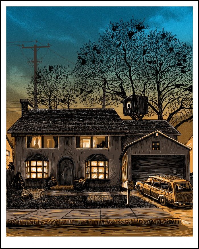
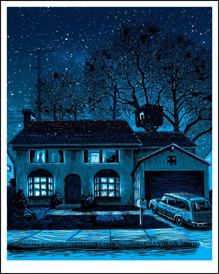
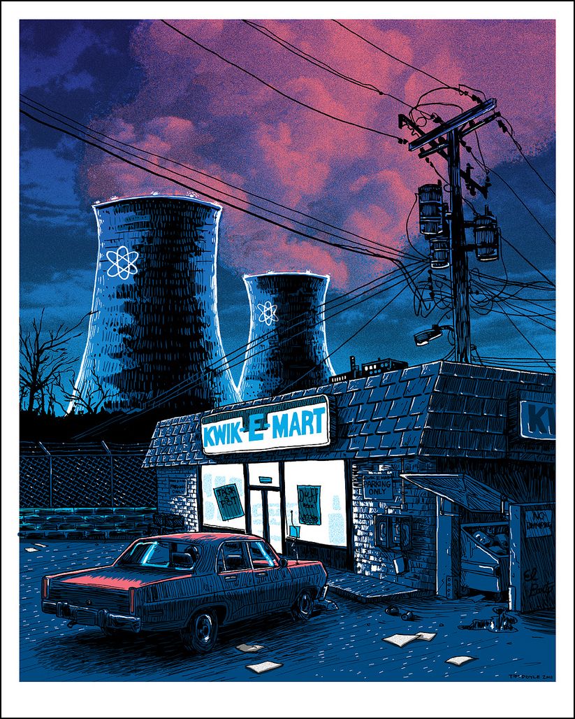
"Night over the SNPP" Art Print
Tim Doyle
16" x 20" - Signed and Numbered
Price TBD - Limited to 100
Inspired By: The Simpsons

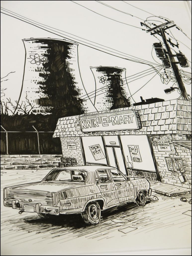
"Night over the SNPP" Original Drawing
Tim Doyle

Please raise your hand if, during your childhood, you spent at least three to five hours every week watching The Simpsons after school and on Sunday night. If you're anything like me, The Simpsons played a VERY large role in shaping you as a person - your sense of humor, your alarmingly apathetic handling of plutonium rods, and your general distrust of monorails and the men who sell them. Seriously, this was an incredibly important show to me, and even though I've since ceased regularly tuning in, The Simpsons will forever hold a special place in my heart. And I think out of all the prints from Tim's show, his Simpsons inspired work may be my favorite so far. Beyond the immediately familiar setting, I'm head over heels for the beautiful billows of purple, pink, and blue smoke rising up from the nuclear plant's cooling towers. I also appreciate the care Doyle has taken in so meticulously crafting the power lines and utility poles - the criss-crossing of wires and cables is at once gorgeous and grotesque. If "Rusty Shackelford" brought to mind a dust bowl, then "Night over the SNPP" makes me think of cancer and carcinogens. Tim Doyle on his Simpsons prints:
"The first three prints I created for the show were all inspired by The Simpsons- I knew I had to kick them out of my head up front and move on, as The Simpsons could very easily dominate the entire exhibit if I let it. I purposefully set these three images at night or sunset to force the color scheme away from the pastel and neon palette of the show."
The "Night over the SNPP" art print will be available through Spoke Art Gallery on Thursday (2/2) and will be purchasable online soon after that. The print measures 16" x 20", is signed and numbered, and is limited to an edition of 100. If you haven't already, I recommend signing up for Spoke Art's mailing list to make sure you don't miss any drop info.

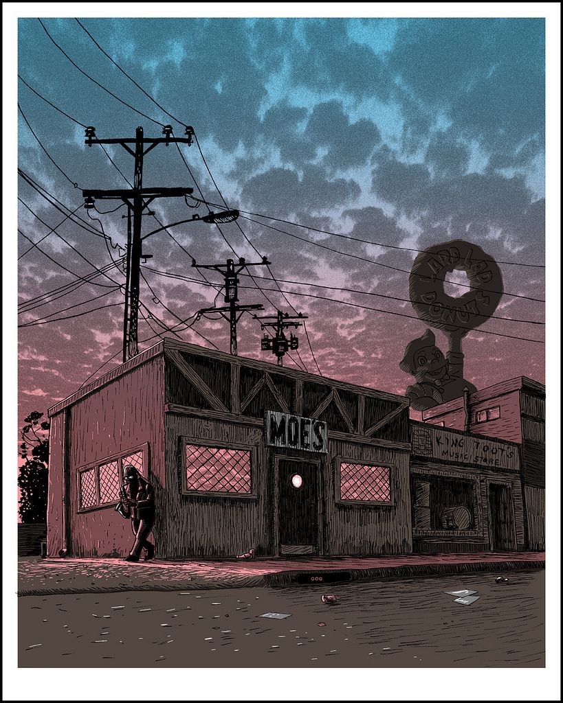
"Amanda Hugginkiss" Art Print
Tim Doyle
16" x 20" - Signed and Numbered
Price TBD - Limited to 100
Inspired By: The Simpsons

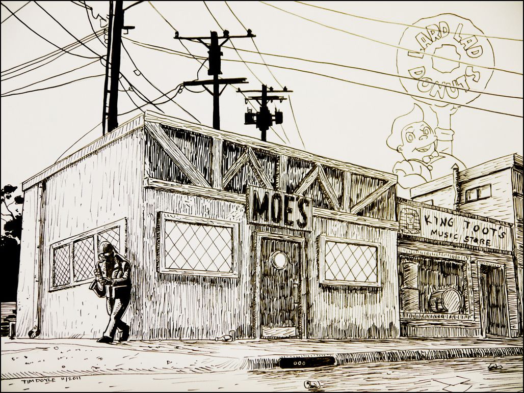
"Amanda Hugginkiss" Original Drawing
Tim Doyle

I have a feeling there are going to be a lot of folks aiming to pick up all three Simpsons prints. Doyle's approach to the Simpsons posters manages to balance a certain classiness, with their twilight color palettes and wonderfully realized depictions of Springfield, while also paying respect to the overall silliness that's so integral to the series. Oh yeah, and it features freaking Bleeding Gums Murphy! How can you not immediately fall in love with "Amanda Hugginkiss"?! Wait, that came out wrong. And it's impossible not to appreciate the Lard Lad Donuts sign, which will forever and always remind me of the "Treehouse of Horror" episode when Lard Lad comes to life. Here's what Mr. Doyle had to say about his jazzy Simpsons print:
"This one is my favorite of the bunch- the blue to pink split fountain echoing the setting sun.
The problem with starting a series like this is that you might write up a list of all the pieces you want to do, but once you've got a few images in, you've already thought of a whole list of brand new images you want to do first and the original 'sacred cows' you wanted to hit get bumped further and further down. (All In the Family is a casualty of this process.) This two part print of America's favorite street is one of the ones that popped up and refused to wait it's turn."
Tim's "Amanda Hugginkiss" measures 16" x 20", is limited to an edition of 100, and is signed and numbered. The print will be available through the Spoke Art Gallery once "Unreal Estate" opens Thursday (2/2) night, and depending on whether it sells out or not, may be available online the next day. Be sure to follow both Spoke Art (@Spoke_Art) and Tim Doyle (@NakatomiTim) to keep with all their shenanigans and any poster-related news.

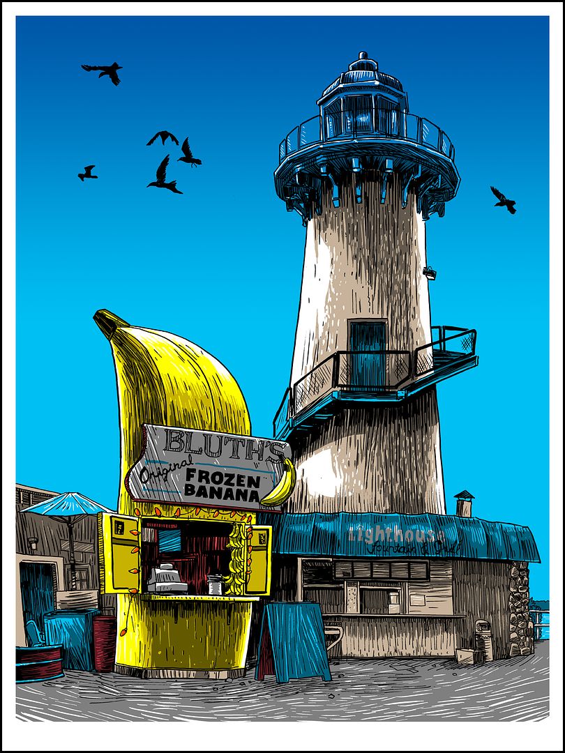
"10 Cents Gets You Nuts" Art Print
Tim Doyle
18" x 24" - Signed and Numbered
Limited to 100
Inspired By: Arrested Development

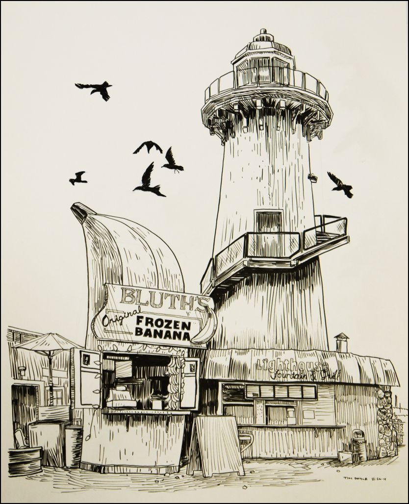
"10 Cents Gets You Nuts" Original Drawing
Tim Doyle

There's always money in the banana stand. Words to live by, right? I jumped on the Arrested Development bandwagon during its second season on-air and was immediately caught up in the labyrinthine dramas and intrigues the Bluth family continually (and hilariously) bungled through. Tim Doyle's "10 Cents Gets You Nuts" print depicts the constantly-in-a-state-of-repair banana stand in all its kitschy glory and has somehow made what was already a beautiful locale look even more picturesque. Tim on his feelings about the show and its recently announced return:
"I went a little bit more contemporary with the Bluth Banana stand. This show wormed its way into me post-cancellation, I'm embarrassed to say. But I'd guess that's the case with the vast majority of AD's fans today. As I was working on this print, the news broke that Arrested Development was in fact coming BACK to television, albeit through the subscription service Netflix, and later into theaters in a long-rumored film. This is fantastic news- and what I believe is a first for network TV- the internet spoke as a collective and WILLED this show back into production. This isn't the case of some stiff in a suit saying 'You know what was popular? 90210. Let's do that again, even though no-one ever asked for it.' The only reason Dallas is back on the air is because people recognize it as a BRAND, not as a show anyone was dying for more of. But this is something...else. We weren't done with the Bluths, and we demanded a family reunion. And we're getting it. Now, who wants to start a Kickstarter to get Firefly back? The internet has spoken."
I could definitely get behind that! Tim's "10 Cents Gets You Nuts" art print will be available through the Spoke Art Gallery on Thursday (2/2) and placed online shortly following that. The print measures 18" x 24" and is limited to an edition of 100. Be sure to visit Spoke Art at spoke-art.com for more info on the "Unreal Estate" show.

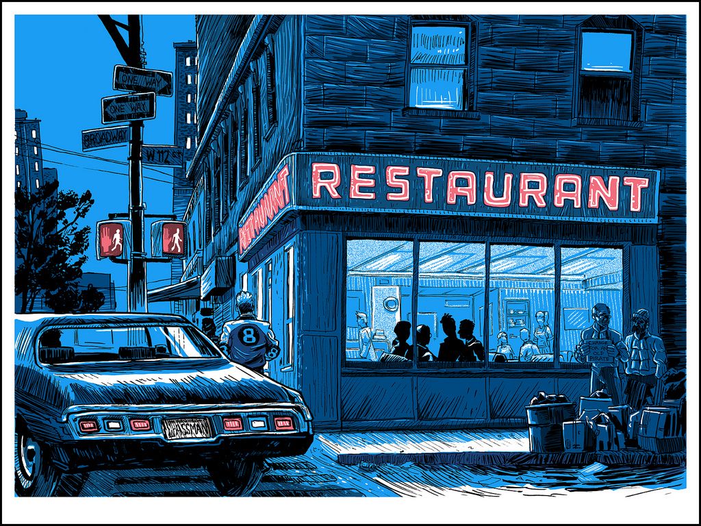
"The Big Salad" Art Print
Tim Doyle
18" x 24" - Signed and Numbered
Limited to 100

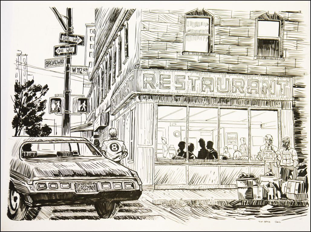
"The Big Salad" Original Drawing
Tim Doyle

I think this may be Tim Doyle's most loaded print out of the posters mentioned here. It features references galore (take a quick look at the license plate if you don't believe me) and is sure to please the Seinfeld fanatic in all of us. At this point, I recommend you just stare into the craziness that is this print and find some of the little Easter eggs that have been hidden in plain sight. Tim Doyle on the poster's setting:
"For a show based almost completely around interior locales, there is one stand-out exterior shot in Seinfeld- the restaurant. Unlike the other prints in this series, the restaurant is an actual location you can visit and touch- reality and fiction intertwined. While the diner is called 'Monks' in the show, it is in fact Tom's Diner (of the Susanne Vega song) on 2880 Broadway in New York. Fun fact I learned while researching this print is that the exterior of the actual diner in no way matches up with the set that was built in LA."
"The Big Salad" will be available on Thursday (2/2) at the Spoke Art Gallery and online shortly after. The poster measures 18" x 24" and is limited to an edition of 100.

I think it's officially time for me to pass out from exhaustion now. "Unreal Estate" opens on Thursday (2/2) at the Spoke Art Gallery in San Francisco. Any unsold prints will be available online the day after at store.spoke-art.com. This is sure to be a great show, and (out of intense jealousy) I curse anyone who can make it there in person! Good night all!

Thursday, January 26, 2012

Mondo's "Planet of the Apes" Movie Poster Series

The five prints included in this post have already gone on sale as a set, and IMMEDIATELY sold out, but since there'll be a few more copies of each poster sold separately later today (minus Edmiston's "Go Ape"), I wanted to write a brief review for each print available. It's what I do. Let me start this entry off by saying I honestly think every single piece of artwork here is insanely impressive - there's not a dud in the set. And there's no denying that Mondo, and all of the artists involved, really brought their A-game to this anthropoid abundant series. Now on with the show!

Planet of the Apes Movie Poster
Martin Ansin
24" x 36" - Numbered
$230 (Entire Set) - Limited to 415

This shouldn't come as a surprise to anyone, but I really, really like Martin Ansin's Planets of the Apes poster. In fact, I'd go so far as to say it's my favorite in the collection. I saw this design printed on wood at SDCC last year and was very close to pulling the trigger, but thankfully my fiscally responsible doppelgänger got the better of me. As usual, Ansin's eye for composition and his ability to create some truly jaw-dropping photorealistic primates is on full display here. I'm not sure if this is at all intentional, but it looks like all the characters included in this poster come together to form a vague skull-like shape. Color me intrigued. Bottom line: it's another stunner from Martin Ansin and almost assuredly going to make it into my top 10 of 2012. To learn more about the artist, be sure to visit martinansin.com and follow him on Twitter @martinansin.

Beneath the Planet of the Apes Movie Poster
Ken Taylor
24" x 36" - Numbered
$230 (Entire Set) - Limited to 395

I feel like Ken Taylor's posters always have a somewhat reverential quality to them. I don't mean that in a bad way, that's actually one of the things I really like about his work. Ken's monolithic arrangements remind me of a shrine or altar in their construction, which is absolutely perfect given the Planet of the Apes film he's covering (please note the nuclear bomb being worshipped in the poster's center). Also, I love the color scheme! It just exudes dark, dingy, dankness! If you'd like to find out more about artist Ken Taylor, head over to kentaylor.com.au.

Escape from the Planet of the Apes Movie Poster
Rich Kelly
24" x 36" - Numbered
$230 (Entire Set) - Limited to 320

I'm a huge fan of Rich Kelly's work, and I think this may be his strongest piece yet. Rich's pencil-sketch style only emboldens his slightly askew interpretation of the characters and their proportions, lending the artwork a smile-inducing and slyly surreal appearance. Out of all of the posters in the series, I think this is easily the most pleasant surprise in the pack. And if what I've been reading is true, I'm not the only one who feels this way. To learn more about artist Rich Kelly, be sure to visit rfkelly.com, his storefront and follow him @TheRichKelly.

Conquest of the Planet of the Apes Movie Poster
Phantom City Creative
24" x 36" - Numbered
$230 (Entire Set) - Limited to 370

The Planet of the Apes poster series from Mondo, is pretty much a who's who of incredibly talented artists that I'm completely obsessed about. As proof of that, I'd kindly like to direct your attention to Phantom City Creative's Conquest poster above. Phantom City has put together a wonderful looking design that evokes the propaganda of yesteryear. Seriously, if you put a Che beret on Caeser, I could picture this being plastered on city walls and used as a rallying cry for the enslaved apes. Here's one for the little guy ape! For more info on Phantom City Creative, be sure to visit phantomcitycreative.com, their store, and follow them on Twitter @PhantomCityCrtv.

Battle for the Planet of the Apes Movie Poster
Florian Bertmer
24" x 36" - Numbered
$230 (Entire Set) - Limited to 345
I think out of all of the prints mentioned here, Florian's poster is the one that most needs to be seen in person to be appreciated. Returning to my ecclesiastical comparisons, if Ken Taylor's artwork is similar to a shrine or altar, than Bertmer's work brings to mind a medieval stained-glass window belonging to a creepy church that may or may not have dabbled in ritual human sacrifice during the early 1350s. It's just pure evil. The man is also known for his crazily ornate borders, so I can't even imagine what this will look like in-hand. Spoiler: it's going to look great! To learn more about Florian Bertmer, checkout his website at florianbertmer.blogspot.com and the Moon Editions store.

All of these posters, except for Jason Edmiston's "Go Ape" print which, due to time constraints, I didn't have time to write about, will be individually available for purchase through Mondo later this morning (1/27) at a random time. Be sure to follow @MondoNews for all the drop details. Good luck! Now get off my lawn, you damned dirty apes!