Showing posts with label Rutger Hauer. Show all posts

Tuesday, April 24, 2012

Tim Doyle's "Tears in the Rain" Oversized Art Print

UPDATE (4/25): "Tears in the Rain" is all sold out! Hope you were able to grab one! The post has been updated accordingly.

Tim Doyle's "Tears in the Rain" print was initially released in October 2010 (predating Posterocalypse's existence by only a few months) and has always stuck with me as one of his best designs. Doyle's take on Blade Runner with its neon-drenched mise en scène captures an iconic moment and manages to be both gorgeous and insightful. I missed my chance the first go around, but as luck (and Tim's generosity) would have it, I'll have another opportunity to snag this beauty later today.
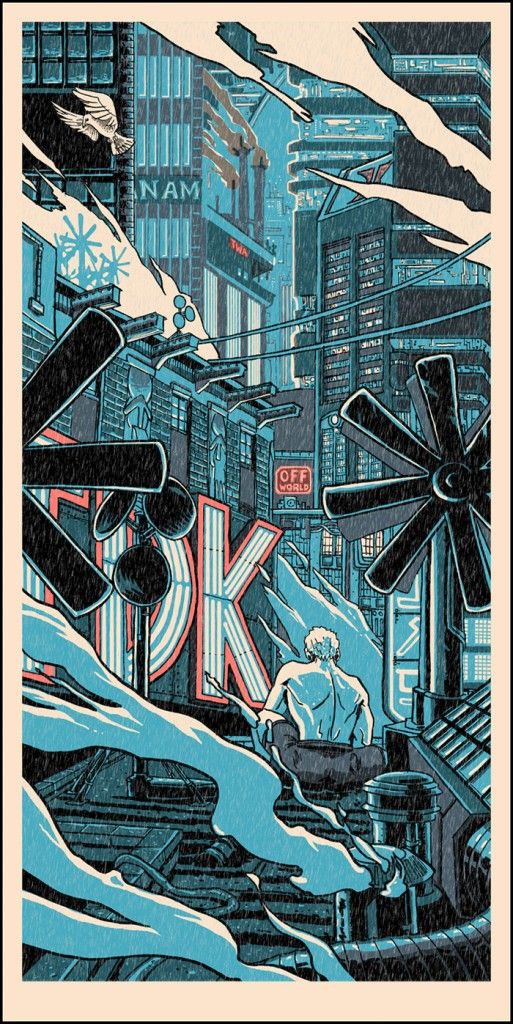
"Tears in the Rain" Art Print (Oversized & Glow in the Dark)
Tim Doyle
21" x 40" - Signed and Numbered
Price TBD - Edition Size TBD
Inspired By: Blade Runner

Tim's "Tears in the Rain" poster is strangely zen. There are probably a few hundred other words that would better describe what I mean, but I work with what I have, which in this case is a smallish vocabulary. Now, I'll do my best to expound on my word choice, but please bear with me as I stumble across this explanation. Roy Batty, a replicant who's host to so much inner conflict and exudes so much anger toward human civilization for making him and those like him a disposable second class citizen is not exactly the poster boy for non-violence or mental stability. With that said, Roy does reach an epiphany and finds some modicum of peace when [spoiler alert] he saves the life of Deckard near the film's end. Tim Doyle's print, at least for me, captures that moment perfectly - there's clarity and solace in his artwork, and the lone man / replicant set against a mechanized world filled with smog, smoke stacks and never ending artificial illumination presents Roy with a certain amount of reverence and humility. It probably doesn't hurt that the paper stock color reminds me of rice paper, which immediately elicits feelings of calm and tranquillity. Oh, and there's the iconic dove too. There's also that.

Tim Doyle's "Tears in the Rain" oversized print was released on Tuesday (4/24) at 3 PM CST through his Nakatomi Inc storefront. It was a timed-release print and measures 21" x 40". To learn more about the artist, be sure to visit mrdoyle.com, nakatomiinc.com and follow him on Twitter @NakatomiTim.

Friday, February 17, 2012

Tim Doyle's "Blade Runner" Art Prints

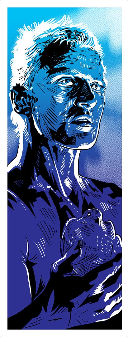
It's hard to say 'no' to free stuff, isn' it? Especially when said free stuff is inspired by the science fiction masterpiece Blade Runner and drawn by Tim Doyle. Tim, who had previously created two prints depicting the replicants Leon Kowalski and Pris as part of his last Nakatomi Mystery Tube sale is at it again, this time with perhaps the coolest and most emotionally tortured character from the Ridley Scott classic. No, not the replicant owl! Don't be ridiculous. I meant Roy Batty!

"Batty" Art Print
Tim Doyle
9" x 24" - Signed and Numbered
Free with Order - Limited to 200
Inspired By: Blade Runner
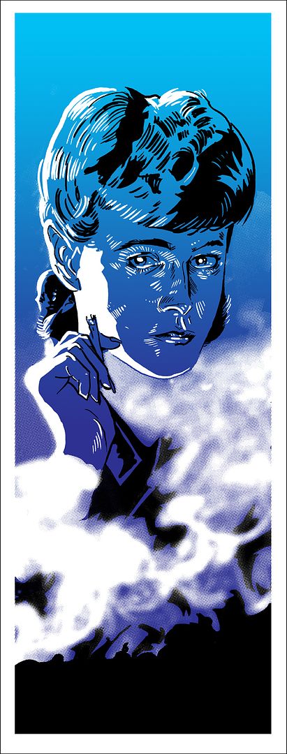
"Rachel" Art Print
Tim Doyle
9" x 24" - Signed and Numbered
Free with Order - Limited to 200
Inspired By: Blade Runner

I really enjoyed Tim's last batch of Blade Runner prints, but I much prefer these. My preference doesn't have anything to do with the previous posters' execution, they are, after all, done in a very similar style. No, my adoration comes from a place of love for the Roy Batty character. I don't know about you, but when I think about Rutger Hauer, Blade Runner is the film that immediately comes to mind. Rutger's performance was brilliant and he completely owned the complexity that made Roy such a memorable villain (and hero). Likewise, Tim has captured and owned, artistically speaking, that iconic moment where a dove-clutching Batty is pondering his mortality and humanity. It's a really touching scene and clearly makes for a wonderful poster. Also, I've got to point out the impressively restrained detail in Roy's face and Mr. Doyle's use of color (or rather, lack of color) to represent his practically fluorescent platinum-blond hair.

And let's not forget about Rachel, Deckard's main squeeze. Similar to his "Batty" print, Tim's "Rachel" artwork uses a prop of sorts to tell us more about the character. For Roy it was the dove, for Rachel it's the hazy cloud of smoke that she's practically wearing like a shirt and her lit cigarette. It's a nice stylistic touch and will surely be impressive to see in person. Ultimately, if Doyle's posters are offering us yet another chance to enjoy and celebrate the characters we grew to love and / or hate from one of the most important science fiction films ever made, which I think they are, I'll take it. With that said, I've got my fingers crossed for a "Batty" print.

Here's the really cool part: Tim Doyle's "Batty" and "Rachel" prints are both completely FREE and will come with any poster orders placed through the Nakatomi storefront until they run out (one print per order). So, if you've been eyeing that new The Massive print by Kristian Donaldson, or haven't been able to get Tim's adorable "Vietnam on Wheels-2" poster out of your mind, then now is the perfect time to pull that metaphorical trigger attached to your wallet. Both Blade Runner inspired prints measure 9" x 24", are signed and numbered, and are limited to an edition of 200. If you'd like to learn more about the talented fellow behind the artwork above be sure to visit mrdoyle.com, nakatomiinc.com and follow him on Twitter @NakatomiTim.
Thursday, November 10, 2011

Joe Wilson's "Blade Runner" Movie Posters

UPDATE (12/19): This print is available now! Head over to Joe Wilson's store to pick one up! The post has been updated accordingly. Get one now!

For many of us in the movie poster collecting community, the name Joe Wilson may not immediately conjure visions of beautiful film-inspired artwork or bring to mind a commanding sense of design. That's not because Mr. Wilson isn't capable of it, not at all, it just so happens that many of us pop culture-obsessed art nerds may not recognize the name at first or second glance. Well, I believe that's all about to change with his upcoming print release. Joe recently teased a poster for a film that holds a hallowed spot in the pantheon of great science fiction cinema, but before I say anything else, I think you should just take it all in. That's right...

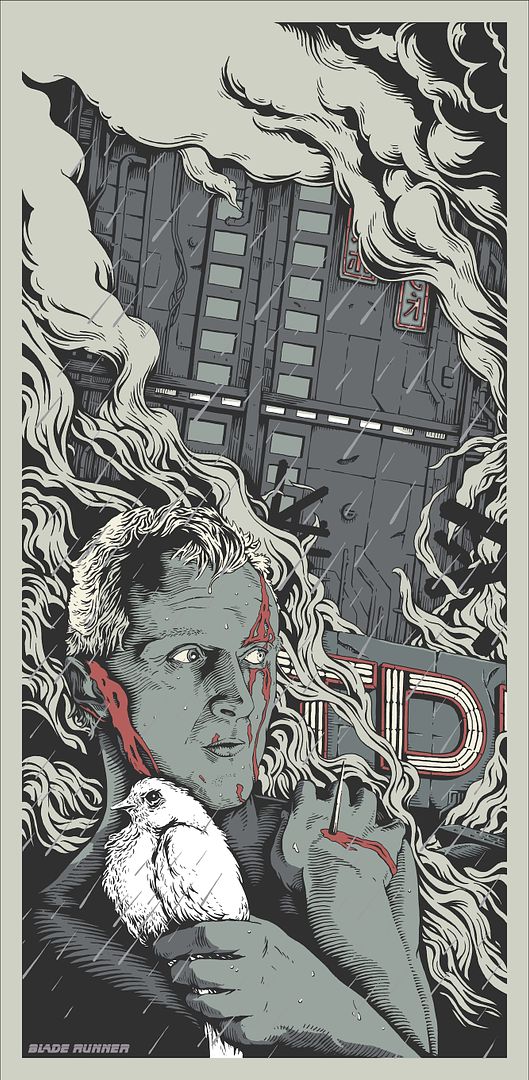
Blade Runner Movie Poster (Regular)
Joe Wilson
300 mm x 620 mm (approximately 11.811" x 24.409")
£40 - Limited to 30

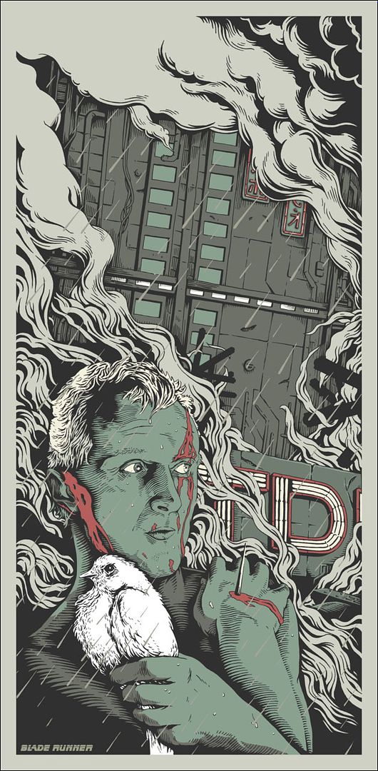
Blade Runner Movie Poster (Var. 1)
Joe Wilson
Price and Edition Size to be determined
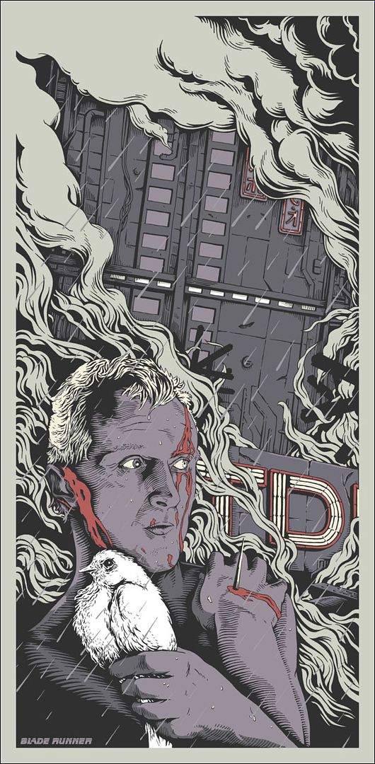
Blade Runner Movie Poster (Var. 2)
Joe Wilson
Price and Edition Size to be determined

Yep. Blade Runner. One of the things that first drew me to Joe Wilson's art was the way he constructed his subjects. From a distance, they looks great, sure, but there's a lot more at play upon closer inspection (I recommend clicking on the images above right now). The majority of that depth and definition you see in these prints, is actually made of many, many smaller lines. This may not be a mind-blowing revelation, but I really think that, in addition to his already admirable talent, Joe's attention to detail is what brings everything he draws to life. Take, for example, the dove our sympathetic replicant is clutching and compare Joe's drawing of the bird with a screenshot from the film. I think you'll agree, that at least in this comparison, the poster's version of the scene appears more realistic, more detailed and livelier than in the movie's still. Yeah, I'm probably reaching, but what I'm ultimately trying to say is that one of this artist's biggest strengths is, in my opinion, his ability to create characters and environments that feel real and alive. Although, to label Joe Wilson a purely naturalistic artist would not be completely accurate.

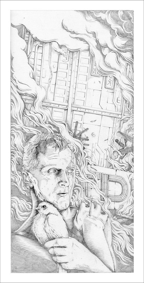
Initial pencil version of Blade Runner Movie Poster
Joe Wilson
Not for sale

If you couldn't tell by looking at this post, there's still a ton of style. You'll notice in several of the images here that smoke, clouds, and fog are like sentient characters in his work. They writhe in and out of the frame and appear to be made of thick unrealistic, yet wholly organic, tendrils of stringy smog. I asked Joe a little more about his motivations behind his Blade Runner print and here's what he had to say:
"In terms of motivation, I love the film; the whole mood of it seems to inspire me. I guess the poster is an acknowledgment of, and tribute to, how good the film looks and is my take on an iconic scene and the film's truly original aesthetic."
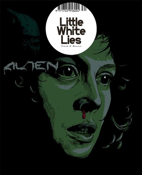
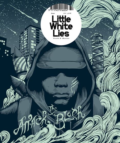
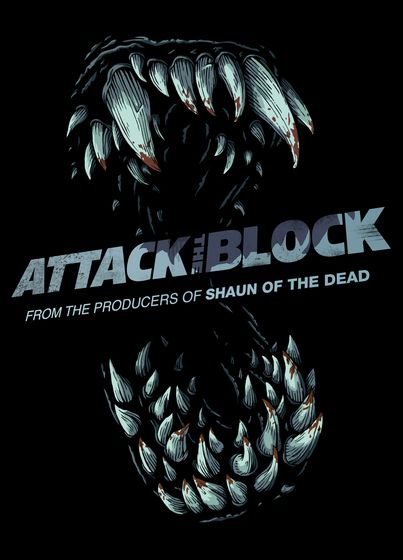
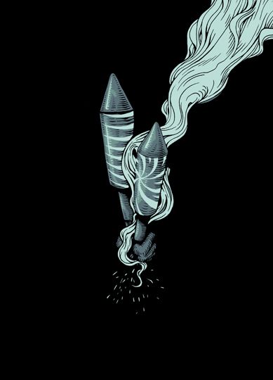
It's a great film, it's a great print, and is sure to be a quick seller. Before closing this post I wanted to quickly share a few more of Joe Wilson's cinema-centric designs. I won't really say anything about them (in case it's not obvious, I really dig his stuff), but I think it should give you a fairly good feel for his style.

Little White Lies Cover
Joe Wilson
Inspired By: Alien
Little White Lies Cover
Joe Wilson
Inspired By: Attack the Block

Attack the Block DVD Cover
Joe Wilson
Attack the Block DVD Back Cover
Joe Wilson

Joe Wilson's Blade Runner print is currently available through his Big Cartel store for £40 (roughly $62 for US readers). The print measures 300 mm x 620 mm, is a five color screen print and is limited to an incredibly small run of 30. It looks like the variants will be available in the near future (I'll have more info as the release approaches). If you're a fan of Joe's work I recommend doing a few things: follow him on Twitter @JOE_WILSON (simple enough), visit / subscribe to his Tumblr blog, obsessively F5 his print store (well, not obsessively), and check out his work at joe-wilson.com. Fingers crossed we see a lot more stuff like this from Mr. Wilson in the future.