Showing posts with label Star Wars. Show all posts

Tuesday, March 12, 2013

LifeVersa's "Neo Polo" Art Print

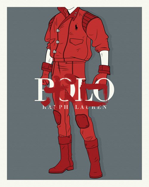
"Neo Polo is about to E-X-P-L-O-D-E," is how I imagine the commercial would start, followed by a bunch of young, attractive, well-lit Japanese people engaged in psychokinetic warfare and motorcycle racing, all set to an ominous soundtrack filled with banging drums. And...scene! Sadly, that commercial will never see the light of day, but at least we have LifeVersa's (AKA Wale Bambose) Akira inspired "Neo Polo" print, which is being released as part of the artist's "Materialism and Popular Culture" series. I think we can all agree this is a good thing.

"Neo Polo" Art Print
LifeVersa
16" x 20" (Screen Print) - Signed and Numbered
$35 - Limited to 50
Inspired By: Akira

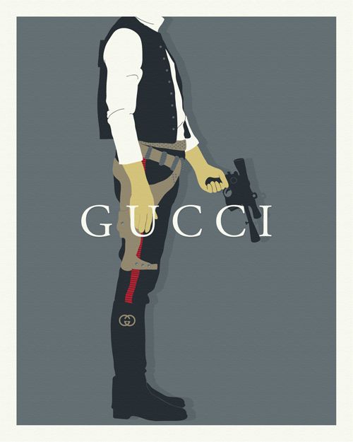
And here's LifeVersa's long sold out first "Materialism and Popular Culture" print, appropriately titled "Style War." Here's hoping we see many more like this and "Neo Polo" in the near future.

"Style War"
LifeVersa
16" x 20" (Screen Print) - Signed and Numbered
Sold Out - Limited to 50
Inspired By: Star Wars

LifeVersa's "Neo Polo" poster goes on sale tomorrow (3/13) at a random time through the LifeVersa store for $35. The screen print measures 16" x 20" and is limited to an edition of 50. For more info on the artist, be sure to visit lifeversa.com.

Thursday, August 30, 2012

Poster Per Diem: Tracie Ching's "Lando" Art Print

If you visit this site with any regularity, you already know I tend to write reviews for film and television inspired prints that are either currently on sale or are about to go on sale. And while I'll still be pouring the majority of my efforts into those sorts of posts, my daily "Poster Per Diem" feature will focus on awesome prints that have since sold out, never existed in the first place (AKA concept posters) or just bear mentioning. In other words: this is my chance to say, "I never got a chance, for whatever reason, to write about you on this here website, but I think you're really purty and I want to let the world know." Or something like that. Oh, and Per diem is latin for "per day" or "each day."

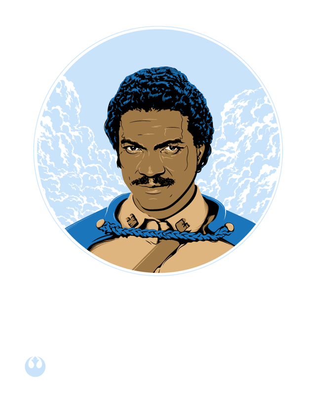
"Lando" Art Print
Tracie Ching
16" x 20" (Screen Print) - Signed and Numbered
$30 - Limited to 50
Inspired By: Star Wars

Returning to the wonderful world of Star Wars, Tracie Ching has crafted yet another kickass poster, this time honoring everyone's favorite galactic brother, Lando Calrissian. Tracie's "Lando" art print is currently available through her store for $30. The screen print measures 16" x 20" and is limited to an edition of 50. To learn more about the artist, visit tracieching.com, her Facebook page, or follow her on Twitter @tracieching.

Tuesday, August 28, 2012

Poster Per Diem: Barry Blankenship's "Charlotte's Deathstar" Art Print

If you visit this site with any regularity, you already know I tend to write reviews for film and television inspired prints that are either currently on sale or are about to go on sale. And while I'll still be pouring the majority of my efforts into those sorts of posts, my daily "Poster Per Diem" feature will focus on awesome prints that have since sold out, never existed in the first place (AKA concept posters) or just bear mentioning. In other words: this is my chance to say, "I never got a chance, for whatever reason, to write about you on this here website, but I think you're really purty and I want to let the world know." Or something like that. Oh, and Per diem is latin for "per day" or "each day."

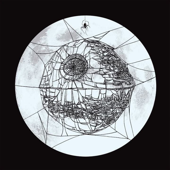
"Charlotte's Deathstar" Art Print
Barry Blankenship
10" x 10" (Screen Print) - Signed
$12 - Open Edition
Inspired By: Charlotte's Web and Star Wars

Ever wonder what a mishmash of Charlotte's Web and Star Wars would look like? Neither did I. But now that Barry Blankenship has answered the question nobody asked with his stunning "Charlotte's Deathstar," I'm completely on board in every conceivable way. As I understand it, the above design initially served as the centerpiece for a Damage Done gig poster, but it appears Barry wisely saw the potential for what turned out to be a killer art print and acted accordingly. The "Charlotte's Deathstar" screen print is currently available through Barry's storefront for only $12 (yes, only $12!) and measures 10" x 10". To learn more about the incredibly talented artist behind this poster, head over to barrytheartguy.com. You can also follow him on Twitter @barrytheartguy and browse his Dribbble. Good stuff all around!

Thursday, July 26, 2012

Poster Per Diem: Christopher Lee's "Star Wars" Movie Poster

Quick note: Apologies! I didn't put together a "Poster Per Diem" for Tuesday or Wednesday this week, so I'll be posting three of them today. Now, on with the show!

For those wondering what the hell "Poster Per Diem" is / means / smells like, here's my not at all concise description. If you visit this site with any regularity, you already know I tend to write reviews for film and television inspired prints that are either currently on sale or are about to go on sale. And while I'll still be pouring the majority of my efforts into these sorts of posts, my daily "Poster Per Diem" feature will focus on awesome prints that have since sold out, never existed in the first place (AKA concept posters) or just bears mentioning. In other words: this is my chance to say, "I never got a chance, for whatever reason, to write about you on this here website, but I think you're really purty and I want to let the world know." Or something like that. Oh, and Per diem is latin for "per day" or "each day."

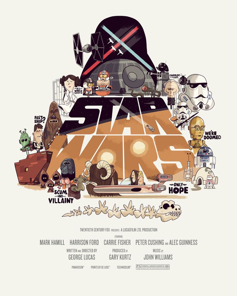
Star Wars Movie Poster
Christopher Lee
16" x 20" (Giclée) - Signed
Sold Out

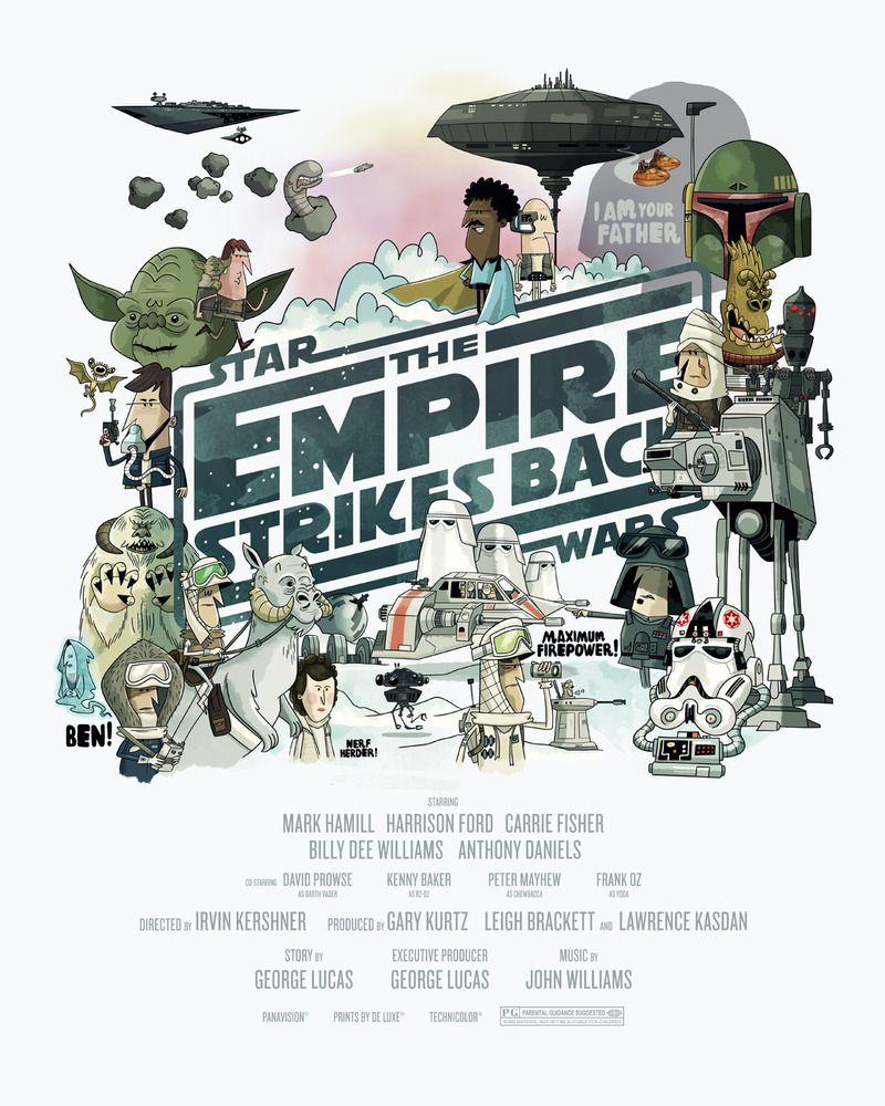
The Empire Strikes Back Movie Poster
Christopher Lee
16" x 20" (Giclée) - Signed
Sold Out
Return of the Jedi Movie Poster
Christopher Lee
16" x 20" (Giclée) - Signed
Sold Out

If the Star Wars and Schoolhouse Rock! met at a bar one night, got really, really drunk (like blackout drunk), grabbed a room at the local Super 8 and made messy, kinky, beautiful, unprotected love, their child would probably look something like these prints. Artist Christopher Lee (not to be confused with the Hammer Films legend) was able to capture all the fun parts from the Star Wars series and made something that every nerd needs to own. You can find more of Christopher's artwork at thebeastisback.com and follow him on Twitter @thebeast_isback.

Also, I'd like to give a tip of the hat to reader Robert Sheppard for pointing me toward some really awesome artwork (including these fantastic Christopher Lee prints). As an FYI to everyone out there, if there's a an awesome print you want me to write about, send me a line at posterocalypse@gmail.com. I may not write about it, but then again, I might.

Friday, March 23, 2012

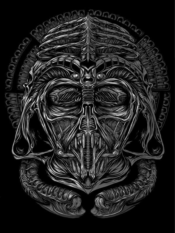
Randy Ortiz's "Lord Necronom" Art Print

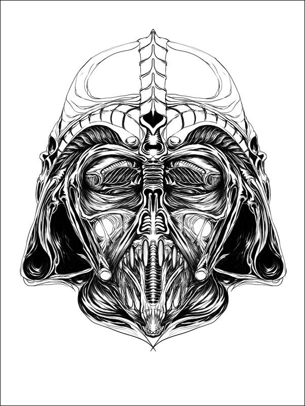
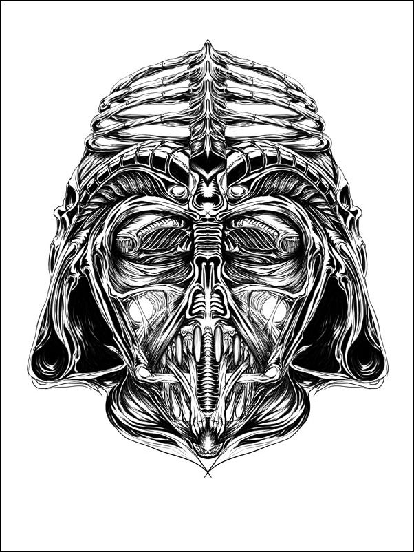
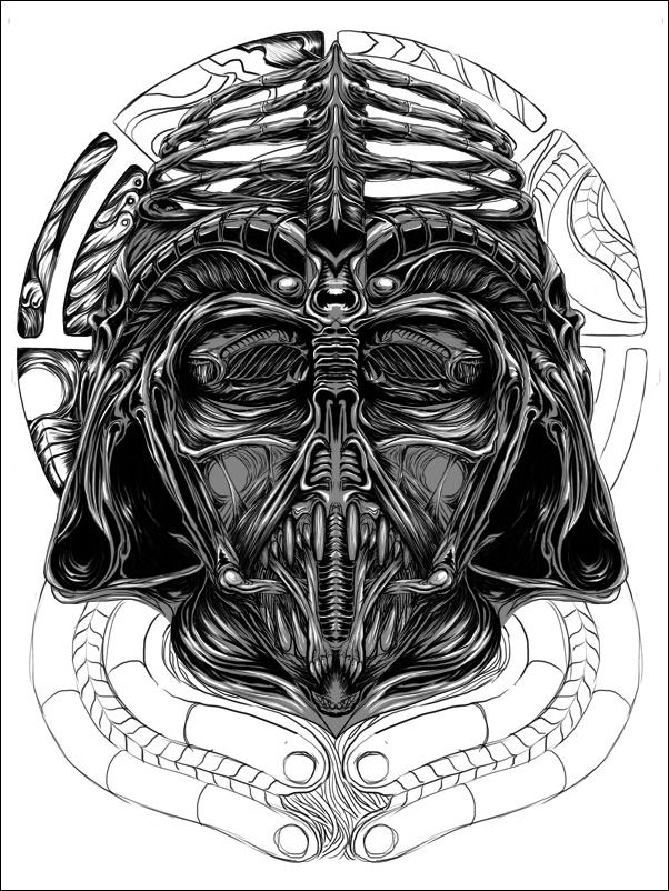
I like to think of Randy's "Lord Necronom" as the art print inspired by the film I never knew I was dying to see. To rewind a bit, I first mentioned Mr. Ortiz in my write up of Spoke Art's second annual "Bad Dads" art show because of his beautiful Fantastic Mr. Fox inspired poster, which then made its way onto my "Best Twenty Posters of 2011" list. I think it's safe to say that tonight's entry is not nearly as cute or cuddly as the wily Mr. Fox, but what it's lacking in adorableness, it more than makes up for in disgusting phallic tendrils and xenomorphic complexity.

"Lord Necronom" Art Print
Randy Ortiz
18" x 24" - Numbered
$70 - Limited to 90 (17 APs)
Inspired By: H.R. Giger / Alien and Star Wars

I enjoy Star Wars as much the next guy, but I've seen enough paintings and posters of Darth Vader to last me a lifetime. With that said, I think the reason this particular remixing of the iconic Vader helmet works is because it feels fresh and it's just plain clever. I like clever. And if there was ever something that could make the Dark Lord of the Sith a more sinister individual overall, it would without a doubt be the incorporation of some Giger inspired creepiness. Not content with his already unsettling creation, Ortiz also saw fit to include a grotesque halo in the background, which somehow makes the print even more irreverent. My favorite elements of Randy's poster are the rib cage forming the top of the Lord Necronom's hard hat, the ghoulish little mouth jutting out of Necronom's face, and what are possibly the most terrifying eyelids ever thought up by anyone...ever. Ultimately, "Lord Necronom" makes my skin crawl, but then again, that's why I like it so much. In lieu of not be able to watch Prometheus yet, I think I may have to throw in Alien tonight.

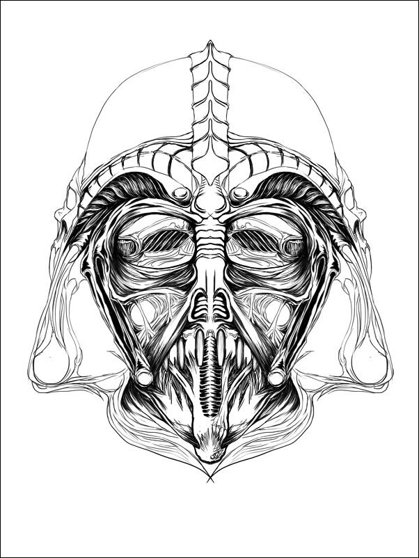
"Lord Necronom" Process Shot #1
(taken from damnthedesign.com)
"Lord Necronom" Process Shot #2
(taken from damnthedesign.com)

"Lord Necronom" Process Shot #3
(taken from damnthedesign.com)
"Lord Necronom" Process Shot #4
(taken from damnthedesign.com)

Randy Ortiz's "Lord Necronom" prints will be available on Friday (3/23) at a random time through his online storefront. The poster costs $70 and measures 18" x 24", with only 17 being made available for purchase (these are his APs). He'll be making the drop announcement via his Facebook, Tumblr and Twitter accounts, so I'd recommend keeping an eye on all of them throughout the day and a little bit of F5-ing probably wouldn't hurt either. To learn more about artist Randy Ortiz, be sure to visit his website at damnthedesign.com. Here's hoping we see a lot more Mondo commissioned stuff from him in the near future!

Thursday, January 26, 2012

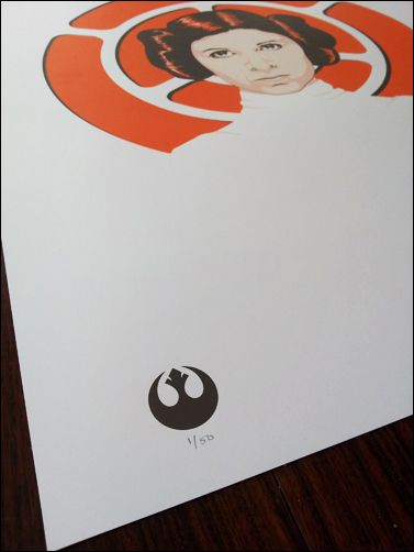
Tracie Ching's "The Princess" Art Print

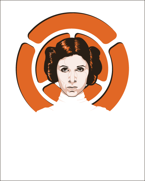
I meant to write about this on Monday, but up until recently I've been sans any quality blogging time. Finally, now that I've got a few moments to myself, I can share with everyone the wonderful artwork of Tracie Ching. I didn't know much about Tracie (read: nothing at all, actually), but her incredibly classy Leia inspired "The Princess" blew me away.

"The Princess" Art Print
Tracie Ching
16" x 20" - Signed and Numbered
$30 - Limited to 50
Inspired By: Star Wars

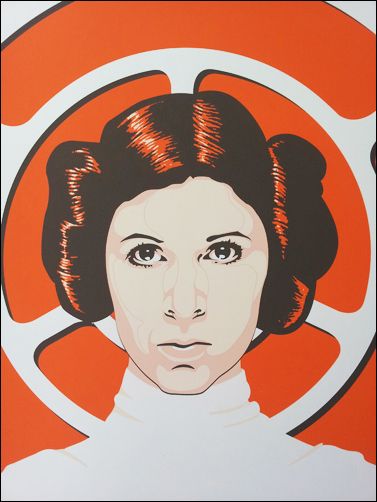
I'm not entirely sure why this print so immediately clicked with me, but I think it mostly has to do with how simple and elegant the design is. I especially like the fact that Tracie's depiction of Leia isn't perfectly symmetrical. I think with these straight-on portraits, it's so easy to be tempted into creating an unrealistic proportionality, and while there's no denying that sometimes the art can call for that, I like the authenticity that a little intentional imperfection brings to the table. I'll admit, I'm not as familiar with the Star Wars emblems as I should be, but I'm assuming the standard behind her head has something to do with her political affiliation in the film's universe. My ignorance of galactic legislative machinations aside, I love how the emblem frames Leia's head and creates a sort of politically-charged halo. This poster just totally works for me, and I'm finding myself really digging Tracie's minimal style.

"The Princess" Close-up

Tracie Ching's "The Princess" poster is currently available through her storefront for $30. The screen print measures 16" x 20" and is limited to an edition of 50. If you can't spare the money right now, Tracie is also running a "Princess" print contest, where she'll be giving away two copies of her Leia inspired poster. Be sure to visit her website, Facebook page and DeviantArt blog for contest info. And if you'd like to know more about the lady behind this very neat and nerdy artwork, check out all of the previously mentioned blogs / sites and follow her on Twitter @tracieching.

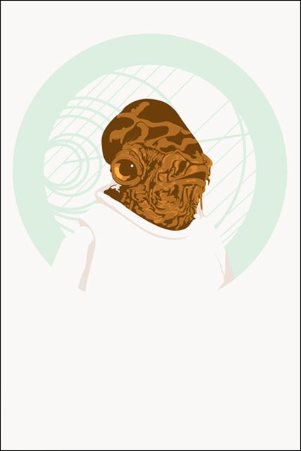
"The Admiral" Art Print
Tracie Ching
16" x 20" - Signed and Numbered
$40 (Currently $35 on Kickstarter) - Edition Size TBD
Inspired By: Star Wars

If "The Princess" still isn't enough Star Wars for you, I thought I'd also mention Tracie's next print, "The Admiral," which can currently be purchased by donating at least $35 to her "Admiral" Kickstarter project. I'm a big fan of her Ackbar inspired poster and have already chipped in my money toward this worthy cause. But most importantly, be confident in the knowledge that...it's NOT a trap!

Wednesday, December 29, 2010

"Star Wars" Movie Posters by Tyler Stout

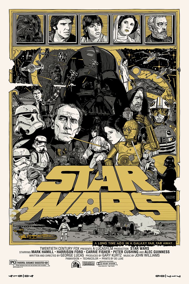
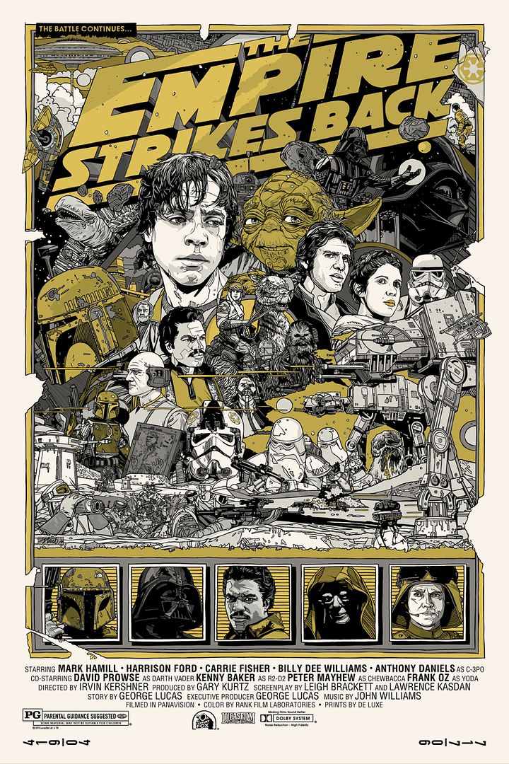
Today turned out to be another wonderful day for art lovers and Star Wars geeks the world over.  This morning Mondo announced the final set of Star Wars movie posters, this time completed by the masterful Tyler Stout.  For those of you who haven't heard of Mr. Stout, he's one of the go-to artists in Mondo's stable and favors a jam-packed, dense, and cluttered aesthetic.  Unlike Olly Moss, who uses negative space to create images within images, Tyler delights in the impenetrable minutia that make up a character’s face or the nicks and cuts on a droid's metal frame.  There's been quite a bit of build up to Tyler's contribution to the Star Wars series and I'm oh so happy to see that he succeeded on every front.

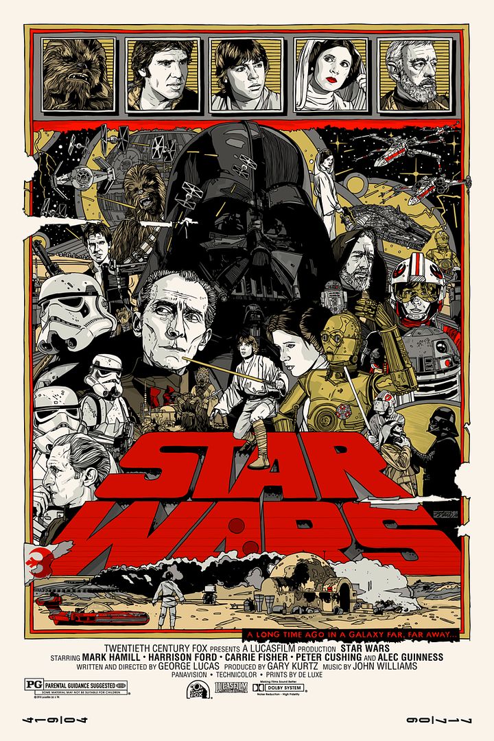
Star Wars - Regular Edition
Star Wars - Variant Edition
There's so much going on in your average Tyler Stout poster that it's often difficult to choose a starting point when reviewing.  I guess we should start off with some of the characters depicted in this gorgeous illustration for the original 1977 film.  Tyler did a bang-up job capturing the glossy sheen of Darth Vader's helmet; you can practically hear the metallic hum of the Dark Lord’s breathing.  I also like what Tyler did with the film's title.  The "Star Wars" wording is like some sort of epic skyscraper enveloping the Tatooine skyline and somehow also managing to act as a platform for Luke Skywalker to strike a slightly awkward heroic pose.  To briefly mention the variant, the gold and silver, a Stout trademark, go a long way in evoking the metallurgic daydreams of our two favorite droids, R2-D2 and C-3PO.

Taken from the UGO article that premiered this artwork earlier today, Justin Ishmael, the man in charge of Mondo, had this to say about the Tyler Stout's Star Wars poster.
"If you look at the Star Wars one, if you kind of start at the bottom and go counterclockwise, Luke is on Tatooine, up the next one you see is him training on the Millennium Falcon with the visor on, and then you go up to him in the X-Wing fighter, and then finally he becomes the Jedi - essentially that’s him posed on the Star Wars logo."
The Empire Strikes Back - Regular Edition
The Empire Strikes Back - Variant Edition
Tyler's use of blue on The Empire Strikes Back poster is a wonderful touch that reminds us of the planet Hoth, a world completely blanketed by snow and ice.  I think I'm definitely more into the regular versions over the variants; there's just something about that added splash of color that give the posters a bit more character.  The AT-AT Walkers are also a nice little bonus as I think Tyler Stout, an artist who thrives on detail, does a great job of outlining all of the metal panels as well as the machine’s laser singed body armor.  Mr. Stout makes clear every point of articulation on machines and humans alike; the specificity with which he draws is really a sight to behold.  This poster also features Boba Fett and Yoda, that's always a big bucket of win to any Star Wars fan.

Justin also briefly spoke with UGO about the amount of time Tyler spent working on The Empire Strikes Back artwork.
"I still can’t believe how much time he spent on Empire.  It’s good that he spent so much time, but it was also very nerve-wracking, as it had to be in approval for so long.  You know, it’s Empire!  This is the big one and I think he really knew it.   
I love the depiction of the Hoth battle, it’s got everything you want.  Everything you think about this movie, you’ve got the Hoth battle, the space slug and even the Millennium Falcon flying out of it."
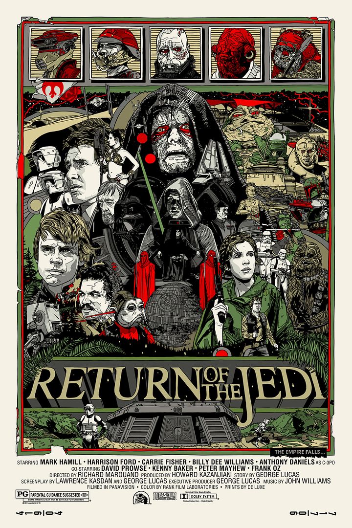
Return of the Jedi - Regular Edition
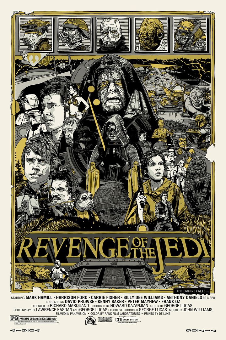
Revenge of the Jedi - Variant Edition
The final poster in the series features Palpatine front and center and Tyler's attention to detail is not doing the man any favors.  I love how on all of the posters he included square icons of some of the main characters featured in the films.  I wonder if Tyler has any plans to release those as handbills in the future.  He's been known to do that you know.  I thought I should also mention the manner in which he presents each poster. Tyler has drawn tears and fold marks onto the images, reminding us all of the way we treated movie posters when we were younger.  Hanging them up on the wall, taking them down, folding them, and then hanging them up all over again – this was all part of the vicious and loving cycle that many posters couldn’t hope to survive.  What also caught my eye was how, out of all the variants, the Return of the Jedi variant has a completely different title.  Instead of the "Return of the Jedi" wording it reads "Revenge of the Jedi."  How crazy is that?

Here’s what Justin had to say about the Revenge of the Jedi title.
"This was the first thing we talked about for the whole Star Wars project.  It was Tyler doing the original three and then Revenge of the Jedi.   
All of the variants are a color change.  All of Tyler’s variants are gold.  It’s his standard thing.  We’ll spend extra money if we think it’s really cool and this is an example.  A New Hope and Empire are color changes to gold and they are all metallic.  But this one we are printing new screens for everything, because it’s like a totally different poster.  
He had to resize the logo, too.  The logo is different enough that it needed to be resized, but we'll go the extra mile to do stuff that’s cool.  If we have to spend money to do it it’s not a problem.  We are fans first.  That’s always what is on our mind."
I did a little additional research (and by research I mean Wikipedia) and apparently a teaser trailer and poster for the film carried the title Revenge of the Jedi, but Lucas changed it to Return of the Jedi before its release because "revenge" was not a Jedi concept.  Very interesting stuff.

I'm really happy to see that Mondo has increased the edition size for these prints.  I'm hopeful that in the future if they're selling Stout or Moss, or any insanely popular artist for that matter, they'll realize their audience has substantially grown since the early days of Mondo Tees and adjust the volume appropriately.  Even if they increase their edition sizes these prints are still VERY limited.  Absolutely nothing is lost if a few more fans are able to get the poster they've been trying to buy since six in the morning.

The final posters in the Star Wars series will be available Friday (12/31) at a random time through Mondo, so if you want a piece of pop culture history you'll need to follow the @MondoNews twitter feed for the exact drop time.  The posters measure 24" x 36" and are all hand numbered.  The regular editions will cost $50 each and are limited to an edition of 850.  The variant editions cost $100 each and are limited to an edition of 250.  These are sure to go quickly.  May the schwartz be with you!

Sunday, December 19, 2010

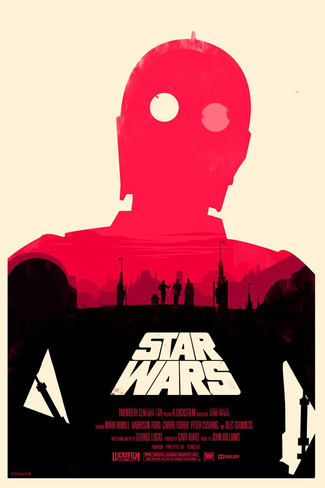
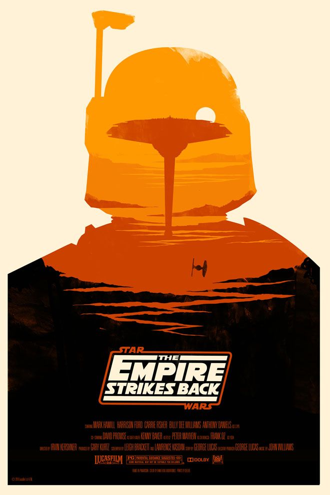
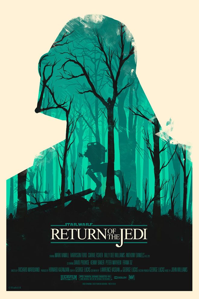
"Star Wars" Movie Posters by Olly Moss

For the three nerds that still aren't aware of Friday's (12/17) internet-melting announcement, Mondo has commissioned fan favorite artist Olly Moss to do full-size movie posters for Star Wars, The Empire Strikes Back and Return of the Jedi.  Commence freak out.  Olly Moss really did a bang up job on all of these prints although I think the Return of the Jedi poster may be my favorite.  A very hearty thanks go out to WIRED for breaking the story, Mondo for commissioning the piece and of course Olly for completely killing it with his stellar designs.

Star Wars
Well this is a gorgeous print.  We've got an outline of a rather dapper looking C-3PO with a wide shot of some beautiful Tatooine scenery, as well as the planet's two suns (AKA the droid's eyes).  Olly Moss really is the master of the clever composition.  He takes shapes and space and can somehow turn what would normally be a boring square or triangle into a character or iconic cinematic moment.  I'd really love to see his process because his brain clearly works better and is entirely more creative than mine could ever hope to be.  I wonder what else he was able to sneak in to this poster?  Moss's ability to shape complicated, and often astute, imagery out of simple and straight forward elements has been his biggest strength in my opinion, but that doesn't mean he's a one trick pony.  Not at all.  His color choice always seems remarkably appropriate for whatever the subject may be and his use of texture gives much of his Mondo work a sense of authenticity and depth.  Whether it be the strong orange in his Rolling Roadshow posters or the retro green predominantly featured in his Lost art print, one thing is for sure: the man knows how to make a captivating image.

The Empire Strikes Back
Another wonderful print.  In many ways I feel like Olly Moss is the anti Tyler Stout.  His designs are always super clean and modern looking, unlike Stout's posters, which are usually filled to the brim with content and bursting with detail.  I am in no way saying that one is better than the other, in fact it's reasons like this that I love and respect Mondo and the artists they choose to work with - diversity is good!  The Empire Strikes Back poster features the iconic bounty hunter Boba Fett and his menacing silhouette, which just so happen to be housing the Cloud City in this wonderfully conceived design.  And again, Moss has cleverly used one of the simpler elements (Cloud City) in the picture to inform the other (Boba Fett's helmet).  There's really nothing I can pick out in any of these posters to complain about.  They're all brilliant.

Return of the Jedi
This is my favorite of the bunch.  I can't exactly place why I like it so much, although I think it may have something do with the fact that it's somewhat similar to his The Evil Dead movie poster, the crown jewel in my art collection.  And this is probably fanboy heresy, but I've got a soft spot for Ewoks.  They're adorable, they're kind of badass in a very juvenile way, and I used to have a cocker spaniel that sort of looked like Chief Chirpa.  Also, this poster features freaking Darth Vader.  Is there a cooler character in the entirety of the Star Wars universe?  Finally, Olly Moss has done a great job of creating a new and sleek looking poster for a classic film series, while also retaining the original whiz bang sense of excitement we all had when first watching the original trilogy.  This in large part is thanks to his use of the original title typography and his own authentic nerdcentric point of view, something which he has proven again and again.  I'm definitely planning on getting all three of the posters, but this is the one I'm REALLY gunning for. 

Olly probably summed it up best when describing his inspiration and excitement in making these posters to WIRED.
"It was so intimidating!  There is such a wealth of great Star Wars art out there already, from paid professionals and from enthusiastic fans.  I suppose my main aim was to make a set of Star Wars posters that were a little different from what people are used to seeing from the franchise, but still retained that essential Star Wars feel.  I started by re-watching the original movies with a sketchbook on my lap, and just sort of went from there."
Olly Moss's Star Wars posters will be available through Mondo on Monday (12/20) for $50 a poster.  If you've got the bankroll, you can snag all three for $150.  The posters measures 24” x 36”, are out of an edition of 400 and will surely sell out within minutes if not seconds.  Be sure to keep your eyes on the @MondoNews twitter feed and/or sign up for Mondo's newsletter to get the scoop.  When you have some free time also be sure to check out Olly's portfolio site and BigCartel store.  May the force be with you.