Showing posts with label Stanley Kubrick. Show all posts

Friday, July 20, 2012

Poster Per Diem: Scrojo's "Dr. Stangelove" Movie Posster

For those wondering what the hell "Poster Per Diem" is / means / smells like, here's my not at all concise description. If you visit this site with any regularity, you already know I tend to write reviews for film and television inspired prints that are either currently on sale or are about to go on sale. And while I'll still be pouring the majority of my efforts into these sorts of posts, my daily "Poster Per Diem" feature will focus on awesome prints that have since sold out or never existed in the first place (AKA concept posters). In other words: this is my chance to say, "I never got a chance, for whatever reason, to write about you on this here website, but I think you're really purty and I want to let the world know." Or something like that. Oh, and Per diem is latin for "per day" or "each day."

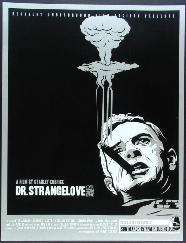
Dr. Stangelove Movie Poster
Scrojo
20" x 26" (Screen Print) - Numbered
Sold Out - Limited to 100

I've seen a few Dr. Strangelove prints in my day, but I can say this is easily the most awesome of the bunch. Scrojo masterfully uses negative space in order to draw the viewer to Sterling Hayden's crazed Brigadier General Jack Ripper and his apocalyptic cigar smoke. This is one poster that I always wish I had gotten back when it was a bit more affordable. Here's hoping Scrojo does a few more movie / television inspired prints in the near future. Head over to scrojo.com to learn more about this talented dude.

Thursday, July 19, 2012

Poster Per Diem: Jay Shaw's "Paths of Glory" Movie Poster

A hearty thanks (and free print) go to reader Brett Smith who came up with the awesome title for my new daily poster column "Poster Per Diem." What do you think? Personally, I'm rather fond of it. For those wondering what the hell "Poster Per Diem" is / means / smells like, here's my not at all concise description. If you visit this site with any regularity, you already know I tend to write reviews for film and television inspired prints that are either currently on sale or are about to go on sale. And while I'll still be pouring the majority of my efforts into these sorts of posts, my daily "Poster Per Diem" feature will focus on awesome prints that have since sold out or never existed in the first place (AKA concept posters). In other words: this is my chance to say, "I never got a chance, for whatever reason, to write about you on this here website, but I think you're really purty and I want to let the world know." Or something like that. Oh, and Per diem is latin for "per day" or "each day."

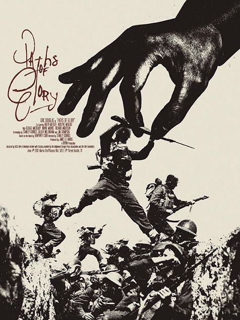
Paths of Glory Movie Poster
Jay Shaw (AKA Iron Jaiden)
18" x 24" (Screen Print) - Numbered
Sold Out - Limited to 225

I'll be honest, I own a ton of art that I absolutely adore, but that I'm fairly certain would never elicit any sort of appreciation from my non-poster collecting pals. But when I see something like Shaw's Paths of Glory poster, I'm hard pressed to imagine anyone who could think this print was anything but beautiful. Also, I would happily accept this as the new official artwork for Criterion's Paths of Glory packaging. If someone out there has seen fit to DIY themselves a Blu-ray cover out of Jay's work, shoot me an email. To learn more about Jay Shaw, head over to kingdomofnonsense.com and follow him on Twitter @tweetofnonsense.

Wednesday, August 24, 2011

Tim Doyle's "Full Metal Jacket" Movie Poster

When I wrote about Martin Ansin's classy El Topo poster last week, I stressed my disbelief that his artwork was still somehow available for purchase. Well it's time for me to flex those muscles again. Tim Doyle also created something for Cinéma du Parc's “J’ai tué le photographe” show, which has, since then, sold out through von Scaramouche, but is still available through Doyle's Nakatomi Inc. Do you hear that? It's getting louder. Here it comes...How has this not sold out already?!

Full Metal Jacket Movie Poster
Tim Doyle
18" x 24"
$30 - Limited to 200

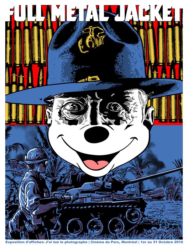
If you've ever seen Stanley Kubrick's Full Metal Jacket (and shame on you if you haven't), then you'll immediately understand the division between the top and bottom half of this print. Much like Tim's poster, the film is divided into two parts: the first half taking place at Parris Island where a group of wet-behind-the-ears Marine recruits are going through training, while the second half jumps forward to a war-torn Vietnam and a sometimes sadistic, always world-wary group of vets. This brings me to the biggest reason I like this poster: the schism in style, tone, and execution between the print's two halves.

In the upper half, Doyle uses the face of Gunnery Sergeant Hartman (played by the extraordinary R. Lee Ermey) to practically fill up the entire top section, similar to how Hartman dominates the soldiers' lives. And behind the demanding drill sergeant, Doyle has placed a luminous brassy wall of bullet casings. I'm sure I'm reaching here, but war is a bright shiny thing to these young jarheads at the beginning of the film, a scary thing as well, sure, but exciting nonetheless. Tim Doyle manages to capture both the fear and respect that the recruits have for their teacher / tormentor and inserts the practically glowing ammunition to represent an innocence not yet lost (although Gomer Pyle sees that there's an end to that). The bottom section is sullen, dark, and gloomy, much like Joker in the latter half of the film. And finally we come to Mickey Mouse. Not only is Mickey a uniquely American symbol, but he's also a character that represents optimism, good will, and a lot of other things that seem completely at odds with the movie, and for that reason all the more revoltingly prominent. These two halves, much like the film, come together to create something greater than the whole of their parts and something that definitely needs to be seen to be appreciated. With that said, it's late and I'm tired, so I'm going to take the easy way out and provide you with Tim Doyle's astoundingly more concise and accurate (he did create the thing after all) description of his Full Metal Jacket poster and its meaning (taken from Doyle's portfolio):
"I saw Full Metal Jacket at WAAAAAYYYY too early of an age, and it formed my opinion on war in a brutal 2 hour salvo. That opinion? It’s not for me. As a work of art, the film is a difficult one- the tone shifts considerably at just about the half-way point- it’s essentially 2 films that just happen to have the same lead. But both show the complete dehumanization one must undergo in the process of becoming war-ready, and in the execution of it. The vulgar phrase, “Sally-Jane Rottencrotch’s pretty pink panties” fall on the ears like the memory of a soft lullaby of wholesomeness compared to the spray of bullets and stacks of human meat later in the film. The ubiquitous MOUSE ends each chapter in the film (in epithet and song) and presents a smiling face, now obscene in it’s ineffectual innocence. And to be honest, I think it balances the poster out nicely."
Tim Doyle's Full Metal Jacket poster is currently available through his Nakatomi Inc store for the low, low price of $30. The screen print measures 18" x 24" and is limited to an edition of 200. To learn more about the talented fellow behind this artwork be sure to visit mrdoyle.com, nakatomiinc.com and follow @NakatomiTim.

Thursday, March 3, 2011

Rhys Cooper's "A Clockwork Orange" Movie Posters

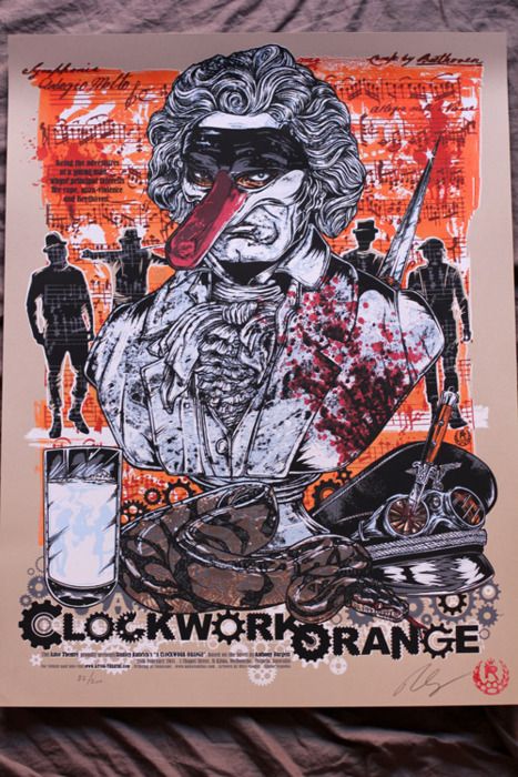
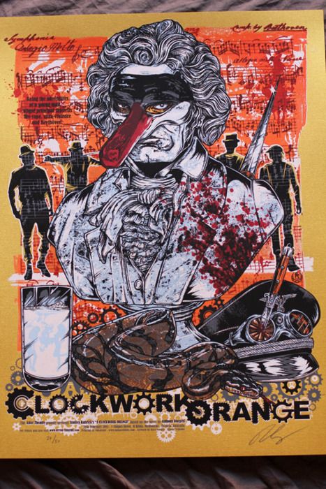
Alright, alright, so I guess I lied when I said no more Kubrick posters this week, but this is kind of a big deal and I just found out about it today. Tommy Good, the fine folks who handle all of the poster releases for Melbourne's Astor Theatre, have just announced their next release - A Clockwork Orange print by Rhys Cooper. Is your heart racing yet? I've already briefly (very briefly) explained my love for Kubrick's dystopian tour de force, so I won't delve to deeply into that this time around, but I did want to comment on the astonishing level of detail and complexity present in these prints. This design is just dripping with Cooper's trademark bloodletting splatter style artwork and can be a bit frightening to take in, but then again so can A Clockwork Orange.

A Clockwork Orange - Regular Edition

A Clockwork Orange - Variant Edition (Printed on Gold Foil Stock)

Is that Beethoven with a rather phallic looking mask? Yep. In case you couldn't tell just by looking at these posters, A Clockwork Orange is kind of a strange / brilliant / amazing movie. And as is often the case with his art, Rhys has packed a ton of stuff into this striking image, including a snake, a glass of milk laced with narcotics (no doubt from the Karova Milk Bar), a silhouette of the gang, and of course the aforementioned Beethoven bust, all set against a colorful page of sheet music. These posters seem to really capture the manic "ultra-violence" that is Alex's primary drug of choice. I'm really not sure which version I like better, the regular or the variant printed on gold foil stock. On the one hand, I tend to go with the less showy (and always cheaper) edition, but on the other hand, the garishness of the gold variant perfectly reflects Alex's bombastic personality. I'm also loving the title work Rhys did here. I especially appreciate the cog-within-a-cog transition he used to connect the "K" and the "O."

I highly recommend visiting Tommy Good, where you can find an excellent interview with the artist, but I wanted to excerpt the bit of the conversation that focused on his inspiration.
"[I've] always been a fan of Clockwork and one of the parts that fascinated me was Alex's relationship with his parents and how they had no idea what he was really like. How could you not be suss of a kid who has a combination lock on his bedroom door? He has a record player, images of Beethoven and his python under his bed, it is the real Alex who lives in there and kinda like his trophy room so that is the approach I took with the poster. Like a bedroom shelf."
Both 18" x 24" Clockwork Orange posters will be available for purchase at some point next week through the Tommy Good website / storefront. The gold foil variant is limited to an edition of 50, while the regular edition will be limited to 200, and both posters are signed and numbered. Be sure to sign up for their newsletter as well as follow @ThisIsTommyGood to get the exact date and time of the drop. Since these posters were printed by Tim Doyle's Nakatomi Inc. there's a good chance that they'll be available at some point down the road through Nakatomi, but you probably don't want to risk losing out. For additional Rhys Cooper artwork head over to his Studio Seppuku store. Finally, the only way I could properly end this post is with a quote from the film.
"There was me, that is Alex, and my three droogs, that is Pete, Georgie, and Dim, and we sat in the Korova Milk Bar trying to make up our rassoodocks what to do with the evening. The Korova Milk Bar sold milk-plus, milk plus vellocet or synthemesc or drencrom, which is what we were drinking. This would sharpen you up and make you ready for a bit of the old ultra-violence." - Alex

Tuesday, March 1, 2011

Stanley Kubrick-Inspired Movie Posters by Adam Maida

I promise this is my last Stanley Kubrick-related post of the week. I found these gorgeous images today and was completely floored. I'll start with the most recent one and work my way back from there. If you're a lover of Kubrick, then you'll no doubt be in paradise for the next several minutes.

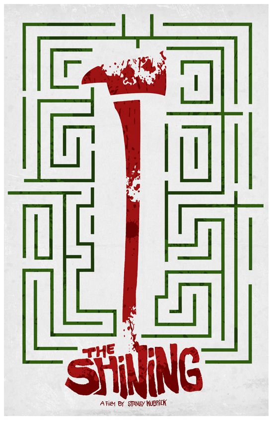
The Shining

I found this one by way of the Minimalist Movie Posters blog (which actually led me to the artist's Tumblr page, where I saw the rest of his Kubrick work) and found myself quite liking it. Is it weird that something can make you think of Christmas (the green and the red), while also conjuring images of blood, murder and insanity? The type and color Adam used for The Shining title is pitch perfect, and the dark red on lighter red color scheme really conveys the chaos and menace that this movie exudes. Unfortunately, this poster is not currently available for purchase (the next two are though), but I'm sure we'll be seeing this in his Etsy store at some point in the near future.
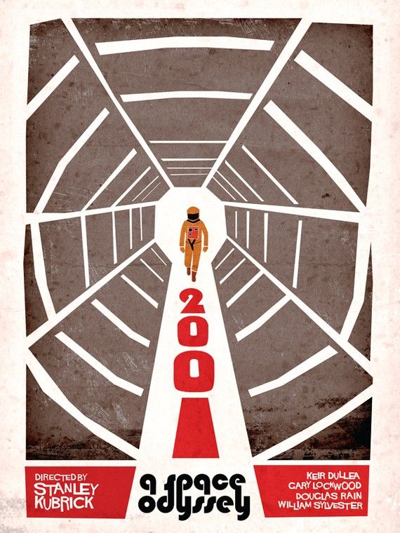
2001: A Space Odyssey

Here's a retro take on Kubrick's science fiction spectacle 2001: A Space Odyssey. Maida's 2001 poster has a very cool 60's look, similar to the now very recognizable Saul Bass aesthetic. He totally nailed the astronaut and the antiseptic paranoia that HAL 9000 and the vacuous void of space create. Unlike the previously mentioned Shining poster, Adam Maida's 2001 poster can be purchased and only costs $25 through his Etsy store. The poster measures 18" x 24" and appears to be an open edition. And on a completely separate note, the 2001 Blu-ray is one of the most beautiful transfers I've ever seen - it looks like it could have been filmed yesterday.

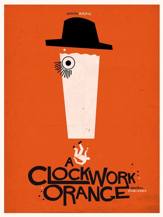
A Clockwork Orange

This is my second favorite Kubrick film after Dr. Strangelove. A Clockwork Orange somehow still manages to shock me every time and watching a hungry, intense Malcom McDowell is always a treat. Here Adam has taken advantage of, and reinterpreted, the iconic shot of the young, criminally reprehensible Alex, fake lashes and all. This poster isn't bursting with detail or brimming with double-meanings, but it's a very fitting representation of Kubrick's sometimes disturbing, always darkly comedic vision. This poster is also available as an 18" x 24" print for $25 through Adam's Etsy store. Be sure to visit his blog to see even more of his stylish artwork and if you're a fan of The Royal Tenenbaums, Adam has a created some really great movie posters in honor of one of my favorite dysfunctional families.

Monday, February 28, 2011

Livia Lucie's "Full Metal Jacket" Movie Poster

I'd been meaning to write about this print for a while now, but kept forgetting until today. I guess there's just too many amazing posters out there (this is a good thing). The films of Stanley Kubrick are pretty mindblowing and I'm not sure I could ever be friends with someone who doesn't love at least a fraction of his filmography. One of my favorites is Full Metal Jacket (although my number one Kubrick film will forever be Dr. Strangelove). I really loved his take on the Vietnam war, and although I think the whole movie is a masterpiece, it's the first half, the part that takes place on Parris Island during recruit training, that truly blows me away (no pun intended).
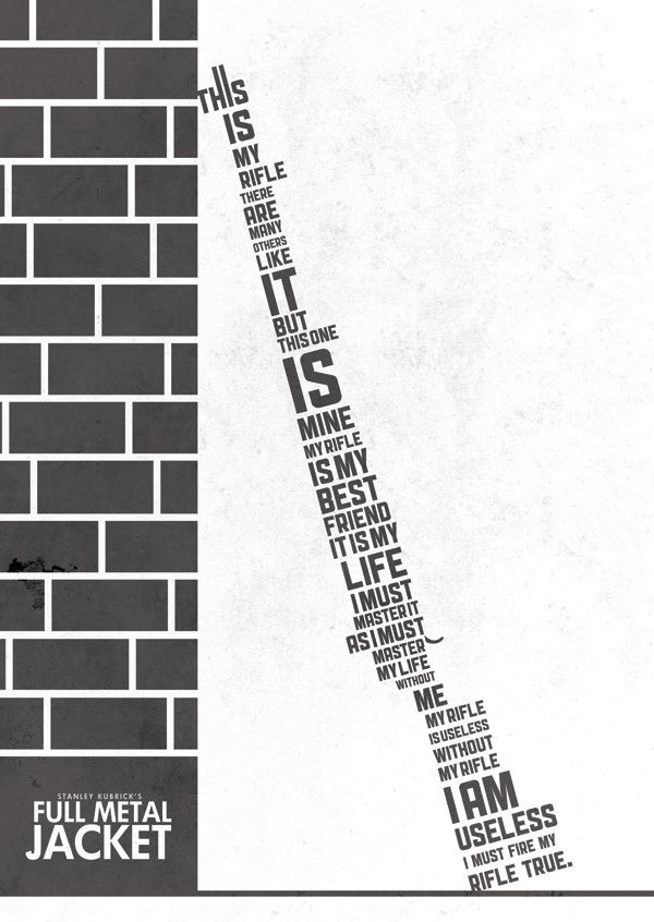

Full Metal Jacket

Artist Livia Lucie created this mind boggling typographic masterpiece in honor of one of the greatest war / anti-war films ever made. For anyone who's seen Full Metal Jacket, or served as a Marine for that matter, you'll immediately recognize the Rifleman's Creed that has been shaped to create the body of said rifle; it's inventive, creepy and beautiful all at the same time. I'd love to see an entire series from Livia dedicated to the films of Kubrick, each with its own clever composition. Over the span of my obsession with poster art I've seen some great type-centric posters, especially as minimalist posters have really started picking up steam over the last year, but I have to say, this may be one of my favorites (definitely top three).

The A3-sized (equivalent to 11.69" X 16.54") Full Metal Jacket print is available right now through the Picmix Store for £12 (or around $19). The storefront says it's a limited edition print, but I'm not seeing the edition size anywhere. If you're having any hesitation about picking one of these up, put it away, because not only will you be buying an awesome poster, 10% of all sales will go toward Wateraid, an organization attempting to improve access to safe water, hygiene and sanitation in the world's poorest communities. It's a win-win. To learn more about Livia Lucie head over to her website and check out her blog. If you've got some extra money lying around, would you mind commissioning her to do another Kubrick-inspired print? I'd really appreciate that. Thanks!

Wednesday, February 23, 2011

Disturbia Clothing's "Travis Bickle" & "Redrum" Art Prints

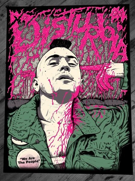
Taxi Driver is easily one of my top ten films of all time and possibly my favorite Scorsese film (although I also happen to love Casino). Disturbia Clothing, a company I'm not all that familiar with has recently released a Taxi Driver-inspired art printed, titled "Travis Bickle." But wait, there's more. Disturbia had also previously released The Shining-inspired art print, titled "Redrum." Pretty cool, right?

Travis Bickle
This print captures one of the films most iconic scenes (in a film filled with iconic scenes) near the very end of its runtime. In terms of photo realism, it's pretty spot on. And in a funny way, this print and the film have more in common then one would think. Taxi Driver, a film that really pushed the envelope of what was acceptable in cinema (as many films of the 70s did), had an issue with the MPAA and in order to get an R rating, Scorsese was forced to desaturate the color of the blood to make it less realistic looking. This print also features blood that, while not desaturated in any way (quite the opposite, in fact), has certainly been tampered with and makes the blood less realistic in appearance and indeed more stylistic. Wow - okay, that might have been a bit of a reach on my part, but you've got to respect me for trying! Anywho, the "Travis Bickle" art print is available through Disturbia's store in the 'Art Prints' section for £17 (roughly $27) plus shipping. The screen printed poster measures 18" x 24" and is limited to an edition of 50. Get'em while they're hot!

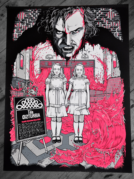
Redrum
Reprinted from a previous review I had written on the "Redrum" art print: Somehow Kubrick's The Shining is one of those rare films that continues and, in my opinion, will continue for a long long time, to inspire artist to create some magnificent (read: horrifying) artwork. What a masterful layout. Using Jack Torrance’s outline as a frame for the twins and elevators of blood? Brilliant, brilliant stuff. Add to that the inspired inclusion of the labyrinth and you’ve got one amazing design. I have to admit I wasn’t sure how I felt about the lighter almost-pink blood for about the first five seconds, but now I’m all in. The incoming flood of sanguine fluid really draws in the eye. The "Redrum" print measures 18" x 24" and is limited to an edition of 50 for the low cost of £17 (around $27) through Disturbia's online store. These have been on sale for a while, so I can't imagine there are that many left. You can check out the artist, Michele Boscagli, through his Myspace page.

As a reminder for those of you that haven't entered the Posterocalypse Fighter giveaway yet, I'll be giving away The Fighter movie poster by Alan Hynes and a mystery print on February 28th to one lucky person who leaves a comment with their name and email address (US only) in last Saturday's blog post (it was titled "Giveaway - The Fighter by Alan Hynes"). Good luck!