Showing posts with label Brandon Schaefer. Show all posts

Tuesday, March 19, 2013

Contest: Brandon Schaefer's "The Wicker Man" Poster

UPDATE (4/22): The contest officially ended on Friday (4/19) and a winner has been chosen. There were some really great write-ups, but in the end we decided on Gary Alcock's entry. In it, Gary talks about his first viewing of the film and how his feelings about the movie have since changed. Congrats, Gary! You can still read all the entries in the comments section below. Thanks to all of those who entered!


It's contest time, folks! I've got number 1 of 50 of Brandon Schaefer's stunning The Wicker Man print up for grabs. And guess what? All you need to do to win it is tell us why you love / respect / admire / whatever The Wicker Man. Maybe you could write about your first experience with the film or that one time you and a few friends sacrificed that virginal copper to the old gods for harvest. Who knows? It's completely up to you. Not bad, right? Please leave a comment below with your (brief or long) write-up and an email address where I can reach you should you be the lucky winner. This contest is open internationally and will be ending on April 19th, meaning you have an entire month to come up with something good. The winner will be chosen based on his or her story / anecdote / what have you. Now have at it!

The Wicker Man Movie Poster
Brandon Schaefer
26.5" x 38.5" (Screen Print) - Numbered
£40 (UK) / £50 (International) - Limited to 50

As a quick reminder, Schaefer's The Wicker Man is currently available through the FrightFest Originals website and measures 26.5" x 38.5. There's also a bunch of other great film prints, including posters for Razorback, Hostel, Martyrs, Zombie Flesh Eaters, and Night Breed. To see more of Brandon's work, visit seekandspeak.com, silverscreensociety.com, and follow @seekandspeak on Twitter. For the latest news on FrightFest Originals, head over to frightfestoriginals.com, sign up for their mailing list, and follow @frightfestorigi.Good luck!

Thursday, March 14, 2013

Brandon Schaefer's "The Wicker Man" Movie Poster

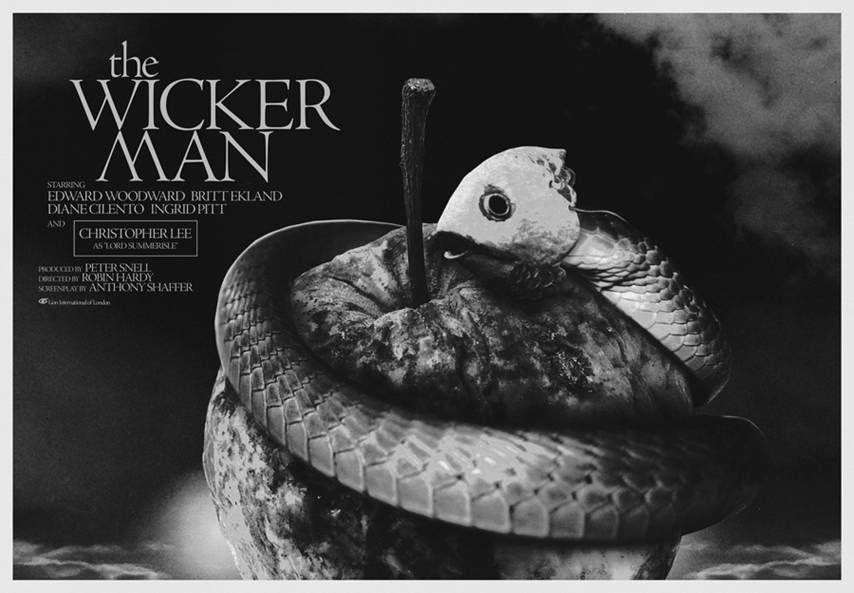
Summer is icumen in, loudly sing cuckoo. Grows the seed and blows the mead, and springs the wood anew. Sing, cuckoo! Ewe bleats harshly after lamb, cows after calves make moo-- Oh, sorry abou that! I didn't see you standing there. I was just singing a little tune I picked up somewhere or another, but I guess I should get going on this whole review thing. The Wicker Man is one of those titles that immediately conjures up two separate and opposing things. You may fondly remember the 1973 cult classic starring Christopher Lee and Edward Woodward that not only tells an engrossing tale, but also explores a world filled with conflicting beliefs and the sometimes sinister sacrifices required by faith. Or you might immediately recall the 2006 Nicolas Cage-starring remake which has itself become a cult film of sorts, though mainly because of its "so bad it's good" reputation. While I'm glad we live in a universe where both of these things can somehow harmoniously coexist, I'm even happier to declare that Brandon Schaefer's print honors the former film of the two and is as artful as it is mysterious.

The Wicker Man Movie Poster
Brandon Schaefer
26.5" x 38.5" (Screen Print) - Numbered
£40 (UK) / £50 (International) - Limited to 50

Brandon's poster is rife with symbolism and speaks directly to the film's central themes of faith, temptation, life, and death by cleverly subverting religious iconography (exhibits A and B: the rotten apple and the pseudo-serpent). I'm probably reading a bit too far into this with my next point, but I think it's interesting how, due to the print's monochromatic color scheme, many of its elements seem to be meld together, refusing any clear delineation and suggesting there are no easy answers. Though before I get too serious, let's not forget that while the original Wicker Man is a beautiful and terrifying film in many respects, it's also laughably nutty in all the right places, and I think Schaefer has tapped into the strange surrealism that helped make the movie so memorable. But the pièce de résistance here is that this may be the only Wicker Man poster that doesn't feature the wicker man, which I think is utterly awesome. Ultimately, Brandon's print offers up a grim, but beautiful interpretation of the film that's sure to spark many a conversation, as great art often does.

Here's what the artist had to say about his original intentions regarding the Wicker Man artwork (taken from the Seek and Speak tumblr):
"As for Wicker Man, the poster pulls from a lot of different places, but the main thrust plays off of the Christian story of the serpent offering an apple from the tree of knowledge and the consequences that come from taking that deceptive offering. It felt like it synched up with so much that was going on throughout the film. Howie is a devout Christian who, after being deceived and learning the truth about Summerisle, finds himself cast out of the world, alone in a burning effigy, crying out for God. The island of Summerisle is famous for it’s apples, stemming from an earthy crunchy set of beliefs. That society is ultimately rotten, however, given the foundations that it’s based on. The fish mask on the snake is a nod to the final act of the film which, well…is more than a little bizarre."
If you haven't yet experienced The Wicker Man do yourself a favor and watch this hypnotic trailer and then immediately purchase the film.


Brandon Schaefer's Wicker Man print will be available tomorrow (3/15) through the FrightFest Originals store at £40 and £50 for UK and international buyers, respectively. The print measures 26.5" x 38.5" and is limited to an edition of 50. To see more of Brandon's work, visit seekandspeak.com, silverscreensociety.com, and follow @seekandspeak on Twitter. For the latest news on FrightFest Originals, head over to frightfestoriginals.com, sign up for their mailing list, and follow @frightfestorigi.

Thursday, September 13, 2012

Best Of: Bottleneck Gallery's "More Than You Imagined" Art Show

Bottleneck Gallery's first big show, "More Than You Imagined," opened last Friday and appears to have been a smashing success. So much so, in fact, that when the prints went online the influx of folks visiting thebottleneckgallery.com crashed the site and forced Bottleneck to move to a bigger server. Well, good news, the site and storefront are now very stable and there is a ton of great artwork currently available for purchase. Today's "Best Of" post will be a little different than my usual, but I'll get to that in a second. First, I wanted to talk a little more about the show itself, starting with its premise (taken from Bottleneck Gallery's website):
"Television plays a crucial role in our lives, influencing our opinions, actions, and daily routine. It is only natural that the small screen would also influence art, linking the two through memorable stories and images. Bottle Neck Gallery has decided to embrace this connection and commission an incredible group of artists for 'More Than You Imagined: Art Inspired by Premium Cable.' This exciting and entertaining exhibit will feature work influenced by some of the most popular HBO, Showtime, and Starz programs, giving you a reason to get off of the couch."
Now that's something I can get behind. Premium cable's original programming was a turning poing in the movie vs. television argument, with shows like The Sopranos and The Wire forever changing our entertainment landscape. Below, I've included my favorite pieces from the "More Than You Imagined" exhibit that are still on sale and have broken up its contents by show and network. Have at it and let me know what you think!

Band of Brothers (HBO)

"Band of Brothers" Art Print
Paul Shipper
16" x 24" (Giclée) - Numbered
$60 - Limited to 20
Inspired By: Band of Brothers

Note: This paragraph should be read with the "Star Spangled Banner" playing softly in the background. Band of Brothers is so good, it deserves to be watched on a yearly basis (preferably sometime around the 4th of July.) Brothers makes you want to be a better person. Paul Shipper's print masterfully captures that sense of heroism and would likely make for a great gift to the war buff in your life. Shipper's Band of Brothers inspired print is available through Bottleneck Gallery for $60. To learn more about the New Zealand-based artist, head over to paulshipper.com and follow @paulshipper on Twitter.

Boardwalk Empire (HBO)

"Half A Gangster" Art Print
Kevin Justin Ang
18" x 24" (Screen Print) - Numbered
$30 - Limited to 50
Inspired By: Boardwalk Empire
"The Tin Man" Art Print
N.E. (New Flesh Prints)
18" x 24" (Screen Print) - S / N
$35 - Limited to 65
Inspired By: Boardwalk Empire

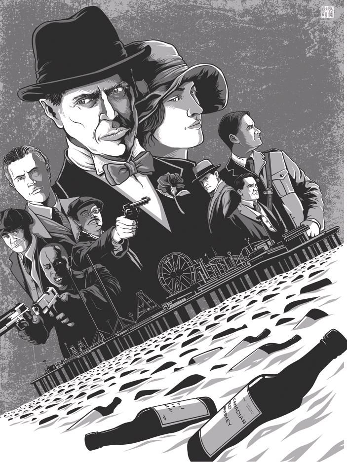
Now, I'm a bit behind in my Boardwalk Empire viewing, but I've finished the first season and can attest that the Scorsese-produced series has all the visual elements necessary to inspire some fantastic Prohibition Era artwork. Sure enough, Kevin Ang and the guys at New Flesh Prints were up to the task. Both prints beautifully highlight the show's often morally-nebulous characters with a monochromatic, but by no means nostalgic, aesthetic. "Half A Gangster" and "The Tin Man" prints are now available for $30 and $35 respectively. To learn more about Kevin, visit his deviantART page. And to learn more about New Flesh prints, I'd recommend heading over to newfleshprints.com, and following @newfleshprints and @NEnewflesh.

Carnivale (HBO)

"A Dark Heart Dwells Where Branches Meet" Art Print
Brandon Schaefer
12" x 18" (Screen Print) - Numbered
$25 - Limited to 50
Inspired By: Carnavale

I freaking loved Carnivale and was devastated when it was cancelled after only two seasons. Part period piece, part Russian nesting doll made out of mystery and enigma, Carnivale was a blast to experience and, as he's wont to do, Brandon Schaefer created a compelling and appropriately mysterious poster. "A Dark Heart Dwells Where Branches Meet" is currently available through Bottleneck Gallery's website for $25. To see more of Brandon's work, visit seekandspeak.com and follow him on Twitter @seekandspeak.

Dexter (Showtime)

"Dexter's Secret" Art Print
Tony Bui
16" x 20" (Giclée) - Signed and Numbered
$50 - Limited to 10
Note: Dexter

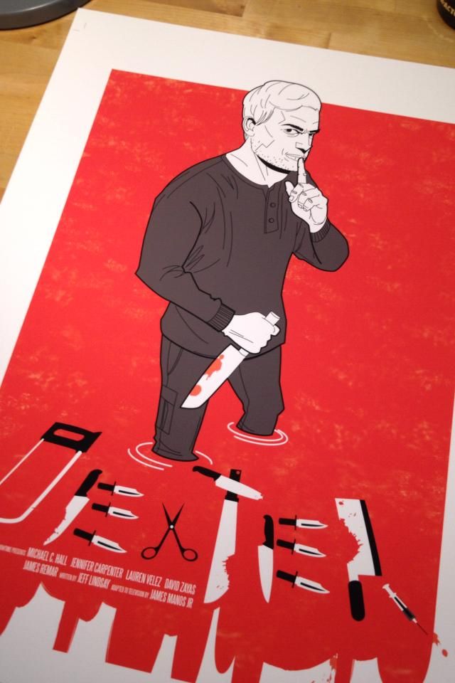
Tony Bui, an artist I wasn't familiar with until today, has created a fairly terrifying (and awesome) print inspired by everyone's favorite serial killer. And as a huge fan of creative typography, it doesn't get much better than a title comprised entirely out of the tools necessary for murder and / or body disposal. "Dexter's Secret" is ready to be purchased for $50. The print is limited to an edition of 10 and measures 16" x 20". I'm not 100% sure if this is the correct Tony Bui, but it may be worth checking out tonybuifanclub.com.

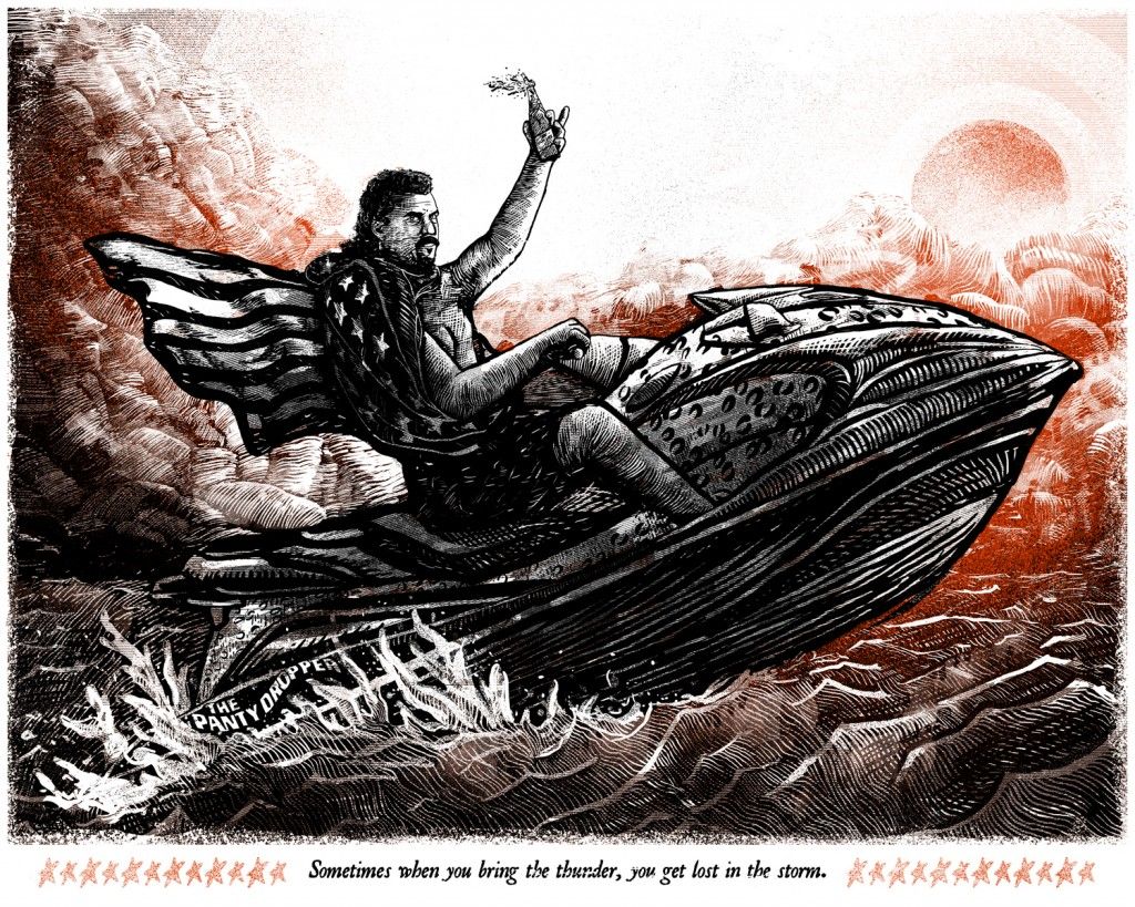
Eastbound & Down (HBO)

"Kenny Powers" Art Print
Zeb Love
20" x 16" (Screen Print) - Numbered
$25 - Limited to 45
Inspired By: Eastbound & Down

All I've got to say to this is, "F**k yes!" Zeb Love's Eastbound & Down inspired print is the pitch perfect (get it?) representation of Kenny Power's philosophy (and his profanity-laden audiobook.) This great looking print is still available for $25, which is a pretty unbelievable price for something this intricate. For more Zeb-related insanity, head over to zeblove.com and follow @zeb_love on Twitter.


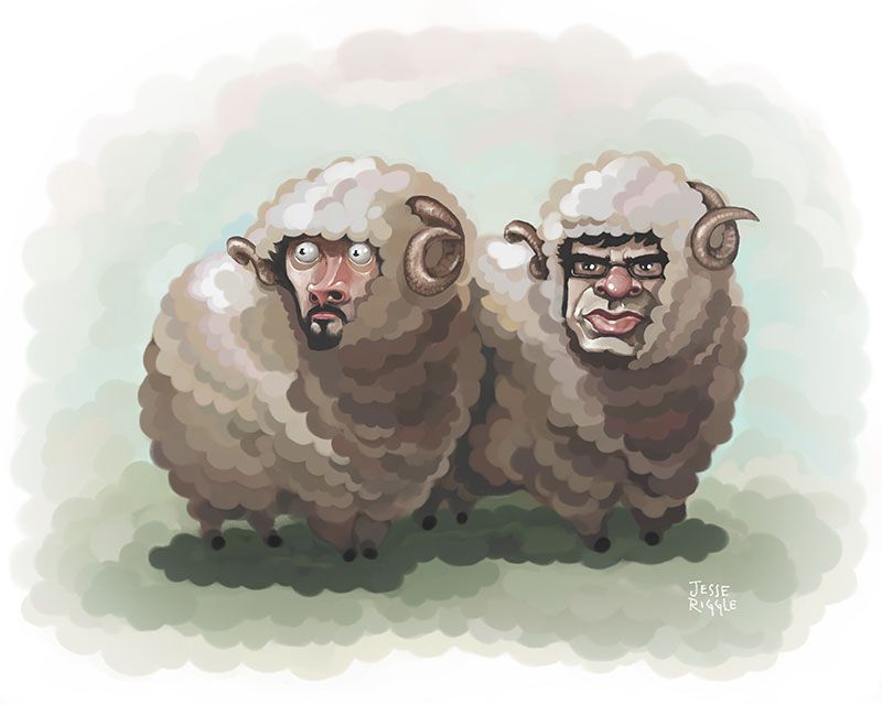
"Flock of the Conchords" Art Print
Jesse Riggle
8" x 10" (Giclée) - Signed and Numbered
$30 - Limited to 20
Inspired By: Flight of the Conchords

Conchord's "The Most Beautiful Girl [in the Room]" still gets constant play in my household. In fact, with all this recent wedding planning nonsense, I've found that the Brett and Jemaine composed opus has been chosen as the first dance song by a decent amount of people. Believe you me, I was tempted. Thankfully, cooler heads prevailed and we decided on Tim and Eric's sublime "I Sit Down When I Pee." (Apologies for that terrible joke, folks.) Brooklyn-based artist Jesse Riggle channeled his inner Kiwi and created a gorgeous looking portrait of the two musicians in their natural habit (i.e., sheep bodies), that's a must own for any fan of the show. Riggle's "Flock of the Conchords" print is now available for only $30 through the Bottleneck website. To learn more about the artist, visit jesseriggle.com and follow @jesseAlso.


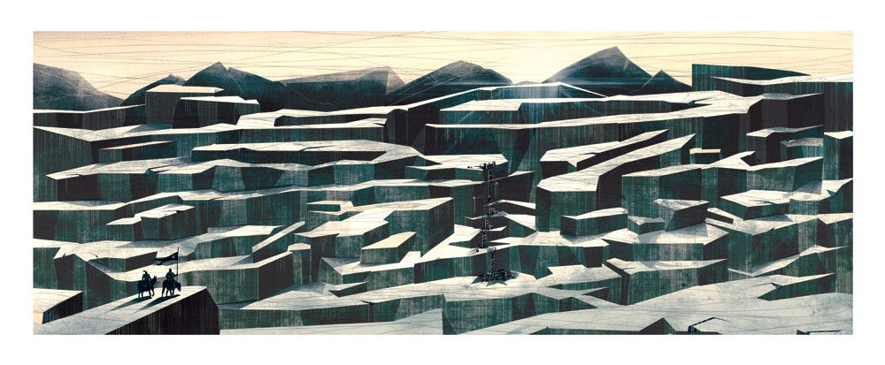
"Winter is Coming" Art Print
Marie Bergeron
27.25" x 11.25" (Giclée) - Signed and Numbered
$80 - Limited to 20
Inspired By: Game of Thrones

"Game of Musical Chairs" Art Print
Isaac Bidwell
12" x 18" (Giclée) - Numbered
$30 - Limited to 50
Inspired By: Game of Thrones
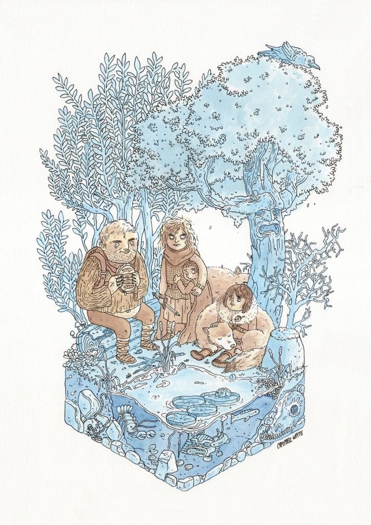
"Born to Run" Art Print
Campbell Whyte
11.75" x 16.5" (Giclée) - Numbered
$30 - Limited to 10
Inspired By: Game of Thrones

Game of Thrones seems to be the show that everyone wanted to create artwork for. And why not? It's an epic sword and (minimal) sorcery tale that feels far more realistic than you would ever think possible. In other words: there's a lot of inspiration to be had what with all the skulduggery present in the Seven Kingdoms. The three prints above ("Winter is Coming," "Game of Musical Chairs," and "Born to Run") represent a vast spectrum, with one being hilarious, another a beautiful (if barren) vista, and a third falling somewhere in between. It's that diverse creativity, which goes to show you how affecting the series can be and how brilliantly conceived the show is to warrant such dedication. "Winter is Coming," "Game of Musical Chairs," and "Born to Run" are all available through the Bottleneck Gallery storefront. To see more of about the artists, visit mariebergeron.com, isaacbidwell.com, and campbellwhyte.com.

Homeland (Showtime)

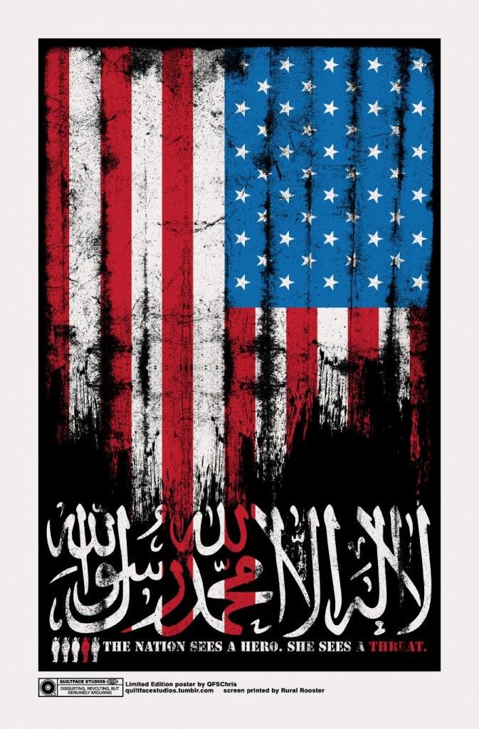
"Hero or Threat?" Art Print
Chris Garofalo
12.5" x 19" (Screen Print) - Numbered
$20 - Limited to 40
Inspired By: Homeland

Truth time: I haven't seen a single episode of Homeland ever. Don't get me wrong, I plan on changing that, but I've got a few shows higher on the priority list right now. With that said, while I may not have seen the series, I'm familiar enough with the synopsis to appreciate Chris Garofalo's inspired print. Garofalo's art often has a grimy sort of sheen over it, which lends his work a lived-in and slightly dangerous look. This approach worked for his Hellraiser poster and it works here too. The "Hero or Threat?" screen print is available through Bottleneck for only $20. For more info on the artist, please visit his Tumblr and follow @QFSChris on Twitter.

Weeds (Showtime)

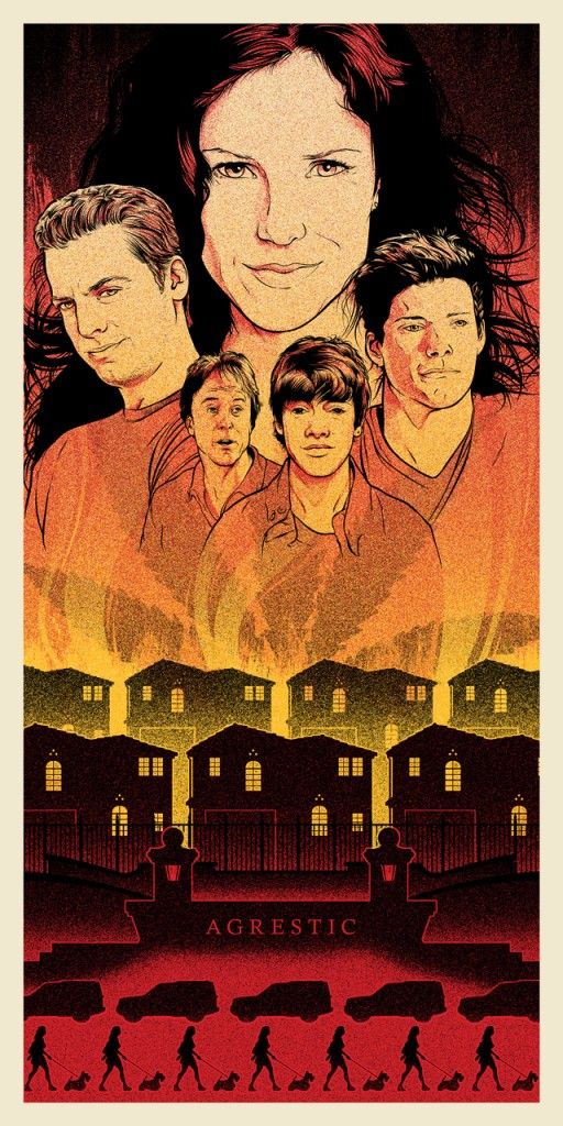
"Agrestic Burning" Art Print
Joshua Budich
12" x 24" (Screen Print) - Signed and Numbered
$30 - Limited to 100
Inspired By: Weeds

I think I enjoyed Weeds more at the beginning than I did in later episodes, but I always thought the premise was great. Posterocalypse favorite Joshua Budich, with his usual skill and aplomb, has chosen to depict the community of Agrestic in all its uniform glory under the weight of a fiery and destructive ganja-related force. Overseeing all of this devastation is the Botwin family and their accountant friend Doug Wilson. Budich's "Agrestic Burning" is available through Bottleneck Gallery for $30 and is limited to an edition of 100. To see more of the artist's work, be sure to visit joshuabudich.com and follow @jbudich on Twitter.

The Wire (HBO)

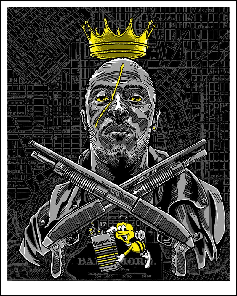
"King of Baltimore" Art Print
Tim Doyle
16" x 20" (Screen Print) - Numbered
$40 - Limited to 150
Inspired By: The Wire
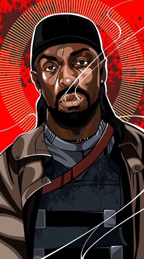
"The Saint of West Baltimore"
Samuel Ho
11" x 19" (Giclée) - S / N
$35 - Limited to 10
Inspired By: The Wire

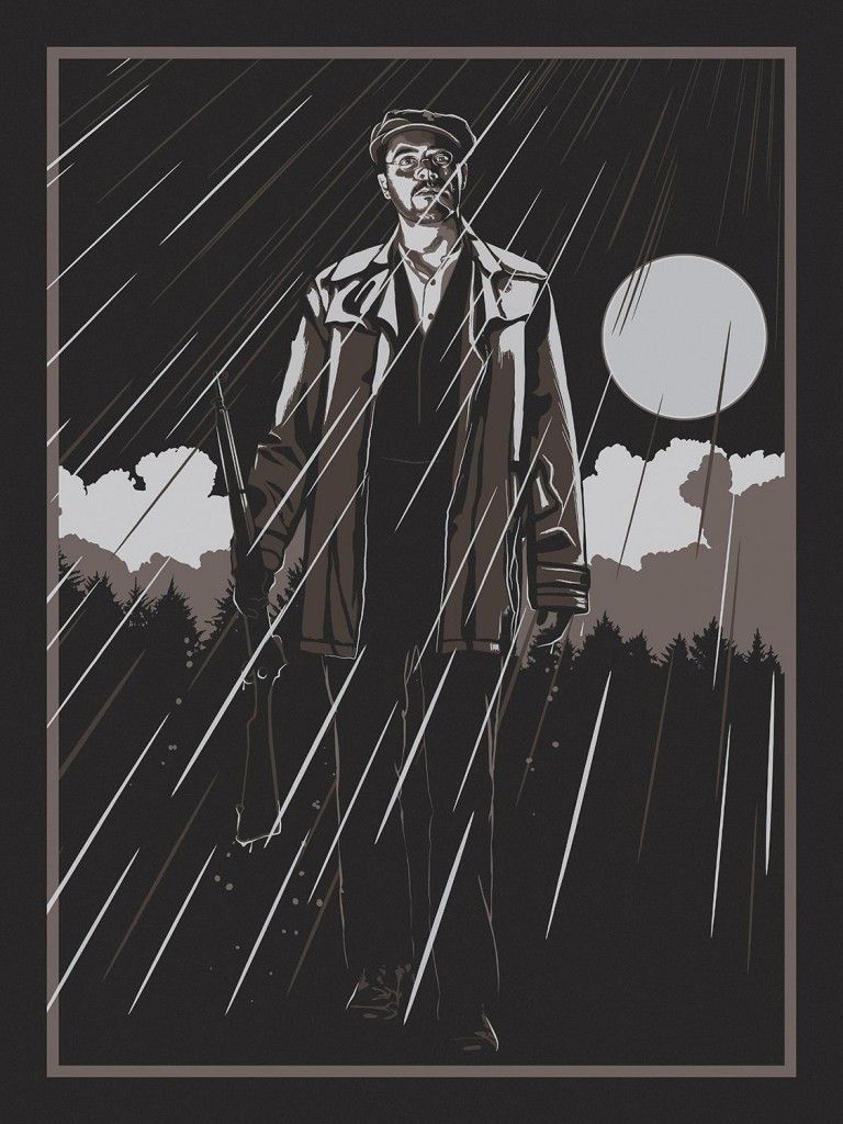
"You come at the king, you best not miss..." Words to live by, no? Tim Doyle's and Samuel Ho's prints celebrate the strange and ghostlike Omar Little, both choosing to treat the character as an almost god-like presence. Truth be told, I'm shocked these haven't already sold out, because not only does the entirety of the Internet worships The Wire (myself included), but for a show so universally loved, there's a surprising lack of decent artwork available for it anywhere. Do yourself a favor and pick up one or both of these before they're all gone. You won't be sorry. The "King of Baltimore" and "The Saint of West Baltimore" prints are currently available for purchase. To learn more about Tim Doyle, be sure to visit nakatomiinc.com and follow @nakatomitim. Visit samuelho.com and follow @samuelho to see more of Samuel Ho's work.

And that's it! What were some of your favorite pieces?

Tuesday, August 28, 2012

Heads Up: Death Waltz's "Halloween II" and "Halloween III" Vinyl Albums

I've heard that vinyl recordings give off a musical "warmth" that you just can't get with digital. And we can't forget about the cool factor, which I believe empirically states that regardless of a record's quality, being in close proximity to said vinyl imparts an aura of knowledge, wisdom, and sophisticated musical taste to everyone in the immediate area. There's also something incredibly romantic about the tangibility and immediacy of a record that just doesn't exist in other audio formats. So, why on Earth did it take me so long to delve into the wonderful world of vinyl? Well, I guess the short answer would be I was intimidated. Rightly or wrongly, I always pictured those who were into records as the musical elite - snobs who would no doubt raise their nose at me and my naiveté the moment I approached the register. How wrong I was, dear friends! Thanks to the folks at Death Waltz Recording Company, I've been slowly amassing a beautiful record collection that appeals to the movie lover in me both visually and auditorily. What does all this mean? Hmm. I guess this rather long-winded exploration of my troubled psyche is my way of telling you that you need to support these guys. Not only does Death Waltz use some of today's most talented cine-obsessed artists when designing their album covers, they go that extra mile, working with the people behind the music to ensure they have the best possible product out there. As proof of their dedication to everything I love, Death Waltz just put their Halloween II and Halloween III: Season of the Witch albums on sale a few minutes ago. Need more convincing? Take a peek at the beautiful artwork below.

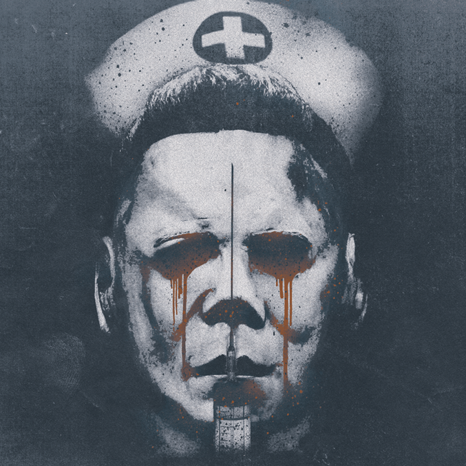
Halloween II Album
Artwork: Brandon Schaefer
Music By: John Carpenter & Alan Howarth
£20 - Limited to 400 (I think)

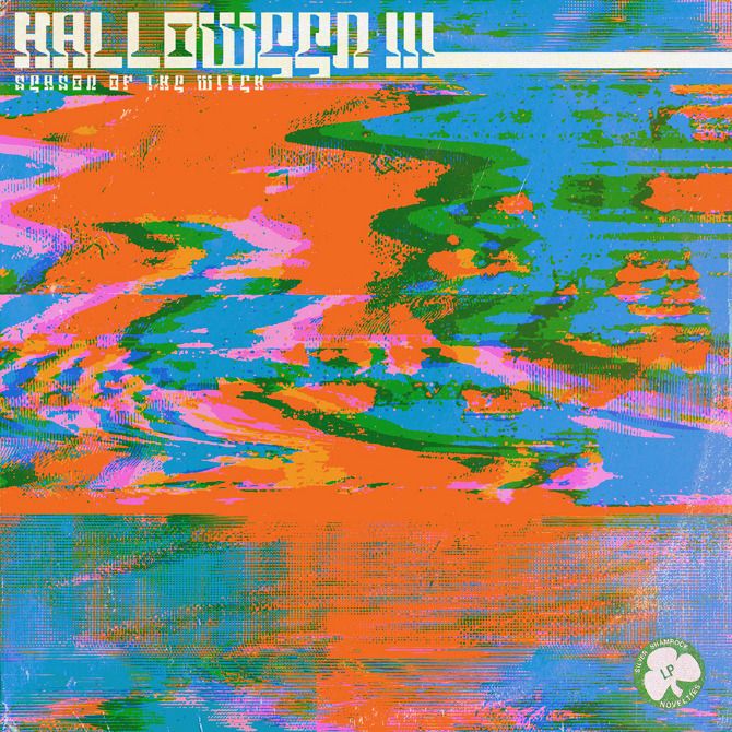
Halloween III: Season of the Witch Album
Artwork: Jay Shaw
Music By: John Carpenter & Alan Howarth
£20 - Limited to 400 (I think)


Death Waltz's Halloween II and Halloween III albums are currently available for pre-sale through their website for £20 each. Both albums also come with a 12" x 12" lithograph print and a folded A2 poster. If you have any interest at all in amazing music, amazing artwork, and the films that made the two previous elements possible, be sure to sign up for the Death Waltz newsletter and follow @deathwaltzrecs on Twitter. Oh, and did you see tricked that out black and orange record? Beautiful stuff!

Tuesday, July 31, 2012

Write Up: Brandon Schaefer's Mel Brooks Movie Poster Set

"What's better than one Mel Brooks movie poster," you ask? Easy. Two Mel Brooks movie posters! Spoke Art, who's been working with the historic Castro Theatre in San Francisco to promote some recent screenings, has just released two incredible prints by artist Brandon Schaefer for a very, very reasonable price. In order to properly express myself I tried to find a clever quote from either Spaceballs or Blazing Saddles that accurately captured my excitement, but somehow "I am your father's brother's nephew's cousin's former roommate" wasn't really doing the trick. In lieu of the perfect quote, I think I'll just ramble on about how much I like these prints. Read on if you dare!

Spaceballs Movie Poster
Brandon Schaefer
18" x 24" (Giclée) - Signed and Numbered
$40 (Separately) / $60 (Set) - Limited to 120

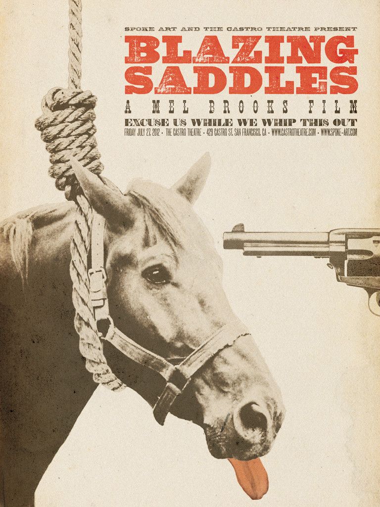
Blazing Saddles Movie Poster
Brandon Schaefer
18" x 24" (Giclée) - Signed and Numbered
$40 (Separately) / $60 (Set) - Limited to 120

With every Brandon Schaefer poster I see, I love his work a little bit more, which has always been a bit of surprise to me given how I'm not usually one to fall for prints that prominently feature photographic elements. But sure enough, I've been consistently blown away by what Schaefer and fellow cineaste Jay Shaw have been doing recently and could easily add a ton of their artwork (and probably will) to this year's "Top 20" list. With that said, I'm not trying to place a box around what Brandon does. In fact, I'd say it's pretty clear by looking at the prints above that he doesn't necessarily lean on one style over another. It's his ability to change and adapt that makes him such an interesting artist to follow, and the only real through-line I can spot when it comes to Schaefer's work is his obvious love for the moving pictures. Both posters are relatively straight to the point, but manage to articulate the films' joke-a-minute construction with their iconic (and bizarre) characters / situations. If I had one complaint (and it's a pretty minor one), it would be that these posters weren't screen printed, especially the Spaceballs print, but honestly, they'll still look super sharp screen printed or no, so don't let that dissuade you from picking up the set.

These posters are currently available (yes, right now) through Spoke Art's store as either a set or can be purchased separately. Just a heads up though, you're saving $20 if you get the set, so it's a bit of a no-brainer in my opinion. Both posters measures 18" x 24" and are limited to 120. To see more of Brandon's work, be sure to visit seekandspeak.com, his Tumblr page, and his continually impressive contributions to the Silver Screen Society. You can also follow him on Twitter @seekandspeak. It probably isn't a bad idea to follow @spoke_art on Twitter and subscribe to their newsletter while you're at it.

Wednesday, May 30, 2012

Grzegorz Domaradzki and Brandon Schaefer's "The Warriors" Movie Posters

I like Mondo as much as the next guy, nay, I feel entirely comfortable saying I love Mondo more than the next guy. I mean, for all I know, the next guy doesn't even collect posters. Maybe he's obsessed with creepy dead-eyed porcelain dolls. And why won't he tell me his name? Does he really expect me to refer to him as "The Next Guy" whenever I talk about him? I don't like it. Seems shady. So, in summation: I love Mondo. But as fond as I am of Mondo (and dislike "The Next Guy"), I'm just as excited, maybe even more so, about what's going on with galleries and groups like Spoke Art. The reason? Competition is good thing for us art lovers. It forces both Mondo and Spoke Art, among many many others, to consistently step up their game. And as you'll see below, San Francisco-based Spoke Art in collaboration with The Castro Theatre has really hit this one out of the park.

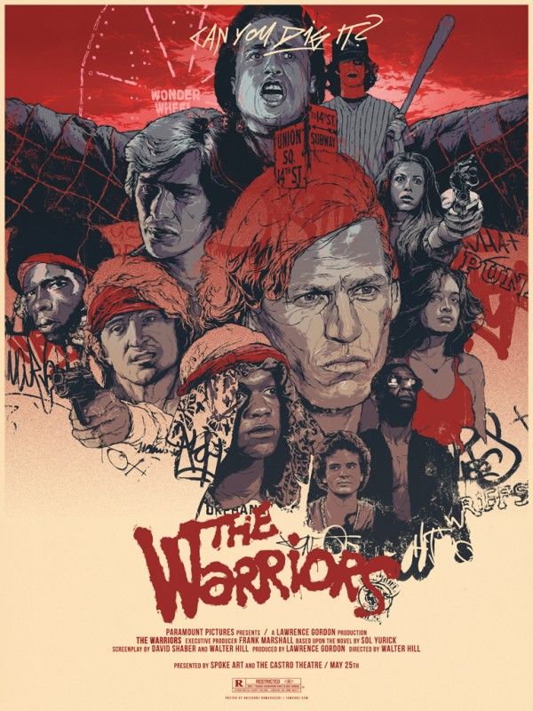
The Warriors Movie Poster
Grzegorz Domaradzki
18" x 24" (Giclée) - Signed and Numbered
$40 - Limited to 100

I'd like to start this review off with a quick "Hell yes!" because Grzegorz Domaradzki (AKA Gabz) is officially back in action. Hell yes! I last wrote about Gabz in October of 2011 and it's been far too long since he released any movie inspired art. Thankfully, Spoke Art and The Castro Theatre have seen fit to remedy this problem, commissioning him to create a poster for the 1979 cult classic The Warriors. In a word: electric. Domaradzki's illustration feels alive and possibly even dangerous. A lot of that tension comes from his line work, which is precise, unerring and completely unpredictable, suggesting we, the viewer, may not be able to fit these people or their actions into neat little boxes. Alright, I'm stepping off of my pretentious soap box now. It's time for a simple truth. This poster is just plain kickass. And I haven't even mentioned the aggressive crimson color palette, the wonderful use of negative space, and the seamlessly interspersed graffiti, all of which give this poster an appropriate "don't mess with me or I'll blow you're f**king head off" vibe. Much scarier than the Stop! Or My Mom Will Shoot vibe, isn't it? Yeah, I went there. Unfortunately, this print is already sold out, but there's always eBay or Expresso Beans for the truly ravenous. To learn more about artist Grzegorz Domaradzki, be sure to checkout iamgabz.com and his Facebook page.

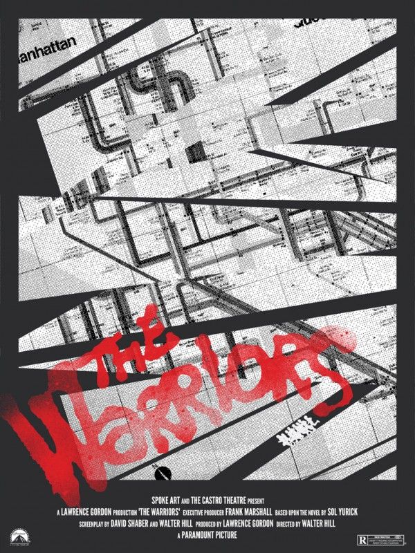
The Warriors Movie Poster
Brandon Schaefer
18" x 24" (Giclée) - Signed and Numbered
$40 - Limited to 100

I feel a little sick. I've been following Brandon Schaefer of seekandspeak.com fame for quite a while, and I'm only now mentioning him on Posterocalypse. I remember first discovering Mr. Schaefer's work after picking up a Monty Python and the Holy Grail poster of his from Gallery 1988's "Crazy 4 Cult" show a few years back and have kept track of the guy ever since. Anyway, I'm glad I finally get to write about his work, and definitely plan to cover more of Brandon's art in the near future. Now, onto the reason why you're actually here. Schaefer's Warriors print could not be more different than Grzegorz's, and that's exactly why it works. The majority of Warriors posters, including the first design included in this post, tend to highlight the crazy players over the locales. And why wouldn't they? The costumes and make-up are pretty outrageous, but in my opinion, each location is just as important to the story and could easily qualify as a character unto itself. Brandon's poster is one of the few to truly highlight the locales over the gang members, which is a pretty novel idea and seems wholly appropriate given how important the setting, and more specifically, the subway system, is to the film. It's a beautiful print and is sure to be treasured by any Warriors fan, although I'm a little bummed this wasn't a screen print, as it looks like the perfect candidate for the process. Brandon Schaefer's gorgeous Warriors movie poster is currently available through the Spoke Art store for $40. The poster measures 18" x 24" and is limited to an edition of 100. If you're interested in seeing more of Brandon's art, head over to seekandspeak.com and follow him on Twitter @seekandspeak.

One last thing. This goes without saying, but be sure to visit Spoke Art, their Tumblr, follow them @spoke_art, sign up for their newsletter, and peruse their store!