Showing posts with label Criterion Collection. Show all posts

Tuesday, April 16, 2013

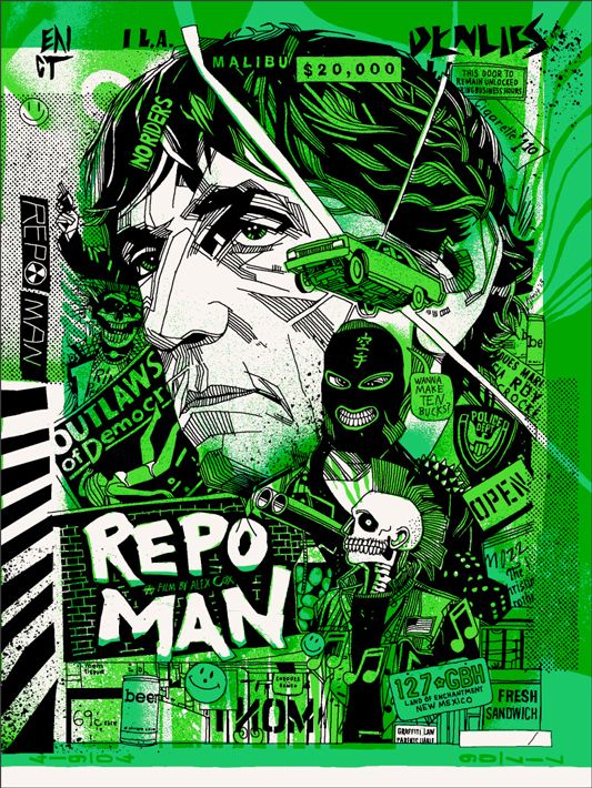
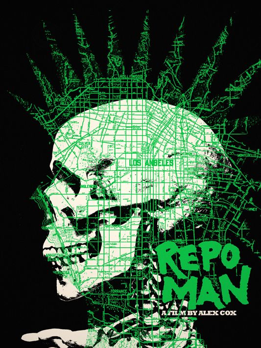
Jay Shaw & Tyler Stout's "Repo Man" Posters

It finally happened. My two obsessions, the Criterion Collection and Mondo, have collided to make sweet, sweet venn diagram love, and from their loins has come the following prints. Amazing! Just amazing!

Repo Man Movie Poster
Tyler Stout
18" x 24" (Screen Print) - Numbered
Regular - $45 - Limited to 510
GID Variant - $65 - Limited to 220

I'm going to keep this short, because I've got to wake up in time to actually grab these prints in the morning. I'm guessing everyone has already seen the amazing Shaw print, so I decided to lead with the Stout's jaw-dropping design. Stout's Repo Man artwork will be available on Tuesday (4/16) at a random time through Mondo for $45 or $65, depending on which version you go for. Both the regular edition and the glow in the dark variant measure 18" x 24" and are hand-numbered. For more Tyler Stout news, visit tstout.com.

Repo Man Movie Poster
Jay Shaw
18" x 24" (Screen Print) - Numbered
$45 - Limited to 195

The above image is probably what you've grown accustomed to seeing whenever Criterion's soon-to-be-released Criterion Blu-ray and DVD was discussed, but much like the film, that doesn't mean it's any less stunning on its fifth or thirtieth screening. Jay Shaw's Repo Man print will be sold through Mondo later today. Be sure to follow @mondonews for the exact drop details. To see more of Shaw's work, head over to kingdomofnonsense.com and follow @ironjaiden on Twitter. Good night and good luck!

Wednesday, November 14, 2012

Criterion Connection - It's That Time Again!

The "Criterion Connection" is my little corner of the world where I can obtusely and clumsily wax on about my commitment to Criterion's commitment to important classic and contemporary films.

It's been a long, long while since I've posted one of these, and while I don't have too much to say, I did want to remind everyone that Barnes & Noble's 50% Off Criterion Sale is happening right now. If you're anything like me, you've already purchased the one, two, or five films you've had your eyes on. There's only a few days left (sales ends on November 19th), so act fast.

And my loot!

Rosemary's Baby
Weekend
Rashomon

Heaven's Gate
Brazil*

What did you grab?

* The price of the Brazil Blu-ray has risen recently for some reason. Lame.

Monday, November 28, 2011

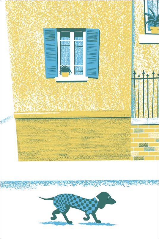
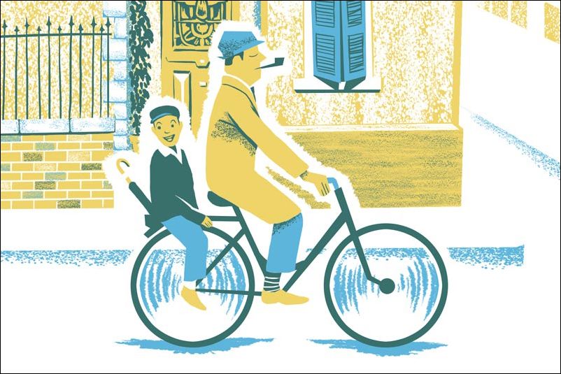
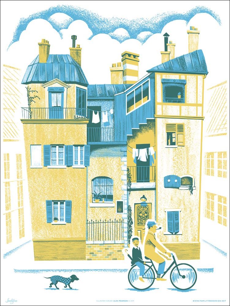
Alex Pearson's "A Ride Through Town" Art Print

If you're a fan of Buster Keaton, Charlie Chaplin, W.C. Fields, or even Peter Sellers' Chief Inspector Clouseau, then you'll probably enjoy the subtle slapstick of Tati's Monsieur Hulot. And whether you recognized all the names in the previous sentence or not, I'm still going to go ahead and recommend you watch the brilliant Mon Oncle.

"A Ride Through Town" Close-up

"A Ride Through Town" Close-up

"A Ride Through Town" Art Print
Alex Pearson
$25 - 18" x 24"
Inspired By: Mon Oncle

I like to include close-ups of prints whenever they're available, because not only do I feel they provide the consumer with a better idea of what the poster will look like in-person, but it also allows you / me / whoever to absorb the image in much smaller fragments and thereby (hopefully) increase your / my / their appreciation for the art and artist. I'll follow up that point by directing you to the three close-ups I've included above. Any of these images could be beautiful art prints all by their lonesome, don't you think? My utterly engrossing philosophy on poster close-ups aside, this really is a spectacular print and a wonderful tribute to a timeless film by Jacques Tati. To provide a little background on the poster, Alex Pearson's "A Ride Through Town" was part of the Silver Screen Society's recent Mon Oncle exhibition. For those unfamiliar with the Silver Screen Society and the amazing concept posters they create, I recommend remedying that by visiting their blog immediately. In Mon Oncle, Tati whimsically compares old-fashioned individuality and technological "progress" as a personal status symbol and uses Monsieur Hulot as a child-like wrecking ball whenever he interacts with the cosmopolitan world. The film is filled with beautiful images and quietly (and sometimes not so quiet) funny moments. Among those beautiful moments we have the uncle (Tati as Hulot) and nephew tooling around on a bicycle, Hulot's antiquated residence, and, oh yeah, I almost forgot, there are adorable dogs aplenty. The artist has combined all these colorful and, at times, outré moments together and created something fantastic and worth owning for any self-respecting Tati fan. And yes, I had to look up the word "outré" to see if I was using it correctly. It just seemed appropriate given the film's Frenchness.

Alex Pearson's "A Ride Through Town" is currently available through the Familytree webstore at familytreedesign.net. The three-color screen print measures 18" x 24" and costs $25. I believe this is a sale price, so it might be back up to $35 by the time you read this. No word if it's signed and / or numbered. To learn more about the artist be sure to visit his website and follow him on Twitter @alexfamilytree.

Monday, November 7, 2011

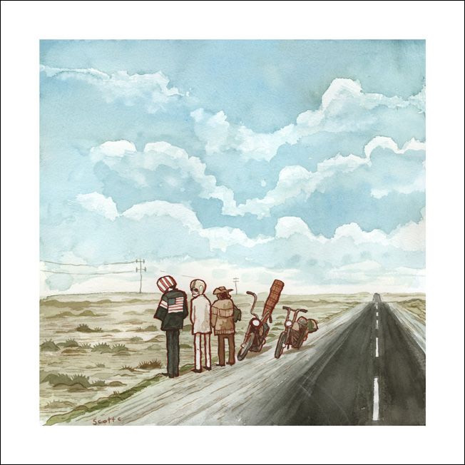
Scott Campbell's "The Open Road" Art Print

Easy Rider is one of those movies that almost every person has seen, or at the very least been told they need to see! It's iconic; it's as much a piece of American history as it is film history, but more importantly it's a great film. And now, fans of Easy Rider, like myself and probably you, have the chance to own a gorgeous print inspired by the film from artist Scott Campbell.

"The Open Road" Art Print
Scott Campbell
12" x 12" - Signed and Numbered
$50 - Limited to 50
Inspired By: Easy Rider

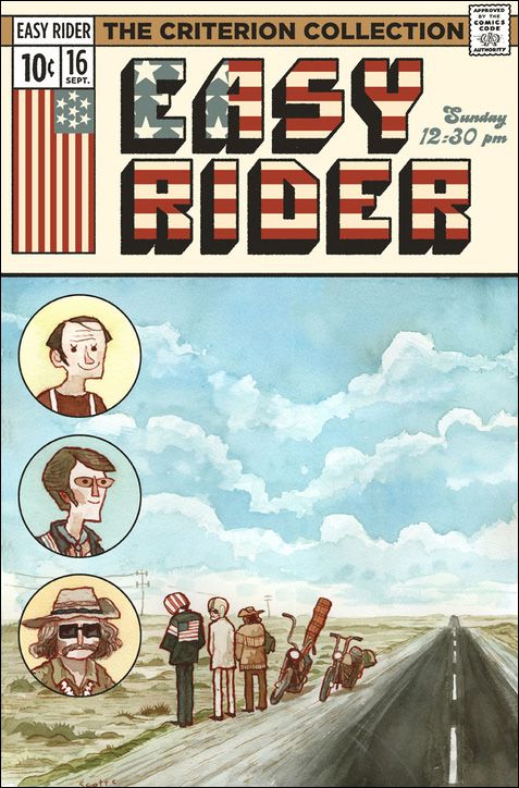
Scott Campbell, who's best known for his "Great Showdowns" series, has created an absolutely stunning poster that celebrates one of American cinema's most influential films. Depending on how recently you've seen the movie, you may even recognize the image Scott painted as the exquisitely framed scene where our three bohemian protagonists are taking a quick bathroom break by the side of the road. A scene, which in my opinion, exemplifies the film's many attempts at bucking expectations and presenting a sometimes optimistic, often tragic look at the fringes of society. Campbell's artwork is at once classically appealing and still completely fun in the way that pretty much everything Scott Campbell does is. But beyond just being a stylish piece of awesome, this print has had a pretty interesting journey itself, though nothing to rival Wyatt and Billy's "trip." The above artwork was initially used as a portion of the Easy Rider movie poster (presented below) for the All Tomorrow's Parties / Criterion Collection screening of the film in 2010.

Easy Rider Movie Poster (for All Tomorrow's Parties / Criterion 2010 Screening)
Scott Campbell
Not Available for Purchase

It's a beautiful piece of artwork as you can tell, that has sadly never been released to the public for purchase. Thankfully, artist Scott Campbell decided to sell one of the original elements that made up this poster, or more precisely, the lower two thirds of the image sans encircled portraits, during Gallery 1988's most recent "Crazy 4 Cult" exhibit. It was a really exciting release, although that excitement was somewhat tempered by the fact that only one person would ever actually be able to own it. Long story short, I guess the demand was there, because Gallery 1988 has decided to release a print of this marvelous and important piece of pop culture artwork.

Scott Campbell's "The Open Road" art print is currently available through Gallery 1988 for $50. "The Open Road" is limited to an edition of 50, measures 12" x 12" and is signed and numbered. To learn more about Mr. Campbell head over to pyramidcar.com, greatshowdowns.com and follow him on Twitter @scottlava. And visiting Gallery 1988 at gallery1988.com should be a no brainer at this point, as they're always doing something cool and finding new and innovative ways to take our money. Finally, if you are in that second group of people I mentioned earlier, meaning everyone has told you to see the film and yet you still resist, do yourself a favor and watch it!

Tuesday, June 14, 2011

ARTicles - Volume 1

I'd like to introduce a new feature called ARTicles tonight. I'm hoping to do an entry like this maybe once a month where I can highlight interesting articles and blog posts that I've happened upon about, you guessed it, art. They may not all be about cool movie posters, but you can rest assured that the vast majority of this column will be either dedicated to art, film, or film art. Please let me know if you like this feature, and of course, if you know of some great ARTicles (yeah, it's cheesy) feel free to email them to me at posterocalypse@gmail.com. Enjoy!

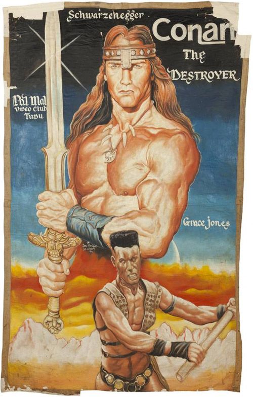
"Tons of Hand Painted Movie Posters from Ghana" (Nerdcore)

Conan the Destroyer
I think the best way to prepare yourself for the images you're about to see is to read the summary of what the posters represent (stolen from the Nerdcore): "During the late 1980s, a cottage industry developed in Ghana, West Africa, called the 'mobile cinema.' It was composed of young entrepreneurs who possessed three pieces of property — a TV, a videocassette recorder (known then as a VCR), and a portable, gas powered generator. Armed with these tools plus desire and ambition, they traveled from village to village showing movies on the VCR and selling tickets to the event...Most cinema operators found the only way to thrive was to increase sales, the only way to increase sales was to advertise, and the only effective way to advertise was to put up posters." What we have here are hand crafted African (Ghana to be exact) movie posters executed with varying levels of success. Any way you look at it, it's a blast to see these one of a kind works of movie art. If you want to check out even more poster goodness head over to Primative Explorer's African Movie Posters Gallery. Note: Much of Nerdcore is in German, so unless you sprechen die Deutsch you might have some difficulty wandering the site.

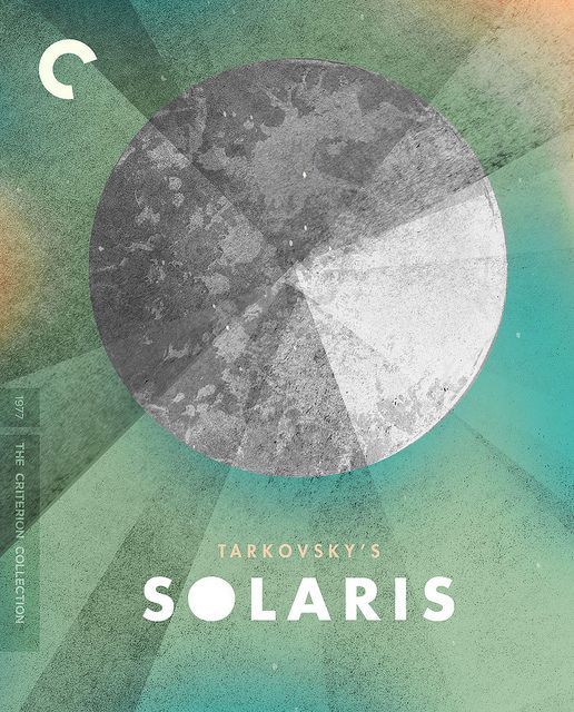
"Process: SOLARIS" (Sam's Myth)

Solaris
Yeah, I go a little nuts over the Criterion stuff (I know, I know), but I'm always excited to read (and then immediately talk about) a Sam Smith process post. It's amazing how thorough he is in discussing and illustrating the creative process. There are some artists who are fantastic at putting together a process post (Kevin Tong's process videos immediately come to mind), but I think Sam may have the most impressively in-depth and analytical write ups on the web. In this post, Sam walks us through the creation of his Solaris Criterion cover artwork. I haven't seen the film yet, but reading through his creative journey while making the cover has definitely piqued my interest. Be sure to check out Sam's blog, Sam's Myth, for additional required reading. And if you're at all interested in  Solaris after reading his post, you can pick it up for a pretty decent price on Amazon.

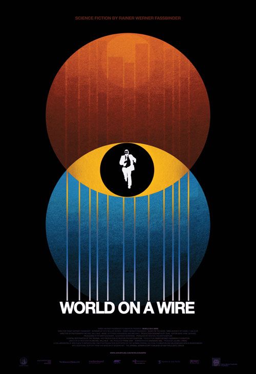
"Movie Poster of the Week: Rainer Werner Fassbinder's World on a Wire" (MUBI)

World on a Wire
This is another Sam Smith-related link, but I think anyone who's a fan of good design will appreciate what he's done here. MUBI, an online community for fans of moving pictures, has a weekly feature called "Movie Poster of the Week." Unsurprisingly, the feature is meant to highlight some of the cool film artwork that has recently been released or announced. It turns out that Sam Smith just so happened to create a very slick poster for a re-release of the 70s German sci-fi masterpiece from R.W. Fassbinder, World on a Wire. I'll let you click the link if you're interested in more information, but that's not going to stop me from teasing the film with a quick synopsis: "Made in 1973 for German television and rarely seen until it resurfaced at MoMA last year, World on a Wire is a three-and-a-half-hour, two-part, sci-fi head-trip of a movie about government conspiracies and parallel realities set in a world of gleaming ’70s corporate minimalism." Interested? I thought so. And as of yesterday, World on a Wire is now available for viewing on Hulu Plus through their deal with Criterion and Janus.

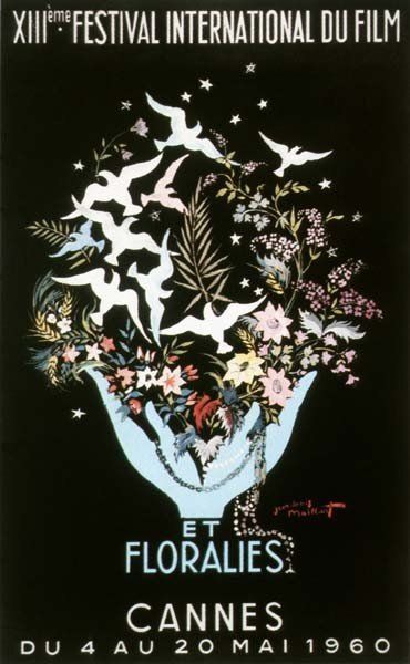
"64 Years of Cannes Film Festival Posters" (L'Express)

Cannes 1960
I found this link by way of Sound on Sight's wonderful "The Art of the Cannes Poster" article and was entranced by the range of artistic styles on display. This collection of Cannes posters goes from 1946 to 2011 and fluctuates from bleak minimalism to indulgent absurdity to just plain weird. I think my favorite may be the 1960 poster (pictured to the left). Yeah, it's kind of busy, but I love the silhouettes against the black background. I can't help but think that by peeking at these posters I'm seeing a snapshot of what cool looked like in years past. For those of us who will probably never make it to the Cannes Film Festival this is as close as we'll get to experiencing the chic avant-garde nonchalance that I imagine everyone walks around with. What's your favorite poster? Note: This website is in French, although you shouldn't have any trouble navigating it.

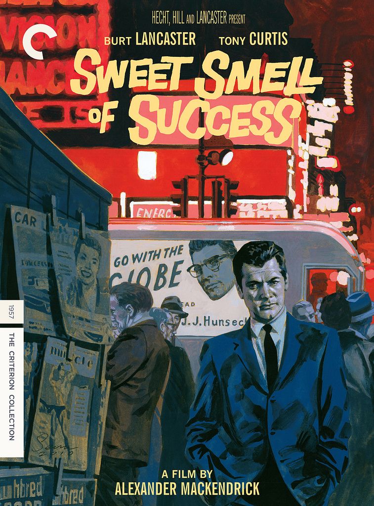
"Critique Commentary: Rick Poynor Selects DVD Covers from the Criterion Collection’s Film List" (Eye Magazine Blog)

Sweet Smell of Success
I promise this is my last Criterion related link (at least for today). The Eye Magazine blog wrote up a great post about some of their favorite Criterion covers. The post is especially fun to read, because not only do you get to find out who the art directors and designers were, but in some cases a little bit about the inspiration for each design. My favorite cover is probably Sean Phillips and Eric Skillman's Sweet Smell of Success cover (pictured to the left), but I also love Skillman's Blow Out and Kellerhouse's Gomorrah covers. And as an FYI to everyone who was wowed by the Sweet Smell of Success cover, I highly suggest you immediately pick up all of Sean Phillips' and Ed Brubaker's amazing Criminal comic book series. I know I mentioned Sam Smith's blog earlier in this entry of ARTicles, but if you're in the mood for some more amazing process posts from another artist I'd recommend visiting Cozy Lummox, the digital home of artist Eric Skillman.

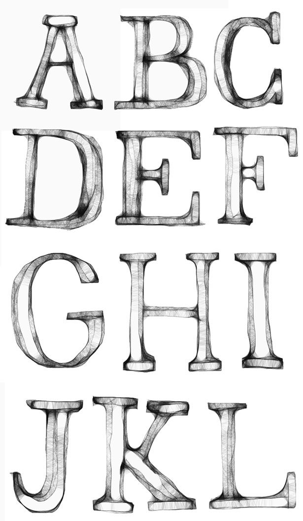
"Mind Blowing Examples of Experimental Typography" (Webdesigner Depot)

Typographic Example
This post really has nothing to do with film, I just thought this was a great collection of typographic experiments. Looking at something like this just makes you want to create, or at least, makes me want to create. I wish these were all available as fonts that I could freely and indiscriminately abuse. It's fascinating when a letter in the alphabet goes from being a small, but important, piece of something larger to a beautiful work of art all on its own. As my own typographic experiment, I googled "typographic experiment" and it turns out there's a book titled Typographic Experiment - that is all. Note: Give yourself about thirty minutes to go through all of these abecedarian masterpieces. I studied three or four of the images for at least a good five minutes, completely lost in the detail, until I realized the faucet had been running for the better part of ten minutes with nary a dish, pot or utensil cleaned.

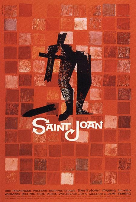
"Saul Bass' Movie Posters: Then and Now" (Christian Annyas)

Saint Joan
This post from Christian Annyas' blog was at once incredibly interesting and also kind of sad. In it Christian compared many films' original Saul Bass posters against the films' more recent (and by "more recent" I mean in the last ten years) DVD covers. To be fair, a few of the DVD covers aren't necessarily bad, not at all, but when you've already got such great artwork waiting in the wing, why oh why, would they opt for the floating disembodied head? One of the things I found most interesting when reading Annyas' post, was that whenever Saul Bass worked on a film "he created a complete and consistent identity for films (main and credit titles, a symbol or trademark, trailers, posters, ads, album cover)." That cohesiveness is sorely lacking in today's films. In fact, the only filmmaker that immediately comes to mind that still seems to exercise that level of control over the entire package (the film and the marketing) is David Fincher. Tangent aside, be sure to check out this post.

Well I guess that's it. Hope you enjoyed everything and again, please send me an email if you've got an ARTicle that you'd like to see here, or if you find a dead link.

Tuesday, March 29, 2011

Criterion Connection - Must-Have Artwork

The "Criterion Connection" is my little corner of the world where I can obtusely and clumsily wax on about my commitment to Criterion's commitment to important classic and contemporary films.

This month's Criterion announcement brought us some very welcome info about their release plans for June, which include Louise Malle's Black Moon and Zazie dans le métro, Nicolas Roeg's Insignificance, Robert Aldrich's Kiss Me Deadly, Kon Ichikawa's The Makioka Sisters, Robert Siodmak and Edgar G. Ulmer's People on Sunday, and Raffaelo Matarazzo's Runaway Melodramas Eclipse Series. I don't know too much about the majority of these films (one of the many reasons why I love Criterion), but I'm most excited for Kiss Me Deadly, Black Moon, Zazie dans le métro and Insignificance. I think this may be the first time in a long while where every announced title is completely new to the collection - well done Criterion. Enough about that though, let's get to the focus of this month's "Connection."

I thought I'd use this entry to highlight my favorite works of art available through the official Criterion Collection store. I think you'll find that the work is top notch and you may even recognize a name or two from Criterion's very impressive stable of artists. I'd go as far as to say, that even if you're not a fan of the Criterion Collection or art house films in general, you'll still come to appreciate the incredible artistry on hand. Without further ado, I give you the must-have artwork from Criterion's vault.

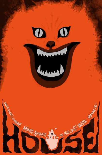
House - Sam Smith

Sam Smith's House movie poster is insane in all the right ways. Recognize the artist's name? That's right, Sam Smith, the man who not only created the super classy Black Swan screen print not too long ago (read my post about it), but was also part of last month's "Criterion Connection," appears to be a favorite throughout the hallowed halls of Criterion. If you haven't seen Nobuhiko Ôbayashi's bat-shit crazy fever dream known as House, you're really missing out. I mean how often do you get to see a carnivorous piano feasting on human flesh, a man turn into a pile of bananas, or a demonic cat winking menacingly? Sam Smith has captured all of that hallucinatory splendor with this intense poster that manages to make you laugh while your skin crawls. Sam Smith's House one-sheet is available from the Criterion Collection website for $25 and measures "27 x 39". This is a limited edition glossy finish poster, although Criterion doesn't explicitly say what the edition size is, and is the perfect gift for the man or woman in your life that loves strange cinema of the fiendish feline variety. I also highly recommend checking out Sam's blog, Sam's Myth, where you can find a great post detailing the House poster process and how he originally got connected with Criterion. It's fascinating stuff. Still not sure you should invest time in a film like House? Then I highly recommend checking out the trailer at criterion.com to seal the deal and get a feeling for just how bonkers the film is. The film is also available for streaming through Hulu Plus, but I'd recommend a blind Blu-ray or DVD purchase if you've got some spare change.

Corridors of Blood
First Man into Space
The Haunted Strangler
The Atomic Submarine

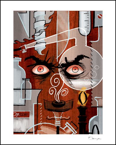
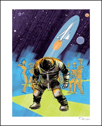
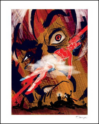
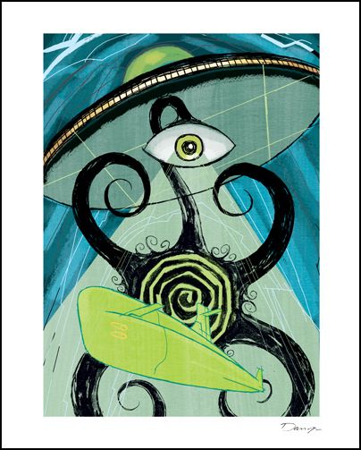
If you're a fan of comics you may recognize the above four prints as a product of the insanely talented Darwyn Cooke. Apart from being an Eisner Award-winning comic book renaissance man (he writes, draws and animates), Darwyn Cooke also created an amazing set of prints for Criterion's release of their Monsters and Madmen boxset. The set contains four films (some horror, some sci-fi) from producers Richard and Alex Gordon that occasionally feature a rather sinister Boris Karloff (is there any other kind of Boris Karloff?). I haven't seen any of these films yet, but I just had to include Cooke's amazing artwork in this entry. Darwyn's nostalgic style fits so perfectly with these four films from 1958 & 1959, that it's a wonder he hasn't done more movie cover art. Seriously Criterion, get this guy back on your payroll! I think my favorite of the set would have to be his "First Man into Space" print, but they're all seriously amazing and make me want to seek out these movies. I really like how Cooke was able to use a different color palette for each print, allowing them to thrive separately, and as a collection. The "Monsters and Madmen" giclée set can be purchased from Criterion for $125, with each print measuring 8" x 10".  The product page states that the first edition consists of 100 sets, so I'm not entirely sure if they plan to make a second edition, but it sounds like a possibility. If you're interested in checking out the films, Corridors of Blood and First Man into Space are currently streaming through Hulu Plus, should you want to avoid the somewhat steep cost of the DVDs. And for those of you interested in learning more about Darwyn Cooke, I recommend picking up his DC: The New Frontier, The Spirit and Richard Stark's Parker: The Hunter comic books. They're all great reads!

Mystery Train - Yee-Haw Industries

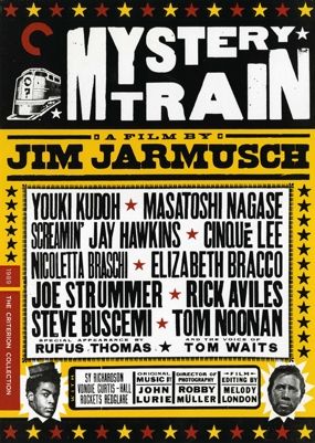
I absolutely adore this film! So it should come as no surprise that Jim Jarmusch's Mystery Train is my favorite movie in the white-haired auteur's filmography. The compositions and color in this film are just jaw dropping. It's amazing to think that prior to Mystery Train, Jarmusch had only made black and white films (beautiful black and white films, but you know what I'm saying). The Mystery Train movie poster by Yee-Haw Industries is the same artwork used for the DVD / Blu-ray cover (similar to Sam Smith's House poster), but still makes quite a fetching poster. I can't quite explain it, but the color and design somehow just seem so fitting for the film's southwestern environs. Maybe that's because Yee-Haw Industries is located in Knoxville, Tennessee, a mere 400 miles from the film's Memphis setting. Alright, so maybe 400 miles isn't a walk in the park, but at least it's in the same state. Another cool thing about this poster is that it was created with a letterpress (picture), which based on the artist's description of the process, sounds like a pretty interesting process (taken from the Mystery Train product page):
"Our process is pretty true to how they would have actually done it seventy to one hundred years ago. We use Vandercook proofing presses, mainly from the thirties and forties. When we initially proofed the headline type, it was all laid out using ascending sizes of wood type. The credits were all typeset using antique wood and lead type. 
Everything in letterpress is set in reverse. So we have fonts of individual letters that are all reversed, and when the paper offsets onto the type it becomes right-reading. Producing a run of posters is a rather slow process. All the prints are hand-printed, one color at a time (Mystery Train is three colors on whiteboard), allowing for time to dry in between. Most of the wood type we use is probably eighty to one hundred years old—strong stuff!”
The limited edition Mystery Train letterpress is available through Criterion for $30 and measures 16.4" x 23.1". Unfortunately, I couldn't find this streaming anywhere, but this is one that's definitely worth owning on Blu-ray - the picture quality and rocking soundtrack are superb! If you've got some free time I also recommend checking out the Yee-Haw Industries website, blog and Flickr account.

Rashomon - Kent Williams

In full disclosure, my Rashomon poster review was taken from a post I wrote for another blog. For those who haven’t seen the film, here’s the gist of it (taken from the Rashomon product page):
Through an ingenious use of camera and flashbacks, Kurosawa reveals the complexities of human nature as four people recount different versions of the story of a man’s murder and the rape of his wife.
Sounds kind of nuts, right? This was the film that changed the role of the narrator in cinema, evidently they can’t always be trusted. This poster perfectly reflects the differing views of a single moment. I love Kent's style. His artwork seems completely chaotic and yet totally controlled. This was the poster that Criterion / Janus used when re-releasing the film in theaters in 2009. Thankfully for you and I, Criterion decided to sell it as a limited edition one-sheet through their website. Have I mentioned how perfect this design is? Toshiro Mifune is looking particularly badass as he’s being torn apart in four different directions. Ouch and symbolic. The Kent Williams's Rashomon movie poster measures 27" x 40" and is currently available at the Criterion store. If you love classic movies, nay, iconic movies that forever changed the landscape of cinema (dramatic I know) then you’ll love this poster. Also be sure to visit Kent Williams’s site. For those who haven't seen the film, and aren't ready to pull the trigger on the DVD, Rashomon is currently streaming through Hulu Plus.

Robinson Crusoe on Mars - Bill Sienkiewicz

Bill Sienkiewicz’s “Robinson Crusoe on Mars” print deserves to be hung in a gallery – this thing is insanely beautiful. One of the things I’ve really come to appreciate about Criterion, and that is on full display with this print, is how they can take a film that may be exploitive or may not be considered a masterpiece by any film scholar and somehow create something that transcends its humble beginnings and lovingly places it in the context of film history. I’m sure I sound like a broken record at this point, but wow, Bill has really created something that completely transports me to another world (Mars to be specific) with his beautiful broad strokes that make up the mountainous landscape of the red planet, to his precision point depictions of the stars in the sky above. You might begin noticing that Criterion likes to use comic book artists (Darwyn Cooke, Kent Williams and Bill Sienkiewicz) who are more than capable of conveying a film’s plot, feeling, and character using only a static canvas. Bill’s limited edition “Robinson Crusoe on Mars” giclée is available through Criterion for $125 and measures 22” x 16”. The Robinson Crusoe on Mars was recently re-released on DVD and Blu-ray and is certainly worth a rent, if not a blind purchase. To learn more about the art of Mr. Sienkiewicz head over to billsienkiewiczart.com or pick up his Stray Toasters, Elektra Omnibus, or 30 Days of Night: Beyond Barrow comics.

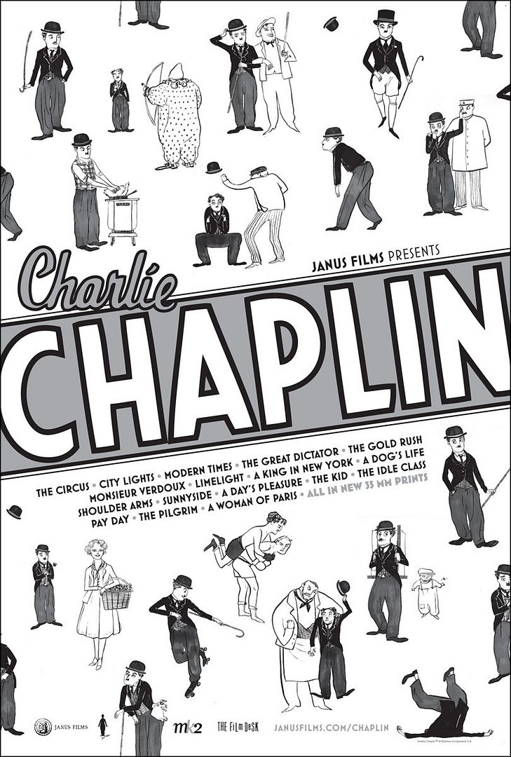
Charlie Chaplin Festival - Kate Beaton

The Charlie Chaplin Festival poster by Kate Beaton is probably the most playful of the posters I chose to write about in this post (the House poster is pretty fun too, but that’s a different kind of playful, a creepy / crazy kind of playful), but it also seems to perfectly match the mischievous mood of the troublesome tramp played by the inimitable Charlie Chaplin. Kate (another comic artist!) did exactly what she should have done here - kept it simple, and I can’t thank her enough for that. From the black and white color palette to the straightforward sketches that illustrate all of the tramp’s iconic gags, pratfalls and poses, the Charlie Chaplin Festival poster is the perfect representation of a comedy legend. Kate Beaton’s Charlie Chaplin Festival one-sheet costs $25, measures 26” x 40” and is available for purchase through Criterion’s store. As I mentioned earlier, Kate, like many other artists included here, has worked in comics, but she tends to skew a little more indie with her web comic Hark! A Vagrant. Check it out, it's very funny!

My fingers are officially exhausted from all of the typing, so I think I’ll end it here. For more information on the Criterion Collection be sure to head to criterion.com. I’ll leave you with a teaser image from this month’s Criterion newsletter that’s meant to hint at what a future, currently unannounced Criterion release could be.

Everyone who knows what they’re talking about has already concluded that this a nod to Stanley Kubrick’s The Killing from 1956, which is one of the few Kubrick films I haven’t seen. Needless to say, I’m very excited. How about you?

As a reminder for those of you that haven't yet entered the Posterocalypse Fighter giveaway, I'll be giving away The Fighter movie poster by Adam Hanson and a mystery print on March 31st to one lucky person who leaves a comment with their name and email address (US only) in last Tuesday's blog post (it was titled "Giveaway - The Fighter by Adam Hanson"). Good luck!