Showing posts with label Steven Spielberg. Show all posts

Thursday, January 17, 2013

Heads Up: Laurent Durieux's "Jaws" and Mike Mitchell's "E.T." Movie Posters

It's barely 2013 and Mondo has already released the screen printed Kraken. Can you believe Thursday's Jaws and E.T. prints will mark the second and third Spielberg movies posterized by the Austin-based boutique in as many weeks into the new year? And it's making quite the impression if one's to look at, oh, practically any movie blog on the Internet.

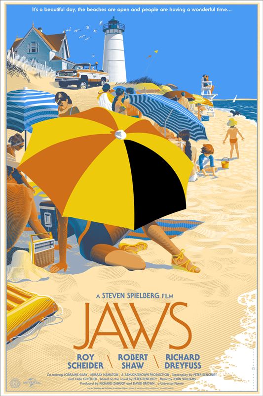
Jaws Movie Poster
Laurent Durieux
24" x 36" (Screen Print) - Numbered
$60 - Limited to 525

Laurent's Jaws design makes for one classy poster and happens to be the perfect ambassador for the taut, restrained direction and storytelling which made Spielberg's shark story so terrifying. The bright colors and cheerful composition, like a happy snapshot before a gruesome murder, are much more unnerving than any grisly crime scene could ever be. Mondo's Jaws poster will be available through their website at a random time on Thursday (1/17) for $60. The print is limited to an edition of 525 and measures 24" x 36". For more info on the artist, check out Durieux's Flickr account.

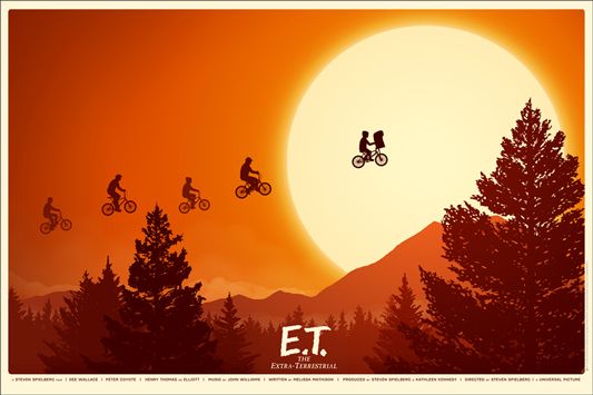
E.T. Movie Poster
Mike Mitchell
36" x 24" (Screen Print) - Numbered
$45 - Limited to 475

On the opposite end of the creepy spectrum, we have Mike Mitchell's sunny E.T. print. You know when it's really hot (like scorchingly so) and your exhausted to the point that passing out and being pecked at by vultures is becoming alarmingly likely? You know what I'm talking about. And then suddenly your three best buds appear with four ice cream cones. "Why four," you ask? Because one of those cones is for you! Fist bumps all around. That's kind of how I feel about this print: good in a fuzzy sort of way. The E.T. poster will also be sold through Mondo on Thursday (1/17) at a random time. The screen print measures 36" x 24" and is limited to an edition of 475. Head over to sirmikeofmitchell.com and follow @sirmitchell on Twitter for more Mike Mitchell-related news.

Friday, December 9, 2011

Matt Verges' "Jaws" Movie Posters

Duuun dun duuun dun dun dun dun dun dun dun BOM BOM dun dun dun dun dun dun doo dedoo doo dedoo dede doo dede doo dededoo. For those unsure of what just happened, that was the text version of the Jaws theme song. And if you're still confused, I'll go ahead and direct you toward the two images below. And if you're STILL not grasping what I'm writing, you're gonna need a bigger boat. Sorry, couldn't help myself.

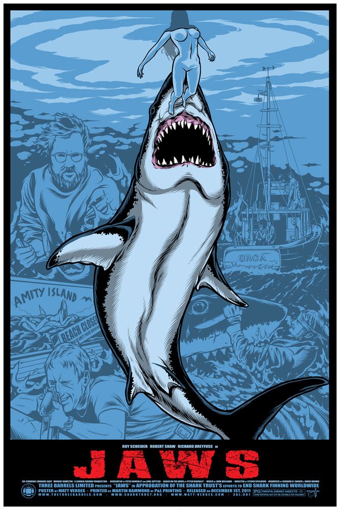
Jaws Movie Poster
Matt Verges
24" x 36" - Signed and Numbered
$24 - Limited to 150

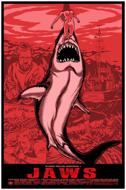
Jaws Movie Poster (Variant)
Matt Verges
24" x 36" - Signed and Numbered
Sold Out - Limited to 50

I wasn't all that familiar with Matt Verges' portfolio, but I'm really impressed with these prints. One of the first things I noticed, besides the massively terrifying shark and voluptuous skinny dipper-cum-shark chum, which are pretty hard to miss, was how perfectly the inconspicuous background scenes complement and flesh out Matt's shark-infested composition. In many ways the design reminds me of Tim Doyle's artwork with its thicker lines and comic book-like sensibility. I'd even go so far as to say that these posters would make for some utterly kickass Jaws comic covers, or a jaw-dropping (wordplay!) first page as there already appear to be several comic-friendly panels present, the majority of which are cleverly divided by the shark's body. And while I still would have appreciated this artwork if the background images were darker and more easily visible, the fact that the Verges wisely chose to not bring the smaller illustrations to the forefront shows he understands exactly why people wanted to see Jaws in the first place - a grotesquely large shark and the ominous threat of attack lurking beneath the water's placid surface.

Unfortunately, I got to this one a little late, meaning the red variant was already sold out (sorry), but the insanely affordable regular version in aqua blue is still available through the Three Barrels Store at threebarrels.bigcartel.com. The regular version measures 24" x 36", is limited to a version of 150 and only costs $24. Yes, you heard right, only $24 for a 24" x 36" screen print! It gets better! A portion of the money made from these posters goes to the Shark Trust, a group based out of the UK dedicated to shark conservation around the globe. It's a win-win folks! For more info on The Three Barrels, head over to thethreebarrels.com and follow them on Twitter @TheThreeBarrels. And to learn more about artist Matt Verges, you can visit matt-verges.com, check out his blog, and buy stuff from his store. Sweet!

Wednesday, October 26, 2011

JC Richard's "Jurassic Park" Movie Posters

UPDATE (10/27): All Sold out! Hope you you were able to grab one!

The majority of us missed out on Horkey's insanely illustrated Jurassic Park posters from Mondo's Mystery Movie screening of the film, but thankfully all is not lost. In fact, I believe the two posters below will be the first public offering, not including the mystery movie release, since Mondo gained the rights to the Spielberg films (can't WAIT until the Tyler Stout Color Purple posters).

Jurassic Park Movie Poster (Regular)
JC Richard
24" x 36" - Hand numbered
$45 - Limited to 375

Jurassic Park Movie Poster (Variant)
JC Richard
24" x 36" - Hand numbered
$75 - Limited to 125

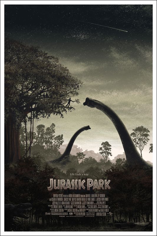
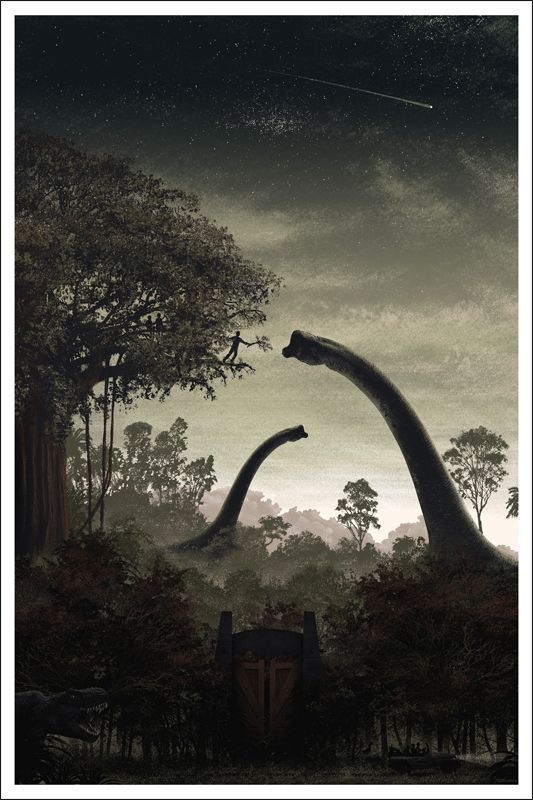
JC Richard, an artist I wasn't all that familiar with, did a great job creating a very realistic and beautiful Jurassic Park vista. With the amount of layers on display here (ten in all!) I have to imagine the detail is just astounding up close and I'm a huge fan of the muted color palette. Richard's posters really evoke that first-time wonder we all felt when we saw this film in theaters. And while I'm not always a supporter of variants, I really like how the Jurassic Park variant gives us an unobstructed view of the lower third of the print. I mean, did anyone even notice that there was a massive gate there until the credits and title had been removed? Finally, I wanted to heap some praise on the layout of the print. There's a beautiful symmetry between the natural arc that's formed by the closest Brachiosaurus and Dr. Alan Grant feeding the creature from the tree trop, and its inorganic analogue, the man-made gate below. It's a wonderful print and is sure to please fans of the film. Here's what JC had to say about his poster (taken from his blog):
"As exciting as some of the chase scenes are, I was always more impressed with the gentler, more awe-inspiring visual moments in the film. The 'scary monster on our heels' stuff was done before in countless movies, but the scenes that stuck with me were the fleeting moments between chases... characters could briefly reflect on their amazing surroundings and interact with these giants with sentiments other than 'RUN!' (That said, just had to include the Trex in there because let's face it- he's the hero of the flick)."
In my opinion, he more than succeeded in his mission and provided the perfect counterpoint to Horkey's ferocious Tyrannosaurus rex.

JC Richard's Jurassic Park print will be available tomorrow (10/27) at a random time through Mondo's website. The posters both measure 24" x 36" and are hand numbered. The regular Jurassic Park print will cost $45 and be limited to 375, while the title-less variant will cost $75 and be limited to 125. As always, to find out the moment these posters drop be sure to follow @MondoNews on Twitter. And to learn more about the artist head over to microcosmicmedia.com and follow him @microcosmcmedia. Hopefully this will be the beginning of a very long and fruitful relationship between JC and Mondo!

Tuesday, August 9, 2011

Charles Forsman's Mash-up Art Prints

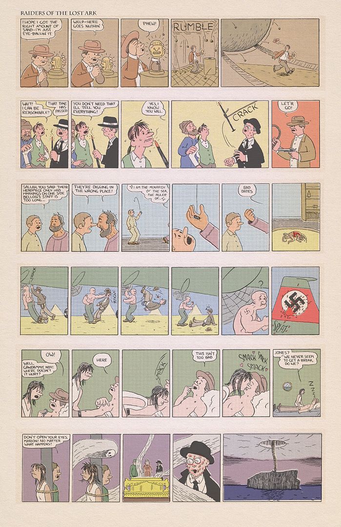
I'd never heard of Charles Forsman until yesterday, but over the past 24 hours I've become a devoted and devout (redundant much?) follower of the man for two special reasons: his Raiders of the Lost Ark / Popeye mash-up and his Jaws / Peanuts mash-up. Behold the majesty of his first print, but don't stare directly at it - your face might melt off (like in that one movie that I can't recall the name of).

Raiders / Popeye Mash-up Art Print (Second Run)
Charles Forsman
11" x 17"
$15 - Limited to 100

Seriously, this print is just too damn cool. I highly recommend you click the above image to see the print in more detail, you won't be disappointed. I love everything about it from the old timey color palette to Mr. Forsman's uncanny ability to channel E.C. Segar's Popeye aesthetic to the world of Dr. Jones. I feel like the artist has just discovered a niche of unfathomable depths and I can't wait to see what mix-and-match he comes up with next. Here's a short summary of what Charles set out to do when attempting this project (taken from his blog):
"I drew six scenes from Raiders as daily Popeye strips and tried to color them to look like they appeared in a newspaper from the 30’s. I put them all together as an 11” x 17” poster that you can frame, put in your bathroom or place it behind that San Diego magnet on your fridge."
He originally only did a run of 100, but the the demand was so high for the Raiders / Popeye mash-up that he decided to do a second run of 100 (though all of the second run prints are labeled as such), which is currently available for a very affordable $15. The print measures 11" x 17" and is signed and numbered. I doubt he'll do a third run of these prints (but you never know), so this may be your last chance to grab one. Did you hear that? What was that? It sounded ominous and musically iconic...what could it be? Oh it's just Charlie Brown never mind.

Jaws / Peanuts Mash-up Art Print (Second Run)
Charles Forsman
11" x 17"
$20 - Limited to 100

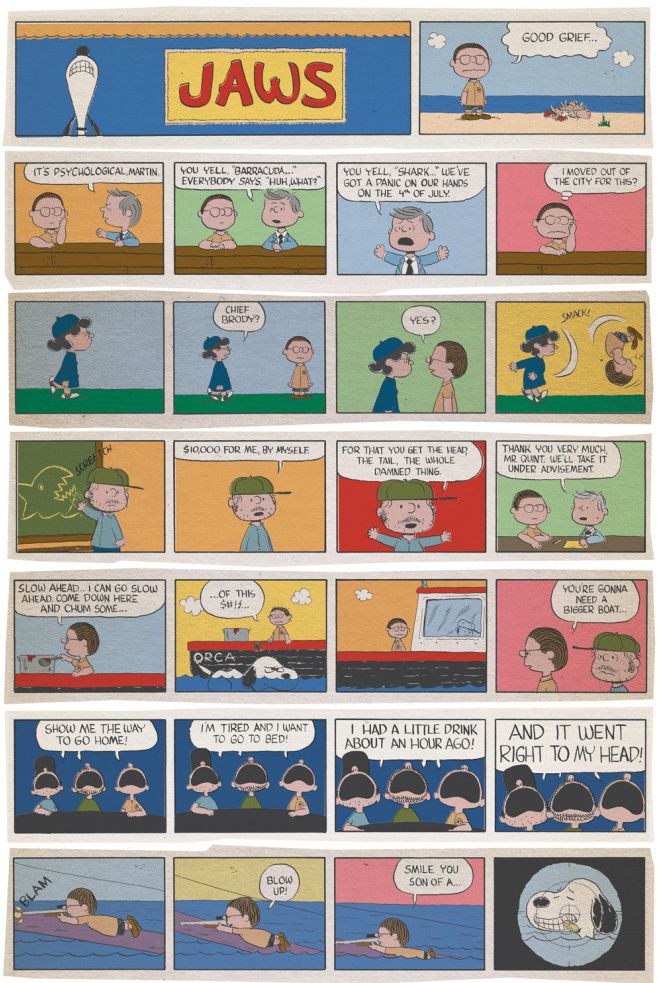
That's right. He's done it again and it's potentially even more awesome-ful. I love that Snoopy, in this alternate universe, is the shark! And it wouldn't be a proper Jaws parody without the "You're gonna need a bigger boat..." line, am I right? This is a must-have for anyone who grew up watching the Charlie Brown specials, which I'm pretty sure is everyone. Charles Forsman provides some insight on the mash-up (taken from Charles' blog):
"After my Raiders / Popeye strip was so well received I decided to try another combination. After a failed attempt at another combination I decided to try mashing up 2 of my all-time favorites: Spielberg and Benchley's Jaws drawn like Schulz's Peanuts.
Like the last mashup, this one does not try to tell the whole story but rather depict some of my favorite scenes. I am a big fan of Peter Benchley who wrote the original book and actually appears in the movie as a TV reporter. Last summer I read almost every Benchley novel. There are still a few I haven't read but they were all super entertaining if a little dated. Obviously people know Jaws the movie so I did my best to stay faithful to both the movie and Peanuts. I hope it worked and is fun to look at."
Like the Raiders / Popeye print, Forsman's Jaws / Peanuts mash-up is in its second printing and is limited to an edition of 100 (the artist said he plans to label them as part of the second printing and possibly change some of the colors around). The print measures 11" x 17 and is signed and numbered. To learn more about the artist visit charlesforsman.com where he's got some pretty bizarre / funny / sad comics to read. Finally, be sure sign up for his newsletter if you want to get a heads up on his next creation.

Thursday, March 10, 2011

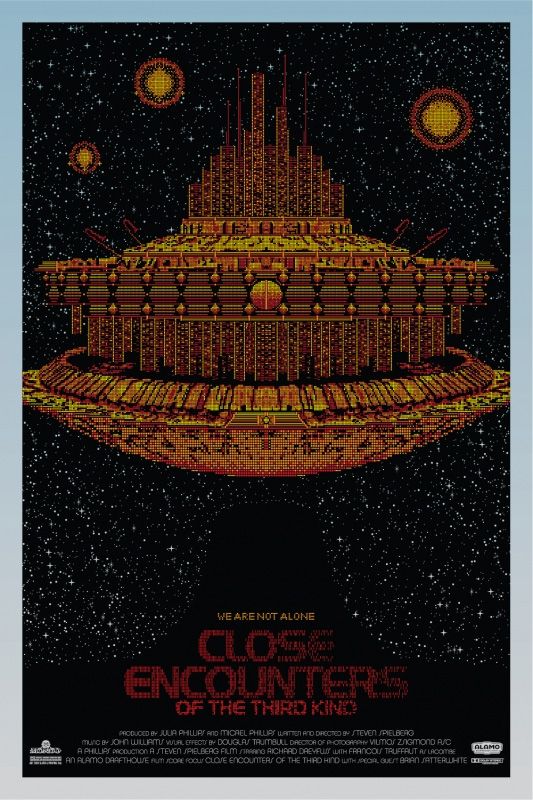
Todd Slater's "Close Encounters of the Third Kind" Movie Posters

Just a warning, the next two days are going to be packed to the brim with Mondo goodness. Today I'll be writing about the soon-to-be-released (as in tomorrow) Close Encounters of the Third Kind poster by Todd Slater. Tomorrow, I'll be babbling about all of the amazing SXSW Mondo posters that were not part of the Duncan Jones Director's Series (I already wrote about those two). As much as I love to write about other companies, there's just no denying that the vast majority of art that comes from Mondo deserves to be covered - it's beautiful stuff. Now let us venture into the world of science and fiction and behold the intricate design that is Slater's Close Encounters.
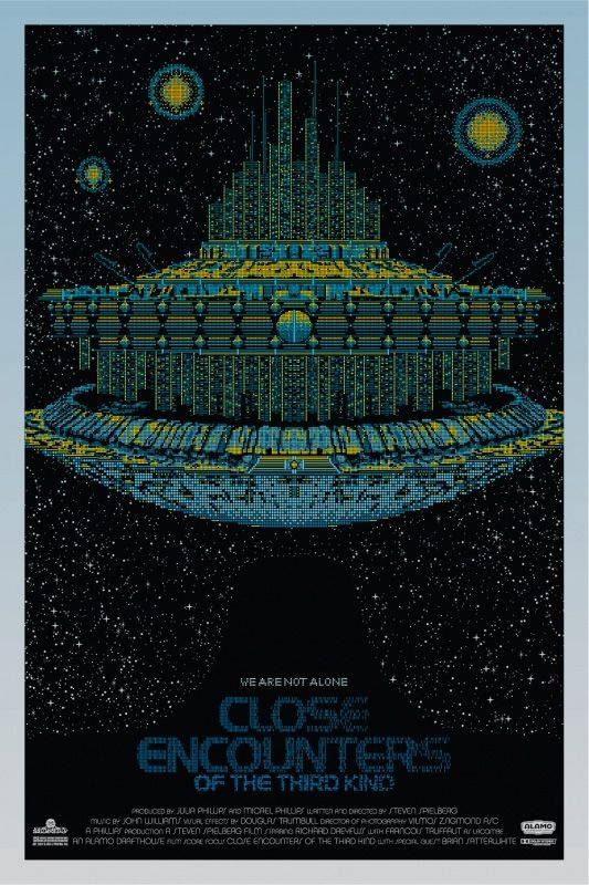
Close Encounters of the Third Kind - Regular Edition

Close Encounters of the Third Kind - Variant Edition

I hate to admit it, but I haven't seen Close Encounters in years, lots and lots of years, probably at least ten. With that said, this poster is immediately recognizable, probably even to those that have never seen the film. In fact, I'd go as far as saying that my first reaction to seeing this poster was a lot like seeing the alien ship for the first time in the film - slack-jawed bewilderment and delight. Todd Slater packed so much detail into these images that seeing them online can in no way do justice to the level of attention that was paid to the pixel-precise construction of these spacecrafts. If you've seen some of Todd's other work (I'm thinking of his "Overworld" art print and Band of Horses gig poster), then you probably already understand just how much fun this guy seems to have with the minute. Ultimately, this poster can be appreciated as both a brilliant piece of eye candy as well as a tribute to one of the best sci-fi films around, something most movie posters don't have going for them. Wow, I really need to watch this movie again!

Todd Slater's Close Encounters of the Third Kind print will be released at a random time tomorrow (3/11) through Mondo's website. Both posters measure 24" x 36", are hand numbered, and were printed by D&L printing. The regular blue version comes in an edition of 300, while the rare yellow variant comes in an edition of 70. As usual, be sure to follow @MondoNews for the drop details and it probably wouldn't hurt to have your lucky rabbit's foot handy. Also be sure to check out Todd Slater's website toddslater.net.