Showing posts with label Insidious. Show all posts

Monday, June 25, 2012

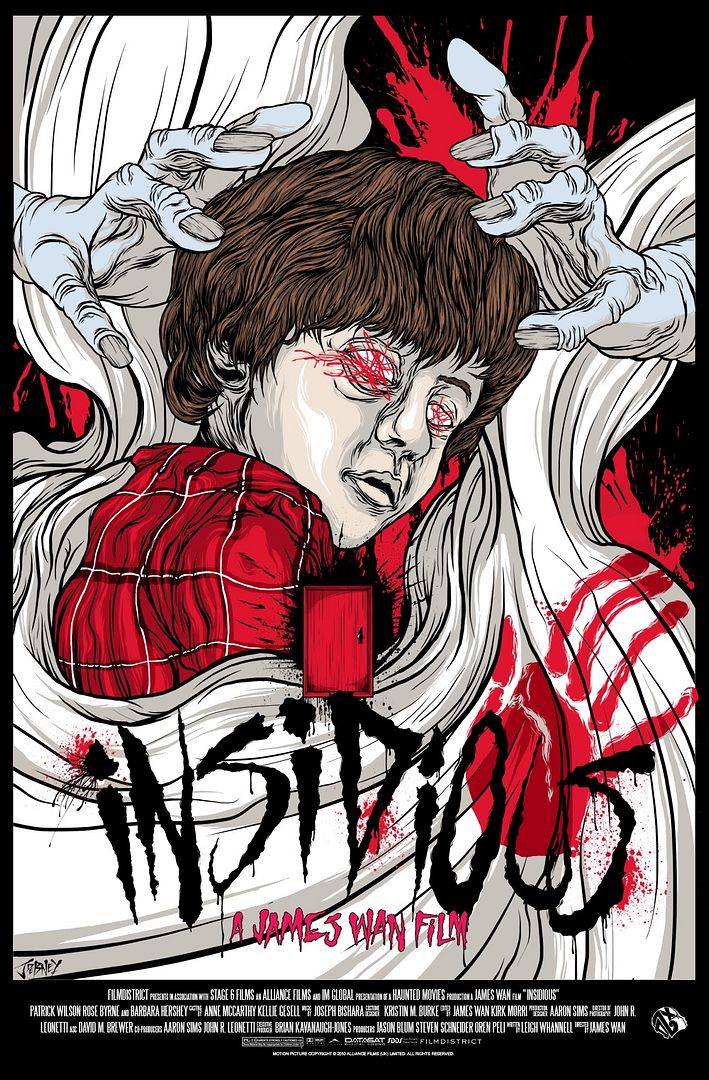
Jordan Debney's "Insidious" Movie Poster

I first learned about Jordan Debney a few months back and had been planning on including some of his work in an early "Art Appreciation" column of mine. Fast forward to today, June 25th, and I've yet to write about the guy. This has nothing to do with him, it's more a testament to my unorganized life and debilitating bouts of laziness. But when I spied the print he did for James Wan's Insidious, I decided now was my chance to strike (and by "strike" I mean write about his art).

Insidious Movie Poster
Jordan Debney
24" x 36" (Screen Print) - Numbered
$60 - Limited to 300

Insidious was a film that impressed me, but I could never love. It takes the tried and true haunted house model and then turns it on its head by adding a dose of interplanar travel. It's a cool concept that I felt was never properly explored by Wan and company. That said, Debney's poster captures what I think was the most compelling aspect of the film, that's right, the aforementioned wibbly wobbly timey wimey* astral projecting shenanigans teased at in the story. Jordan's twisting, turning and warping of his subjects is visually splendid and a bit unsettling given the design's surreal properties and unnatural proportions. And those decrepit hands. My god, those hands are ghoulish in all the right ways. My only real complaint with the poster is the child's face. Perhaps it's contorted on purpose, but the nose and mouth area just look a little off to me. And again, that could be 100% purposeful. Other than that minor gripe, this is a wonderful tribute to a film I didn't fall head over heels for, but can certainly respect. Bottom line: if you dig the film and you're digging Debney's artwork, which has a bat shit crazy Alex Pardee vibe to it, then this print is a must buy, buy, buy.

Jordan Debney's Insidious movie poster is currently available for preorder through Kickstarter for $60. The print measures 24" x 36", is limited to an edition of 300, and was commissioned by DzXtinKt Originals. To learn more about Mr. Debney, head over to eyerupture.com, where you can also pick up a few of Jordan's prints and apparel. And I'm out! Good night everyone!

* Stole that from Dr. Who.

Wednesday, August 17, 2011

Best of the Rest: 2011 - Part 2

The "Best of the Rest" feature is meant to reward and praise the official movie posters that, for some reason or another, were able to escape the clutches of the generic floating head marketing campaigns we all know and love and actually come out with something creative, even, dare I say it, cool. Sure, places like Mondo, Gallery 1988, and Fro Design Co. are going to come out with kickass film artwork, that's to be expected, but what about all of the official one sheets that we see posted on the walls of our local theaters? Since there's going to be a ton of images in this posts I won't be writing too much, but hopefully the images will speak for themselves. As a reminder, all of these posters were chosen based on my personal tastes - there's a very good chance that you'll detest every image found below. Let me know what you think!

To check out part one of this feature click here.

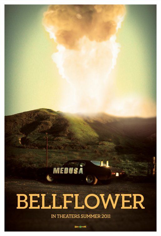
Bellflower
Poster Design By: N/A

Bellflower has a cooler-than-cool trailer, features a badass car with homemade modifications (see "Medusa" in the picture above) and has a beautiful poster. I think I may have an even greater appreciation for a poster like this, because unlike the majority of the films listed in this post, Bellflower had a tiny (almost non-existent) budget and was still able to create a one sheet that looks polished in a post-apocalyptic DIY sort of way.

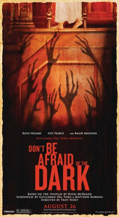
Don't Be Afraid of the Dark
Poster Design By: Troy Nixey
Don't Be Afraid of the Dark
Poster Design By: Ignition Print

I love these posters. They look like they could have been ripped out of a really messed up children's book, although I would expect nothing less from something that Del Toro is attached to. I believe (please correct me if I'm wrong) that director Troy Nixey, who is also a comic artist, did the artwork for the amazing poster on the left. Fairly mind blowing, right?

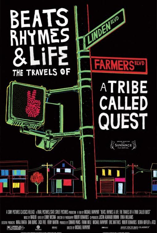
Beats Rhymes & Life:
The Travels of a Tribe Called Quest

Poster Design By: N/A
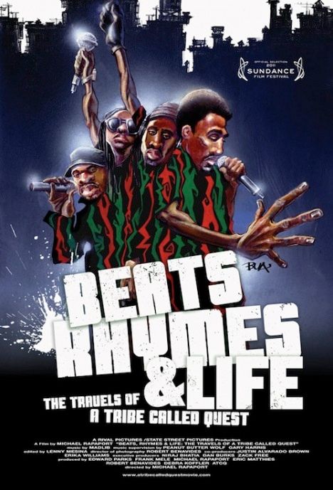
Beats Rhymes & Life:
The Travels of a Tribe Called Quest

Poster Design By: N/A

A documentary about the influential and innovative rap group A Tribe Called Quest having an awesome and innovative poster, who'd a thunk it? Seriously though, I love the neon glow of the cityscape in the poster on the left, and the graffiti / airbrush style artwork on the right.

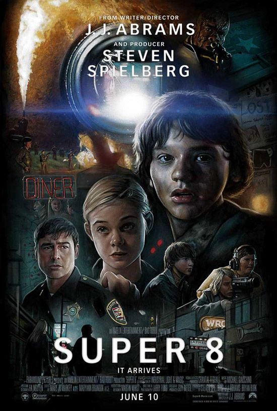
Super 8
Poster Design By: N/A

When I first saw this poster I immediately thought what everyone else on the Internet thought: wow, what an amazing Drew Struzan poster! Yeah, turns out not so much. This is an unofficial fan made poster, but damn, it looks amazing!

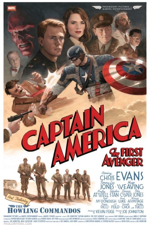
Captain America: The First Avenger
Poster Design By: Paolo Rivera

Captain America punching Hitler, the Howling Commandos...gruffly posing for a picture, old-timey fonts galore - what doesn't this poster have?  While this one sheet wasn't used as the primary (or even secondary) artwork in promotion of The First Avenger, it was officially commissioned by Marvel, but sadly limited to a very small run. If Paramount / Marvel were smarter they would have leaned more heavily on great artwork like this in the film's official marketing campaign.

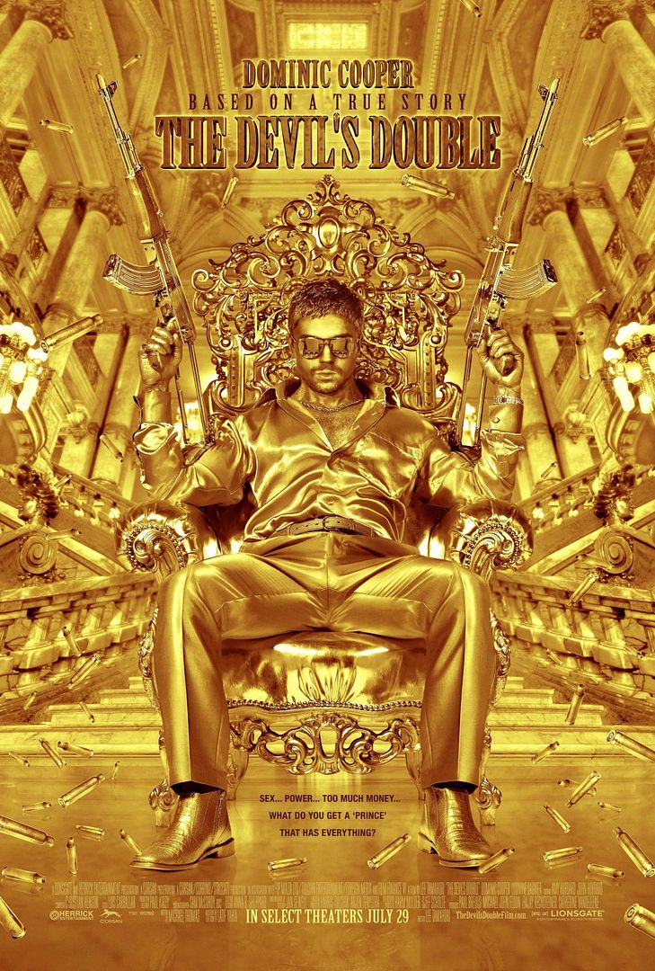
The Devil's Double
Poster Design By: Ignition Print

Bling bling! This poster is garish, flashy, tacky, and any other synonyms for tasteless that you can think of, but in a really appropriate, awesome and beautiful way. Hear me out. The film is about Uday Hussein (Saddam's son) and his body double Latif Yahia, both played by Dominic Cooper, whose world of opulence is only matched by the violence surrounding them - in other words: this poster is perfect.

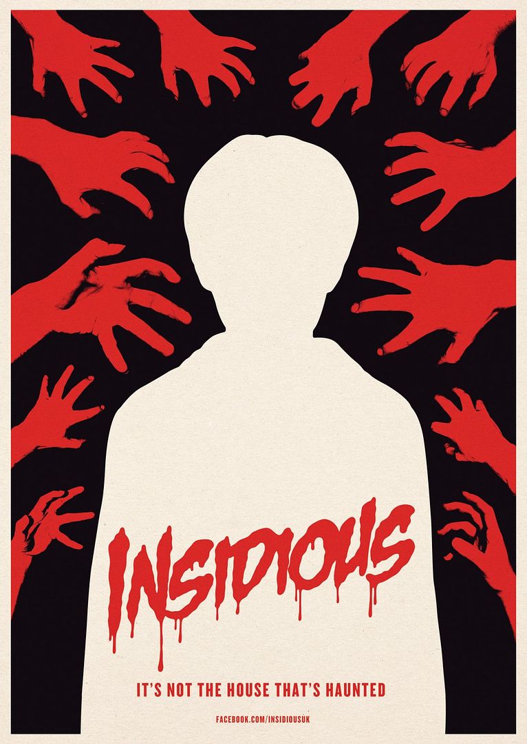
Insidious
Poster Design By: The Church of London

This poster needs to be a screen print. I really don't know what else to say. It's the perfect minimalist horror poster. I think it's also the first time The Church of London has been mentioned. You should check out their site - they've got some really cool stuff.

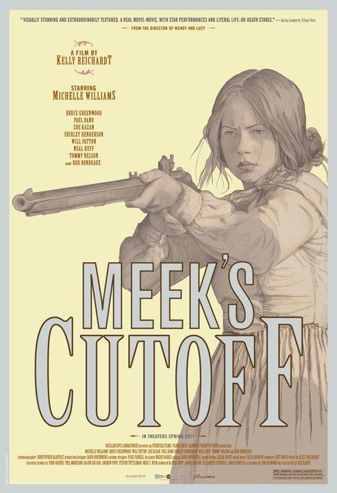
Meek's Cutoff
Poster Design By: N/A

I have no idea who did this poster, but I'm glad they did. The Meek's Cutoff one sheet is eye catching in all the right ways and the color palette is somehow both aridly distressing and pleasing at the same time. If anyone knows who the artist is please let me know.

That's it for part two. If you read part one of my "Best of the Rest" feature you'll be happy (or sad) to know that there wasn't a single Magnet film featured this time around. And again, there were quite a few N/A's listed in the design field, so if you know who any of the artists are please let me know and I'll update the post accordingly. Good night!